

Your Etsy thumbnail is the single most important image in your listing. It is the first — and often only — thing a shopper sees before deciding whether to click or keep scrolling. In a marketplace with millions of active listings, a well-crafted hero image can be the difference between consistent sales and complete invisibility.
Yet most Etsy sellers treat their thumbnail as an afterthought. They upload a quick photo, leave the background cluttered, or rely on default mockups that look identical to every other listing in the search results. The consequence is predictable: low click-through rates, poor conversion, and wasted effort on products that never get seen.
This guide breaks down the core principles behind effective Etsy thumbnails based on a detailed analysis of real listings across six popular product categories — mugs, candles, printable bookmarks, t-shirts, prints and wall art, and tote bags. The insights draw on the experience of Heather, an Etsy seller who has generated approximately half a million dollars in print-on-demand sales over five years and who regularly studies top-performing listing images as part of her monthly trend research.
Part 1. Why Your Etsy Hero Image Matters More Than You Think
Etsy functions as a visual search engine. When a buyer types "mama mug" or "printable bookmark," they are presented with a grid of thumbnail images. The listing title and price appear alongside, but the hero image occupies the most visual real estate and receives the most attention during a scroll.
This makes Etsy thumbnail optimization a core skill, not an optional extra. A listing with strong SEO but a weak thumbnail will attract impressions but fail to convert them into clicks. A listing with a compelling hero image earns more clicks, which signals to the Etsy algorithm that the listing is relevant, which in turn boosts its ranking in search — creating a positive feedback loop.

The principles below apply regardless of whether you sell handmade goods, print-on-demand products, or digital downloads.
Part 2. Six Universal Rules for Better Etsy Listing Photos
Across all six product categories analyzed, the same patterns separated the strongest thumbnails from the weakest. Before diving into category-specific advice, here are the recurring principles.
1. Center Your Product
The highest-rated thumbnails in every category shared one trait: the product was centered in the frame. This sounds basic, but a surprising number of listings on the first and second pages of Etsy search results have off-center compositions, awkward cropping, or too much negative space pushing the product to one side. Centering the product ensures it remains the focal point at any aspect ratio — an important consideration because Etsy has changed its thumbnail dimensions multiple times (from 4:5 to square to 4:3) and the image displays differently on desktop and mobile.

2. Prioritize Lighting and Brightness
Brighter, well-lit images consistently outperformed darker ones. Dim photos with poor lighting looked less professional and were harder to parse at thumbnail size. If your product photo looks slightly dark, increasing brightness and adjusting exposure in post-processing — whether through Photoshop, Canva, or an AI photo editor like Designkit — is one of the simplest improvements you can make. The goal is a clean, high-definition feel that communicates quality at a glance.
3. Create Contrast Between Product and Background
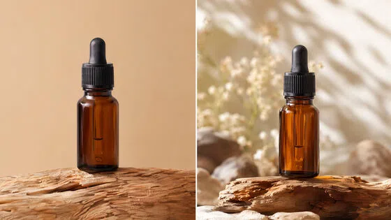
Contrast is what makes a product "pop" in the feed. A white candle on a white background disappears. The same candle against a warm tan or soft wood surface immediately stands out. The strongest thumbnails used complementary or contrasting background colors to draw the eye to the product. This applies to every category — mugs, candles, prints, and tote bags all benefited from deliberate contrast choices.

4. Crop Tighter Than You Think
Many listings suffered from being too zoomed out. Extra space around the product — background clutter, visible table edges, random props — dilutes the impact of the thumbnail, especially on mobile devices where the image is small. A tighter crop ensures the product fills more of the frame and is easier to identify during a quick scroll.

5. Think Mobile First
A majority of Etsy traffic comes from mobile devices [Etsy Investor Reports]. Any text on your product — whether it is part of the design or overlaid on the image — needs to be legible at small sizes. If a buyer cannot read the text on your mug or bookmark while scrolling on a phone, that information is functionally invisible. Design your thumbnail for the smallest screen it will appear on.
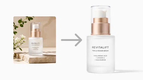
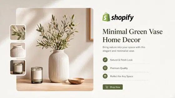
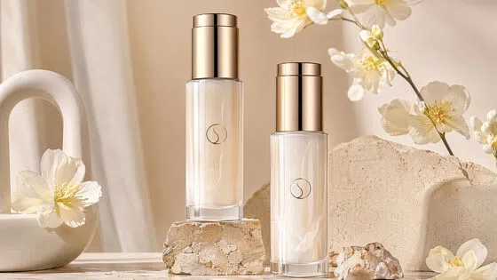
6. Use Lifestyle Mockups Over Plain Backgrounds
Across every category, lifestyle-style images outranked products photographed on plain white or removed backgrounds. A candle on a styled shelf, a bookmark resting on an open book, a tote bag carried by a model — these contexts help buyers envision the product in their own lives. If you cannot photograph your product in a real setting, AI product photography generators — such as those offered by Designkit, Photoroom, or similar tools — are an increasingly viable alternative for creating realistic scenes.

Part 3. Category Breakdown: What Works and What Doesn't
The following analysis examines thumbnails pulled directly from the first two pages of Etsy search results. All images were evaluated at their actual displayed thumbnail size, not at the full-resolution click-in view.
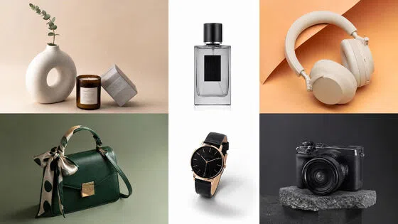
1. Mugs
| Element | Strong Thumbnail | Weak Thumbnail |
|---|---|---|
| Composition | Centered, zoomed in on the mug | Too zoomed out with visible background objects |
| Lighting | Bright, high-definition feel | Darker, less defined |
| Background | Props blurred (bokeh), not readable | Identifiable items (books, plants) that could confuse what is being sold |
| Text | Main text (e.g., "mama") large and readable | Small quote text unreadable at scroll size |
Key takeaway: If your mug features customizable text or multiple design options, do not try to show everything in one hero image. Instead, center on the primary design and use a small inset or circle frame to hint at variations — or save those for secondary listing images.

2. Candles
Candle thumbnails revealed an important nuance about contrast. A dark amber glass candle with a white label on a light background performed well because the product itself provided strong visual contrast. The weakest thumbnail used a white candle on a white background with the background digitally removed — it looked clinical and lacked the warmth buyers associate with candle products.
- Do: Use lifestyle photography with complementary background colors. A soft tan, warm wood, or muted earth tone background works well for most candle styles.
- Do: Shoot from a straight-on or slightly elevated angle so the label is clearly readable.
- Don't: Remove the background entirely unless you replace it with something that adds context. A floating candle on white reads as generic and potentially mass-produced.
- Don't: Use odd angles that prevent the buyer from reading the label text.
Print-on-demand note: If you sell POD candles through providers like Printify or Printful, invest extra effort in making your etsy listing images look handcrafted. Buyers are increasingly aware of print-on-demand products, and stock-looking mockups on white backgrounds are a signal. Ordering a sample and photographing it in a real setting, or using high-quality AI-generated lifestyle mockups, can meaningfully differentiate your listing.

3. Printable Bookmarks
Digital products face a unique challenge: the product itself is a file, so the thumbnail must communicate value through presentation alone. The strongest bookmark thumbnail used a lifestyle mockup — bookmarks displayed on a wooden surface with soft, warm lighting. The weakest showed the bookmark designs floating on a plain background with no context.
- Lifestyle mockups matter even more for digital products than for physical ones, because buyers cannot rely on seeing a "real" photo.
- If selling bundles, show the quantity prominently — but check that the number is not cut off at the current thumbnail aspect ratio. One listing advertised "5+" bookmarks in the corner, but the actual count was 45+. The full number was only visible if you clicked into the listing, meaning the thumbnail undersold the value.
- Keep designs centered so they remain visible regardless of how Etsy crops the image.

4. T-Shirts
The t-shirt category showed how mockup trends evolve over time on Etsy — and why staying current matters for your Etsy product photography.
| Era | Dominant Mockup Style |
|---|---|
| 2020–2022 | Rolled-sleeve, hanging flat lay on a neutral background |
| 2023–present | Comfort Colors-style flat lay on a textured surface (wood, linen) with visible folds and natural shadows |
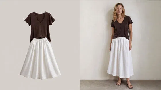
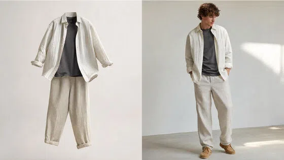
The top-rated t-shirt thumbnail featured a shirt lying flat with natural folds, realistic shadows from direct lighting, and a visible brand tag (Comfort Colors). The folds and shadows made it look like a real garment rather than a digital mockup, and the textured background added depth. The lowest-rated one used a floating shirt on a studio-style gradient background with no visible surface — reminiscent of school portrait backdrops rather than modern e-commerce.
Key takeaway: Match your mockup style to the design aesthetic. A vintage "ESTD 1986" design makes more sense on a relaxed flat lay with a rustic background than floating in front of a gradient. For club or streetwear aesthetics, model mockups (especially oversized fits) tend to perform well.

5. Prints and Wall Art
Wall art listings benefit enormously from framed mockups that place the artwork in a room setting. The strongest thumbnail showed a framed print with a gold frame (notably, matte gold is trending in home decor, with matte black on its way out, according to industry interior designers). The perspective was approximately eye-level, making the buyer feel like they were standing in front of it.
- Frame choice matters. A trendy frame style signals that the seller understands current home decor preferences. Gold and silver frames are gaining popularity over black.
- Perspective matters. Eye-level or slightly below gives a natural "in the room" feel. Overhead shots made the artwork look small and disconnected.
- Avoid off-center compositions where the artwork competes with lamps, plants, or shelving for attention. The product should dominate the frame.

6. Tote Bags
Tote bag thumbnails performed best when a model was shown carrying the bag. The top-rated image featured a model with coordinating clothing colors and a contrasting background, creating a cohesive, visually appealing scene. The weakest showed the bag flat, straight-on, with no lifestyle context — essentially a catalog product shot.
- Monochrome designs (single-color prints on natural canvas) are trending in the tote bag category and photograph well because they match the understated, vintage aesthetic buyers gravitate toward.
- If you use print-on-demand services like Printify or Printful for canvas tote bags, note that white ink does not print on most canvas products. Make sure your mockup accurately represents what the buyer will receive — the design should show the canvas color showing through any "white" areas.
- Even small improvements like zooming in closer on the bag or placing it on a contrasting surface (wood, dark fabric) can shift a thumbnail from average to strong.

Part 4. Aspect Ratio: The Hidden Thumbnail Killer
One recurring issue across multiple categories was cropping caused by Etsy's changing aspect ratios. Over the past several years, Etsy's thumbnail display has shifted from 4:5 to square to approximately 4:3, and the mobile display often differs from the desktop one.
This creates a practical problem: text, badges, or design elements placed near the edges of your image may get cropped on certain devices. Experienced sellers increasingly default to square (1:1) images with the product and all critical information centered, knowing that a square image will survive any aspect ratio change without losing essential content.
Actionable steps:
- After uploading a listing, check the thumbnail on both desktop and mobile to verify nothing important is cut off.
- Keep text, badges, and key design elements away from the edges — especially the top and bottom.
- If you use information badges (like "Bundle of 45" or "Customizable"), position them so they remain visible even if the image is cropped to a wider format.
Part 5. Making Print-on-Demand Listings Look Authentic
A theme that ran through the entire analysis was the importance of making print-on-demand listings look handmade or at least curated. Buyers are increasingly able to distinguish POD products from handcrafted ones based on listing photos alone. Stock mockups on white backgrounds, default provider images, and generic product shots are all signals.
To counteract this:
- Order at least one sample of your product and photograph it yourself in a real setting.
- If ordering samples is not feasible, use AI-powered listing image generators (Designkit, Kittl, or Canva's AI features, for example) to create lifestyle mockups that look realistic and branded.
- Develop a consistent visual brand across your shop — same background style, same lighting tone, same general aesthetic. This communicates professionalism and makes your shop look intentional rather than like a random assortment of Print-on-Demand products.

Part 6. A Quick-Reference Checklist for Your Next Etsy Thumbnail
| Checkpoint | Action |
|---|---|
| Product centered? | Ensure the product sits in the middle third of the frame |
| Bright enough? | Increase exposure if the image looks dim — compare against top competitors |
| Sufficient contrast? | Product and background should be clearly different tones |
| Tight crop? | Remove unnecessary space — the product should fill at least 60–70% of the frame |
| Readable on mobile? | Any text must be legible at thumbnail size on a phone screen |
| Lifestyle context? | Use a real or mockup setting over a plain white background |
| Aspect-ratio safe? | Check the thumbnail at both 4:3 and 1:1 — does anything important get cut off? |
| Looks authentic? | Would a buyer assume this is handmade or at least premium? If not, improve the mockup |
Final Thoughts
The difference between a mediocre Etsy thumbnail and a strong one is rarely about having a better camera or more expensive design software. It comes down to intentional choices: centering the product, increasing brightness and contrast, cropping tighter, thinking about mobile, and presenting the product in a context that helps the buyer imagine owning it.
None of these changes require significant investment. Many can be implemented in an afternoon. But collectively, they address the most common reasons buyers scroll past a listing — and that makes them some of the highest-leverage improvements an Etsy seller can make.
Start with your top-selling listing. Pull up its thumbnail at actual displayed size on your phone. Ask yourself: is it centered, bright, contrasty, and immediately clear what I am selling? If the answer to any of those is no, you have your next optimization task.
Frequently Asked Questions
What size should an Etsy thumbnail be?
Should I use a white background or a lifestyle mockup for my Etsy hero image?
Lifestyle mockups consistently outperform plain white backgrounds. A product shown in context — a mug on a wooden table, a candle on a styled shelf, a tote bag carried by a model — helps buyers envision owning the item. White or removed backgrounds tend to look generic and, for print-on-demand products, can signal mass production. If real product photography is not an option, AI-generated lifestyle mockups are a practical alternative that can produce realistic, on-brand scenes.
How do I make my print-on-demand listings not look like print-on-demand?
Three strategies make the biggest difference. First, order at least one sample and photograph it yourself in a real-life setting with natural lighting. Second, if samples are not feasible, use design tools or AI image generators to create lifestyle mockups that look authentic rather than relying on the default stock images from your POD provider. Third, develop a consistent visual brand across your shop — uniform background style, lighting tone, and overall aesthetic — so your storefront looks curated rather than assembled from random provider templates.
Does changing my Etsy thumbnail actually increase sales?
Your thumbnail directly affects your click-through rate (CTR) in Etsy search results. A higher CTR sends a positive signal to the Etsy algorithm, which can improve your listing's ranking and visibility. While Etsy does not publicly share exact CTR benchmarks, the platform's own Seller Handbook emphasizes that high-quality listing photos are one of the top factors in driving clicks [Etsy Seller Handbook]. Experienced sellers who have optimized their thumbnails — improving lighting, centering, and contrast — report noticeable lifts in both traffic and conversion.
You May Also Like

How to Celebrate National Dog Day 2026: Date & Easy Ideas

Funny Dog Memes to Try: Doge Meaning and 10 Original Ideas

Back to School Checklist 2026: Supplies, Timeline, and Planning

Recraft AI Review 2026: Features, Pricing, Pros, Cons & Alternatives

How to Make an Image Transparent in Google Slides: Opacity & Background Removal

VanceAI Photo Enhancer Review: Features, Pricing & Alternatives in 2026

Vibe Marketing Explained: Strategy, Examples & AI Tools

How to Sell on Depop: Beginner Guide to Getting Your First Sale

What Does Emojify Mean? Text, Photos, & Emoji Art Explained

Back to School Ad: 7 Creative Ideas for Better Campaign Results

Top 7 Back-to-School Sales Ideas to Boost Retail Sales (2026)

Top 8 Online Background Removers for Ecommerce Photos (2026)

How to Remove Background in Photoshop: 7 Easy Methods

6 Best AI Image Upscalers 2026: Tools Tested & Compared

Luma vs Seedance (2026): Ray 3.2 or Seedance 2.0?

15 Simple Self-Care Ideas for Busy Schedules and Daily Life
Celebrate International Cat Day 2026: Date & 10 Fun Ideas

Project Indigo Review: Is It Better Than iPhone Camera?

How to Match Makeup by Undertone: Virtual Lipstick and Foundation Try-On

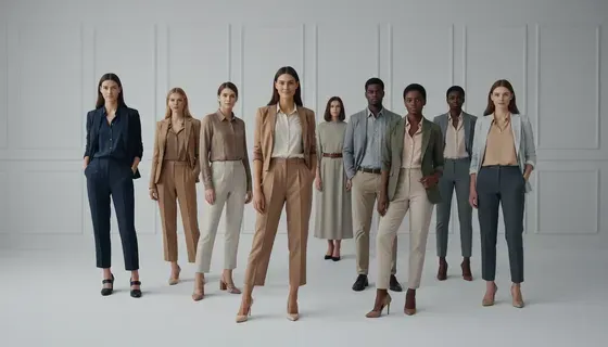
Chic Outfit Ideas for Every Occasion: 15 Stylish Looks & Tips

How Big Is an 8x10 Photo? Size, Pixels & Frame Guide

How Big Is a 4x6 Photo? Dimensions, Pixels & Printing Tips

Picsart AI Review: Features, Pricing, Pros, Cons & Alternatives

Lovart AI Review: AI Design Agent Features, Pricing & Alternatives

Fotor AI Image Generator Review: Features, Pricing & Alternatives

How to Add Emoji to Photo Online for Free

Online Advertising Guide: Types, Costs & Examples (2026)

Facebook Advertising Guide: Costs, Strategy & Tools 2026

What Are E-commerce Ads? Examples, Strategy & Tools (2026)

Where to Sell Handmade Items Online (2026): Etsy, Amazon, or Shopify?

Shopify vs Amazon (2026): Brand Store or Marketplace FBA?

Amazon Handmade vs Etsy (2026): Which Is Better for Makers?

Etsy vs eBay (2026): Handmade, Vintage, or Secondhand?

Selling on Amazon vs eBay (2026): Fees, Profit & Where to Sell

What Is Brand Awareness? Examples, Strategies & Tools 2026

10 Best Online Selling Platforms (2026): Pick by What You Sell

Shopify vs Etsy (2026): Which Is Better for Handmade Sellers?

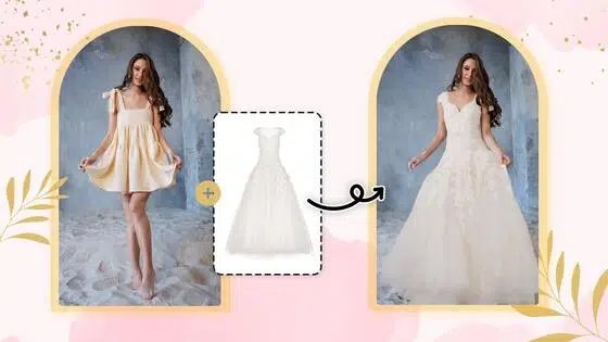
Wedding Dress Styles for Every Body Type: A Practical Guide for 2026

Emoji Wallpaper Ideas & How to Make One Online (2026)

YouTube Automation Step-by-Step AI Guide for Beginners

What Is Brand Identity? Examples, Elements & Strategy

Creatify AI Reviews: Features, Pricing & Alternatives (2026)

Minimalist Poster Design: How to Make a Clean Poster (2026)

What Are Satisfying Videos? Types, Tips & How to Make (2026)
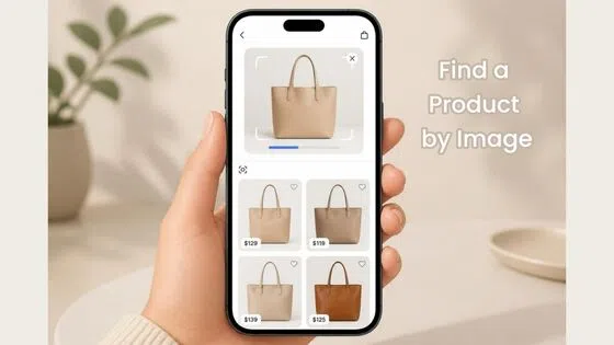
How to Find a Product by Image: 7 Methods That Work (2026)

How to Make a Custom Poster That Is Ready to Print

Gemini Omni Review: Real Tests, Pros & Limitations for Video Generation

How to Generate Product Videos from Images with AI (2026 Guide)

Instagram Image Size Guide 2026: Post, Reel, Story & Carousel Specs

AI Marketing Agent: How It Works, Benefits & E-Commerce Examples
Aesthetic Poster Ideas: Find Your Style and Create Printable Art

How to Create a Product Launch Video with AI: A Step-by-Step Guide

LinkedIn Image Size Guide: Profile, Post & Banner Dimensions

YouTube Profile Image Size: Best Dimensions & Safe Area 2026

What Is Personalized Advertising? Examples & How It Works

How to Build a Shopify Store That Actually Converts Visitors

What Is a Brand Video? Types, Examples & How to Create One

How to Create a Complete World Cup Product Listing Image Set

20 FIFA World Cup Merchandise Ideas That Fans Actually Buy

AI Product Demo vs Live Demo: Which Gets More SaaS Sign-Ups?

How to Create Amazon Summer Sale Posters and Banners with AI
Amazon Summer Sale 2026: Listing Design Trends & Product Image Ideas

How to Create AI Product Promotion Videos in Minutes (Step-by-Step)

Best AI Product Video Ad Generators for Ecommerce in 2026

Father's Day Gift Ideas: Personalized Card, Poster and Video

Father's Day Card Ideas: Messages, Printable and Personalized Cards

Amazon Marketing Guide 2026: Strategies, Tips & Tools
Local Advertising: Strategies, Examples & Tools (2026)

What Is Branded Content? Examples, Strategy & Tools 2026

What Is Performance Marketing? Strategies & Examples 2026

Inbound Marketing: Strategies, Examples & Tools (2026)

How to Boost Ecommerce Sales: Proven Strategies That Work
How to Add Video to eBay Listing: Step-by-Step Seller Guide
Ecommerce Video Ads: 7 Strategies That Drive Higher Conversions

7 Best AI Virtual Makeup Try-On Tools for Realistic Results in 2026

AI Virtual Makeup Try-On: Boost Beauty E-Commerce Sales in 2026

Free Online Glasses Try-On Tools: See Yourself in Glasses Instantly

Top Virtual Ring Try-On Tools for Engagement and Wedding Rings in 2026

How to Try Shoes On Virtually: A Step-by-Step Guide
Best Virtual Shoe Try-On Tools for Ecommerce: 2026 Guide

How to Try On Wigs and Bangs Virtually to Find Your Perfect Style

How to Photograph Shoes for Your Ecommerce Store in 2026

Short Form Video Marketing for E-commerce: AI Video Guide

What Is Video Marketing? E-commerce Guide & Strategies 2026
Create Model Outfit Photos Instantly With AI Outfit Generator
Best AI Virtual Try-On Clothes Tools for Any Body Type
How to Edit Amazon Product Photos That Boost Sales Fast
Product Photography Ideas: Creative Tips & Techniques for Better Shots
Product Photography Pricing 2026: Full Cost Guide by Type

Google Veo 4 Explained: Features, AI Video Creation & What’s New
How to Try On Clothes Online with AI for Better Fit & Style
Virtual Nose Ring Try On Online Before Your Piercing
White Background Product Photography Guide & Tips 2026

Product Photography Starter Package: Gear Checklist 2026
How to Try Makeup Online with AI and Virtual Makeup Try-On Apps (2026)
How to Use Virtual Earring Try-On for a Flattering Look in 2026
How to Try On Engagement Rings Online with AI in 2026
Scale Your Jewelry Brand with Virtual Jewelry Try-On Solutions
How to Try Hairstyles on Your Face Online (Step-by-Step Guide)
Best Virtual Hairstyle Try-On Tools Online for Realistic Previews 2026
How to Use a Free AI Hairstyle Generator to Find Your Perfect Look
Virtual Hair Color Try-On Guide for Every Skin Tone (2026)
Virtual Wedding Dress Try-On Online for Brides in 2026

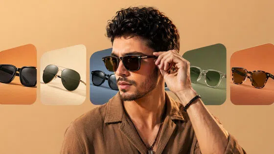
How to Choose the Right Sunglasses for Your Face Shape Online
How Accurate Is Virtual Glasses Try-On? AI vs AR Compared
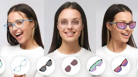
Best Virtual Try-On Glasses Apps in 2026 (Free & Paid Tools)
How AI Virtual Try-On Is Transforming Eyewear Ecommerce

5 Best Virtual Try-On Glasses Tools for Ecommerce and Consumers 2026
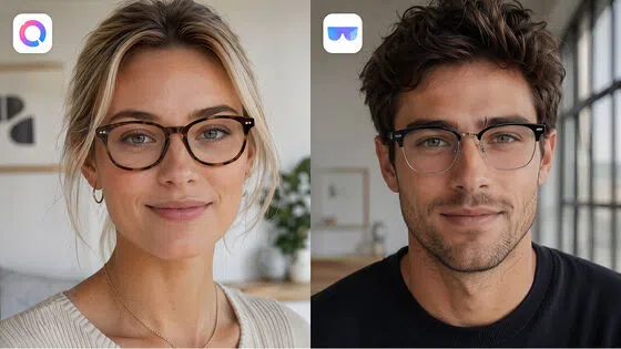
How to Try On Glasses Online with AI in 2026 (Easy Guide)
How to Create Jewelry Photos with AI Models That Drive Sales in 2026
Shopify Product Photography Guide with Tips & Setup
AI-Generated Fashion Models: Technology, Brand Adoption & Trends
How to Batch Generate 100+ AI Clothing Model Photos Fast
7 Best AI Fashion Model Generators for Ecommerce in 2026
Amazon Main Image Requirements: Size, Guidelines & Tips
Shopify Image Size 2026: Complete Guide and Tips for Better Product Display
Studio Product Photography vs AI Product Photography in 2026
7 Product Photography Mistakes That Hurt Ecommerce Sales

AI Clothing Model Photos for E-Commerce: Platform Rules & Best Practices

How AI Virtual Try-On Helps Fashion Brands Boost Sales & Reduce Returns

AI Fashion Models vs Real Models: Which Is Better for Brands?

Best Free AI Fashion Model Generators for Real Product Photos

Virtual Outfit Try-On Guide: Plan Outfits Before You Buy

GPT Image 2 Review: Features, Prompts & E-commerce Use Cases

What Is an AI Clothing Model Generator? Full Guide for Sellers

Change Outfit Colors Online for Outfit Preview with AI Clothes Color Changer

Virtual Try-On Technology in 2026: How It Works & Key Trends

How to Create Amazon Infographics: Boost Sales with Compelling Visuals

10 Best Virtual Try-On Apps & Tools for Online Shopping in 2026

How to Create AI Fashion Models: Complete Step-by-Step Guide

How to Use AI Fashion Models for E-Commerce Product Photos: A Complete 2026 Guide

How to Virtually Try On Clothes Online: A Complete Guide

How to Create Outdoor Product Scenes Without a Photoshoot Using AI
GPT-Image-2 for Ecommerce Product Images: What It Means for Online Stores

Optimize Etsy Images for Mobile: Listing Photos That Convert

Amazon 7-Image Listing Strategy: Boost Sales by Optimizing Every Image

Happy Horse 1.0: The AI Video Model E-Commerce Sellers Need to Know About

Etsy Thumbnail Optimization: Keep Your Product Fully Visible

AI UGC for Ecommerce in 2026: Text-to-Video, Image-to-Video & Reference Replication Guide

The Etsy Thumbnail Formula That Drives More Clicks and Sales

HappyHorse AI Review: Features, Benchmarks & How to Use It

How to Create Pro Amazon Listing Photos Without a Studio

10 High-Converting Lifestyle Product Images for Amazon Listings

How to Automate Your E-commerce Visuals with OpenClaw Workflow

Top 5 AI Tools to Generate Amazon Product Listing Images in 2026

How to Turn One Photo into 10 Etsy Listing Images Fast: Batch Workflow

Etsy Listing Photo Size Guide (2026): Mobile, Desktop & Shop View Specs

Turn White Background Images into Lifestyle Amazon Listings

Fix Etsy Image Cropping: Optimize Listing Photos for Every Device

Amazon Listing Images: Essential Shot List & Optimization Guide

How to Create Lifestyle Product Images Without a Studio

Seedance 3.0 Predictions: Will AI Video Enter the Feature Film Era?

Grok AI vs ChatGPT: Features, Pricing & Best Choice (2026)

How to Use Grok AI: Features, Tips & Best Prompts (2026 Guide)

Sora Is Shutting Down? Best AI Video Alternatives for Creators in 2026

Lifestyle Product Photography Trends 2026: Authentic Looks at Scale

How to Master Lifestyle Product Photography in 2026

Amazon Listing Images Guide 2026: 7-Slot Strategy & Requirements

360 Product Photography Guide 2026: Setup, Shoot and Workflow

Beginner's Guide to Generate Product Photos from Different Angles

AI Product Photography: Create Ecommerce Images Without a Photoshoot

How to Create Realistic AI Product Photos: Step-by-Step Pro Guide

Keep AI Product Images Consistent Across SKUs: Lighting, Color, Background

Seedance 2.0 for Ecommerce: Create AI Product Videos in Minutes

Seedance 2.0 Review: Features, Improvements, Pricing & How It Works (2026)

How to Scale E-commerce with a Product Image Generator

How to Use AI for Spring Product Photography: 2026 Amazon Guide

How to Create a Budget Home Product Photography Setup with AI

How to Achieve Professional Product Photography Standards in 2026

How to Take Product Photos with Phone: Pro Guide for Amazon & AI

Best AI Product Image Generator 2026: Top Tools for Amazon Sales

Amazon Photography Service vs. AI Generator: Best Choice for Sales

What Is Product Photography? Angles, Lighting & Editing Guide

Amazon Spring Sale 2026: Create High-Converting Listing Images (Guide)

AI Agents Transform Amazon Product Photography in 2026

Amazon Photoshoot in 2026: Do You Still Need a Studio?

11 Must-Have Tools for Amazon Product Photography in 2026

2026 Amazon Image Trends Shaping Seller Success and Conversions

Amazon Product Photography Requirements & Best Practices 2026
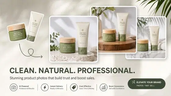
Make every product image ready to sell
Designkit is an all-in-one AI platform for ecommerce visuals. Create product photos, AI videos, virtual try-ons, and Amazon listing images in seconds. Generate HD backgrounds, batch edit photos, and scale your brand with studio-quality content.