
Plan Better Back-to-School Ads with 7 Creative Ideas
Plan a connected back-to-school advertising campaign with seven focused creative directions, consistent visuals, and practical guidance for adapting each asset across channels.

Retailers and ecommerce brands experience one of the year's biggest marketing seasons during back-to-school. In fact, K–12 spending alone is projected to reach $43.3 billion this year, as per NRF. That kind of scale makes it a season worth planning for well in advance.
A strong back-to-school ad needs more than pencils and chalkboards in the background. This guide focuses on planning a connected campaign instead of discussing seasonal discounts. You'll learn how to build stronger advertising concepts and create campaign assets with tools like Designkit.
How to Shape Your Back-to-School Ad Concept
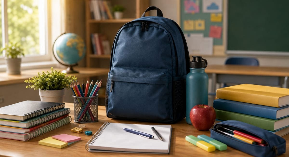
A strong back-to-school ad starts with a clear creative brief, not a campaign calendar or a list of promotional tactics. Before choosing layouts, decide who the ad needs to reach, what it should communicate, and how the idea will remain recognizable across different placements.
1. Identify the Main Buyer
Define the person who makes or influences the purchase. Parents, college students, and teachers respond to different priorities, so avoid addressing all of them inside one ad. Use the selected buyer to guide the product focus, tone, and level of detail.

2. Choose One Message to Lead the Campaign
Decide what customers should understand after seeing the ad once. The message might focus on easier preparation, everyday comfort, or a more organized school routine. Keep supporting copy secondary instead of giving several benefits equal visual weight.
3. Set a Repeatable Creative System
Choose a consistent color palette, headline style, product treatment, and call-to-action format. These elements should connect the campaign even when the content changes. Consistency should come from the visual system, not from repeating the same layout across every ad.
4. Plan for Placements Before Production
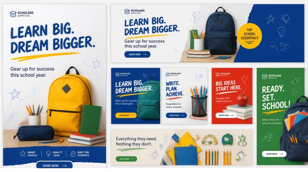
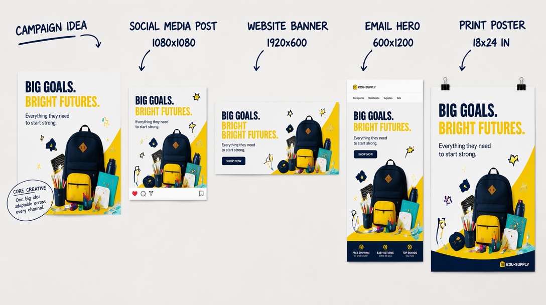
List the placements the campaign actually needs before creating the main asset. A social post, website banner, email hero, and printed poster require different proportions and reading distances. Planning these formats early helps the central idea remain clear as the composition changes.
7 Back-to-School Advertising Ideas
The following back-to-school advertising ideas are creative directions, not promotion types. Each one gives your campaign a distinct angle to build around:
1. Build the Ad Around a Fresh Start
Present the new school year as a practical reset that improves one daily routine for customers. It makes back-to-school ads feel useful because the product solves a clear need. Write a specific headline showing the product benefit while focusing on preparation instead of motivation.
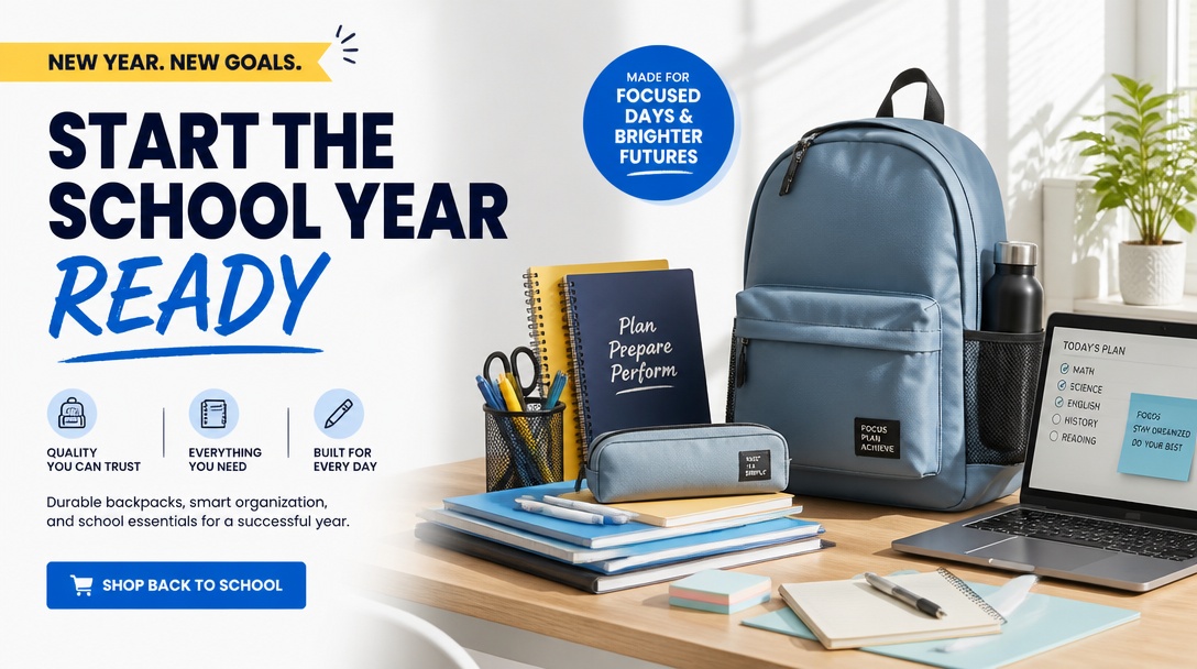
2. Use a Back-to-School Checklist Concept
Build the visual around a short checklist highlighting one important product or customer action. The format supports your campaign because shoppers quickly understand the message without reading everything carefully. Limit checklist items and keep one focal point instead of creating a complete school supply list.
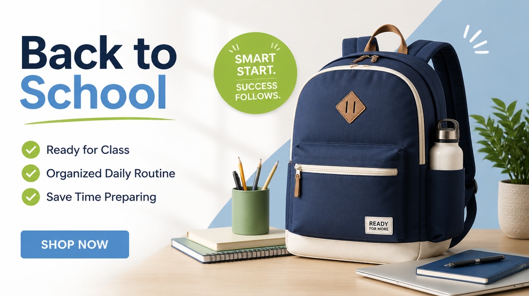
3. Place the Product in a School-Day Setting
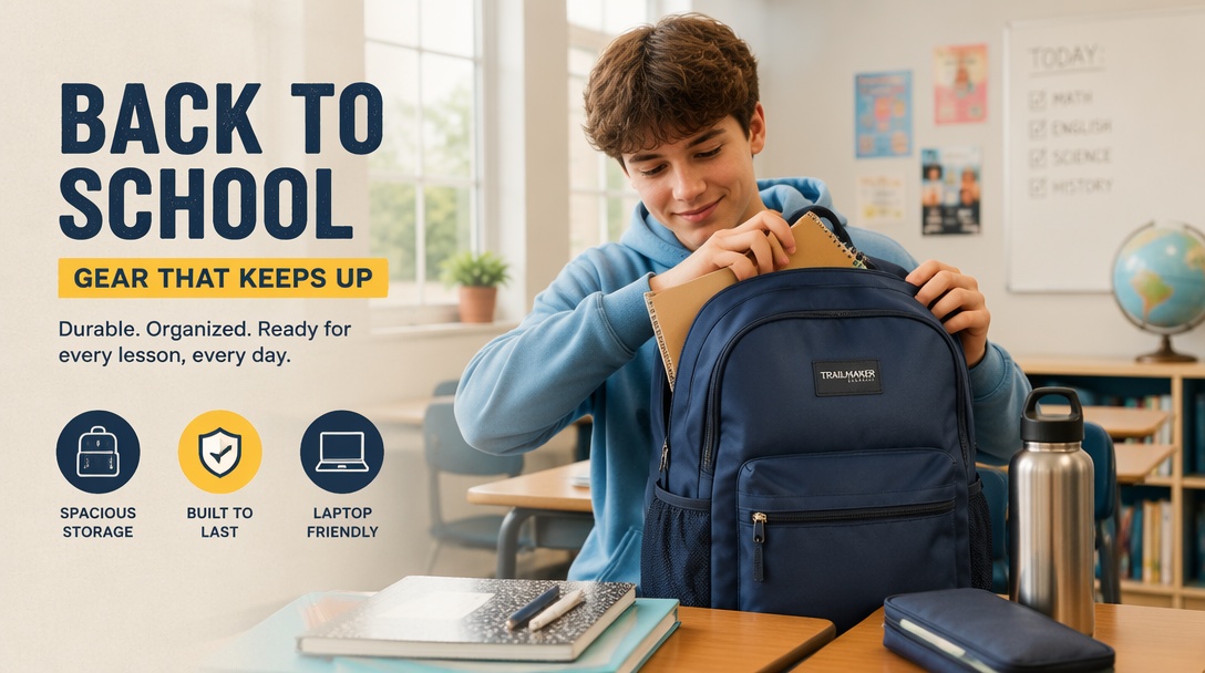
Show the product inside one realistic school-day situation instead of using a plain catalog image alone. Such a setting helps customers imagine using the product during everyday school activities more naturally. Keep seasonal details simple because back-to-school poster ideas should always highlight the product first.
Create Back-to-School Campaign Assets
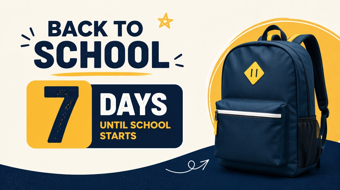
4. Create a First-Day Countdown Series
Create a short countdown leading toward the local school opening with different preparation messages daily. The series strengthens campaign recognition because every design shares matching colors and layout consistently. Change each message completely instead of replacing only the countdown number across every advertisement version.
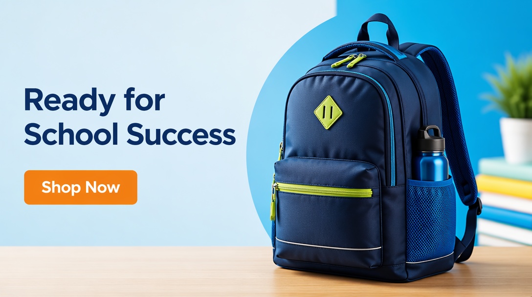
5. Focus Each Ad on One Product Benefit
Highlight one product benefit that matters most during the back-to-school shopping season for families. A single message keeps back-to-school banner ideas clear while avoiding crowded visuals and lengthy feature lists. Match the call to action directly with the selected benefit for stronger customer understanding immediately.
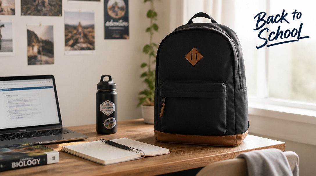
6. Feature a Real Customer Setup
Use approved customer content or recreate everyday product setups that feel believable and naturally familiar. Authentic scenes strengthen trust because they connect naturally with shoppers and support campaign consistency. Remember to request permission before sharing customer content, including back-to-school social media posts, publicly.
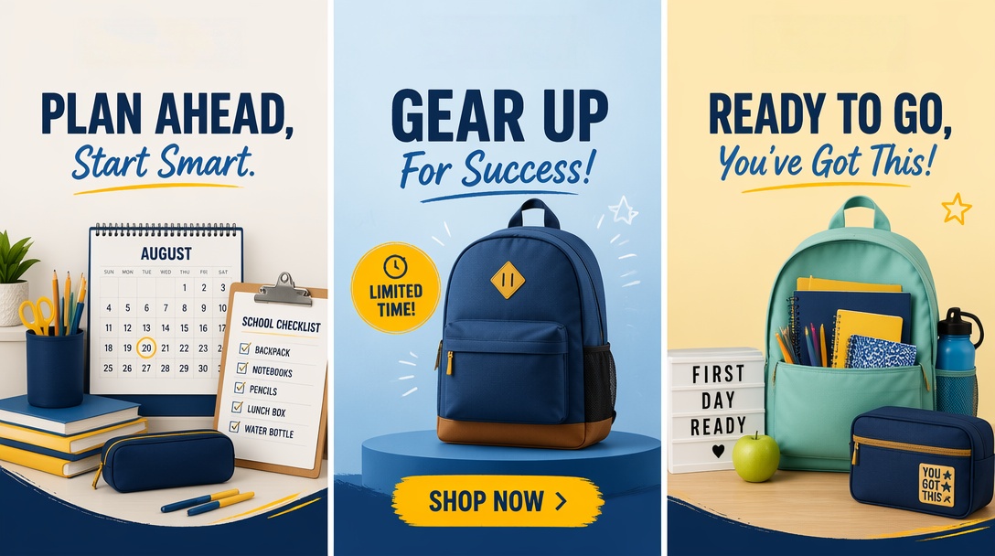
7. Create Versions for Each Shopping Stage
Prepare different advertisements for early planning, active shopping, and final preparation before school begins locally. Such a strategy supports back-to-school email marketing because customer priorities change throughout the shopping season. Yet, update headlines, motivation, and calls to action without changing the campaign identity or branding.
How to Create Back-to-School Campaign Assets with Designkit
The example below follows one continuing back-to-school campaign through four steps in Banner Maker, Designkit's main tool for this workflow. Each visual can support several placements, not just a single website banner.
The screenshots below show the workspace directly, rather than describing individual buttons and panels. You can follow along step by step as the full campaign takes shape from a single starting brief.
Step 1. Add the Campaign Brief and Brand Assets
Open “Banner Maker ” and define one central message and one call to action before adding anything else to the workspace. Upload the product photo or logo the campaign needs, since Banner Maker builds the entire layout around this asset from the very first draft onward.
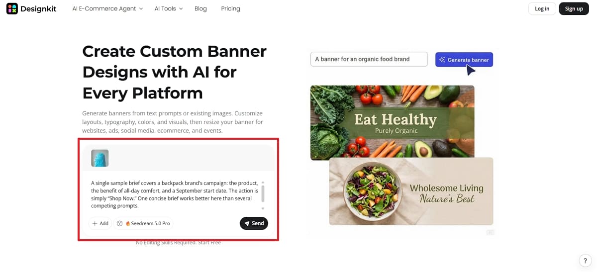
For this example, a single sample brief covers a backpack brand's campaign: the product, the benefit of all-day comfort, and a September start date. The action is simply “Shop Now.” One concise brief works better here than several competing prompts.
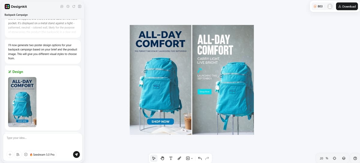
Step 2. Generate the Main Campaign Visual
Review the headline hierarchy and the product focus across each of the generated options before choosing one. Select the version that communicates the main idea before anyone reads the supporting copy underneath it.
Step 3. Refine the Message and Layout
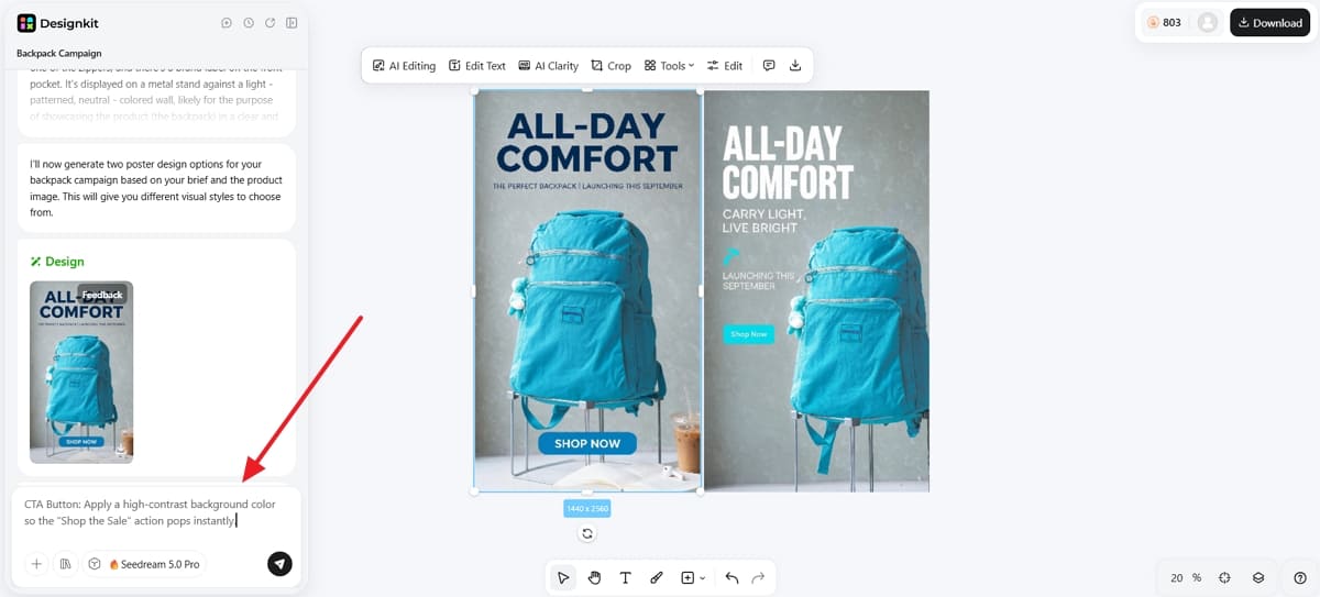
Adjust the headline or CTA until the layout feels intentional. You can enter a prompt to change the CTA button color and press the “Enter ” key.
Step 4. Prepare Different Sizes
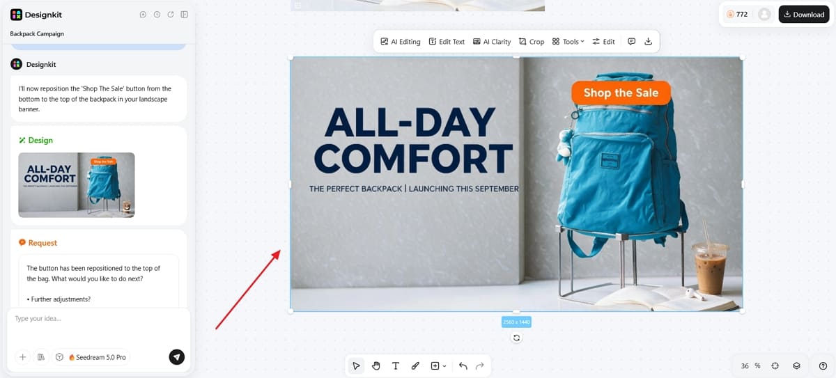
Create the dimensions each approved placement requires, repositioning the headline or CTA. You can input the prompt to change any element placement or resize the image dimension before pressing “Enter. ”
Create Back-to-School Campaign Assets
For downloaded posters or ads that need to be resized, you can access the "Resizer Image ” tool of Designkit and change the dimensions according to your needs.
Adapt Back-to-School Ad Creative by Channel
One campaign idea should not produce identical ads everywhere. Keep the central message, product focus, and visual identity consistent, then adjust the composition according to how people encounter the ad on each channel.
1. Back-to-School Social Media Posts
Social creative needs an immediate focal point before anyone reads the caption. Give each post one role within the sequence, such as introducing the idea, demonstrating the benefit, or reinforcing the final action. Reframe the composition separately for feed and vertical placements, keeping important copy inside safe viewing areas.
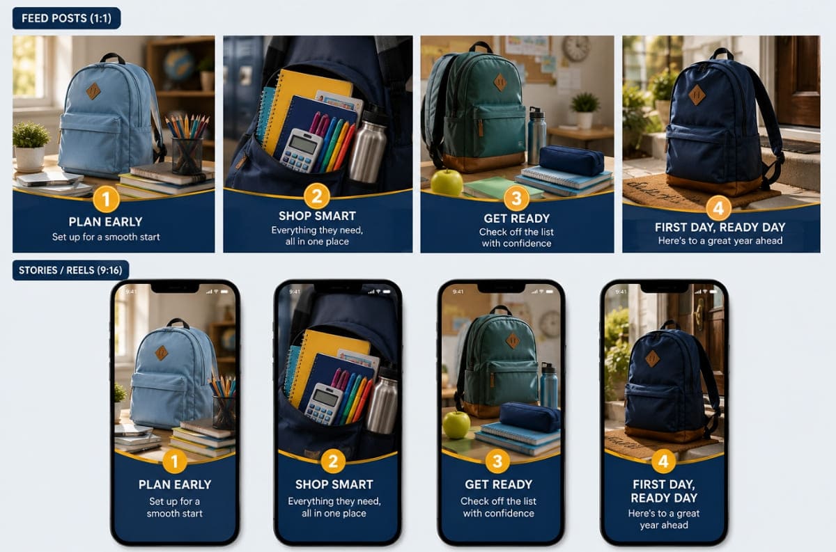
2. Back-to-School Posters and Banners
Posters and digital banners use the same campaign identity under different viewing conditions. A poster needs a short headline, strong contrast, and one focal point that reads from a distance. A digital banner needs a flexible composition that preserves the product and CTA across narrower placements.
|
Designkit Tools |
Best For |
|---|---|
|
Poster-led ads that organize the offer, product image, and CTA into one clear layout. |
|
|
Website and digital campaign banners that need channel-specific dimensions. |
3. Back-to-School Email Marketing
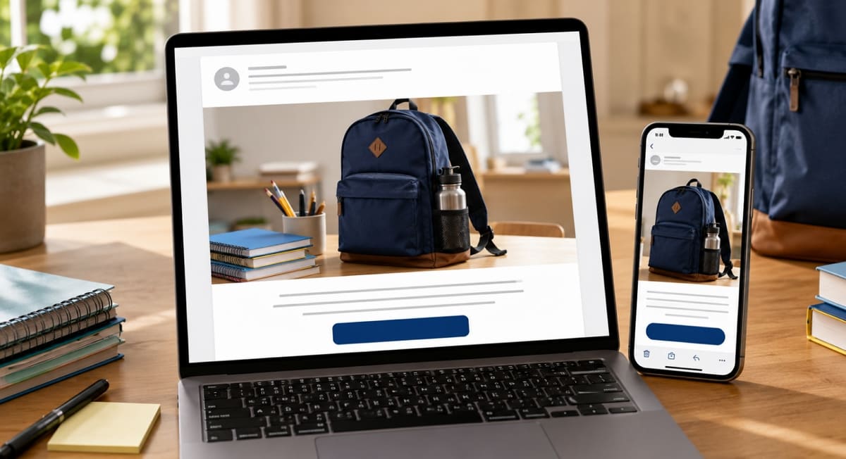
The email subject line and hero creative should reinforce the same central message. Keep the product focus clear and place the primary CTA where it remains visible on mobile screens. Important dates or offer conditions should also appear as live email text instead of existing only inside the image.
Conclusion
Match your primary metric to the original campaign goal, and review each channel by its own role rather than comparing unlike results against each other directly. Test one major creative element at a time, and record which message, timing, and format actually performed best across the whole campaign.
An effective back-to-school ad starts with one clear objective and a focused message, not a longer list of features to cram into a single layout. The process holds together end to end: plan the campaign, pick a creative direction, produce the visual, adapt it by channel, then review the result. It's an ongoing process, not a one-time effort.
None of this requires starting from scratch each season, only adjusting what the previous campaign's results showed you, message by message and channel by channel. Build your first campaign asset with Designkit, then compare it against real performance data once the season is fully underway.
Frequently Asked Questions
When should back-to-school ads start running?
What makes a back-to-school ad effective?
A strong ad focuses on one product benefit, one clear audience need, and one direct call to action. Avoid crowding the design with several offers or messages.
Which channels work best for back-to-school advertising?
Social media, display banners, email, ecommerce pages, and printed posters can all support the campaign. Choose channels based on where your target shoppers research and buy.
Should the same ad be used across every channel?
Keep the central message and visual style consistent, but adapt the size, layout, and amount of detail for each placement.
How can small businesses run back-to-school ads on a limited budget?
Promote a focused offer to a defined local or product-based audience. Reuse one core visual across several formats and spend more on the versions that perform best.
How do you measure a back-to-school ad campaign?
Track clicks, conversions, revenue, and return on ad spend. Compare results by creative, product benefit, channel, and shopping stage to guide later campaigns.
You May Also Like

T-Shirt Design Size Guide: Placement, Dimensions, & DPI

Best AI Ad Generators in 2026: Tools for Creating Better Ads

How to Sell on Poshmark: A Complete Beginner's Guide
Zeely Reviews 2026: Features, Pricing, Pros, Cons & Alternatives
Create TikTok Ads From One Photo: An AI Product Launch Kit
Depop vs Poshmark: Which Is Better for Selling in 2026?
How to Create an Amazon Storefront: 4-Step Guide for New Sellers

How to Sell on Amazon in 2026: A Complete Seller Guide

How to Sell Books on Amazon in 2026: Beginner Guide

AI Product Photography: 7 Best Tools for Ecommerce in 2026

Pippit AI Review 2026: Features, Pricing, Pros & Cons

What Is a Hero Image? Definition, Examples & Design Tips
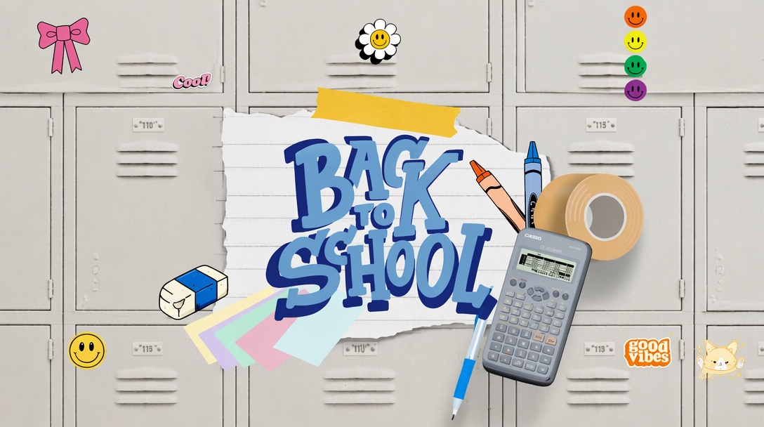
Back to School Ad: 7 Creative Ideas for Better Campaign Results
Top 7 Back-to-School Sales Ideas to Boost Retail Sales (2026)
How to Create a Complete World Cup Product Listing Image Set

How to Create Amazon Summer Sale Posters and Banners with AI
Amazon Summer Sale 2026: Listing Design Trends & Product Image Ideas
Ecommerce Video Ads: 7 Strategies That Drive Higher Conversions

Product Photography Ideas: Creative Tips & Techniques for Better Shots

Product Photography Pricing 2026: Full Cost Guide by Type

Product Photography Starter Package: Gear Checklist 2026
How to Photograph Shoes for Your Ecommerce Store in 2026
White Background Product Photography Guide & Tips 2026
Shopify Product Photography Guide with Tips & Setup

Shopify Image Size 2026: Complete Guide and Tips for Better Product Display
Amazon Main Image Requirements: Size, Guidelines & Tips
How to Create Amazon Infographics: Boost Sales with Compelling Visuals

7 Product Photography Mistakes That Hurt Ecommerce Sales

Studio Product Photography vs AI Product Photography in 2026

How to Create Outdoor Product Scenes Without a Photoshoot Using AI
Change Outfit Colors Online for Outfit Preview with AI Clothes Color Changer
The Etsy Thumbnail Formula That Drives More Clicks and Sales

How to Automate Your E-commerce Visuals with OpenClaw Workflow
Amazon 7-Image Listing Strategy: Boost Sales by Optimizing Every Image
Optimize Etsy Images for Mobile: Listing Photos That Convert
Etsy Thumbnail Optimization: Keep Your Product Fully Visible
How to Create Pro Amazon Listing Photos Without a Studio
Top 5 AI Tools to Generate Amazon Product Listing Images in 2026

How to Turn One Photo into 10 Etsy Listing Images Fast: Batch Workflow
Etsy Listing Photo Size Guide (2026): Mobile, Desktop & Shop View Specs
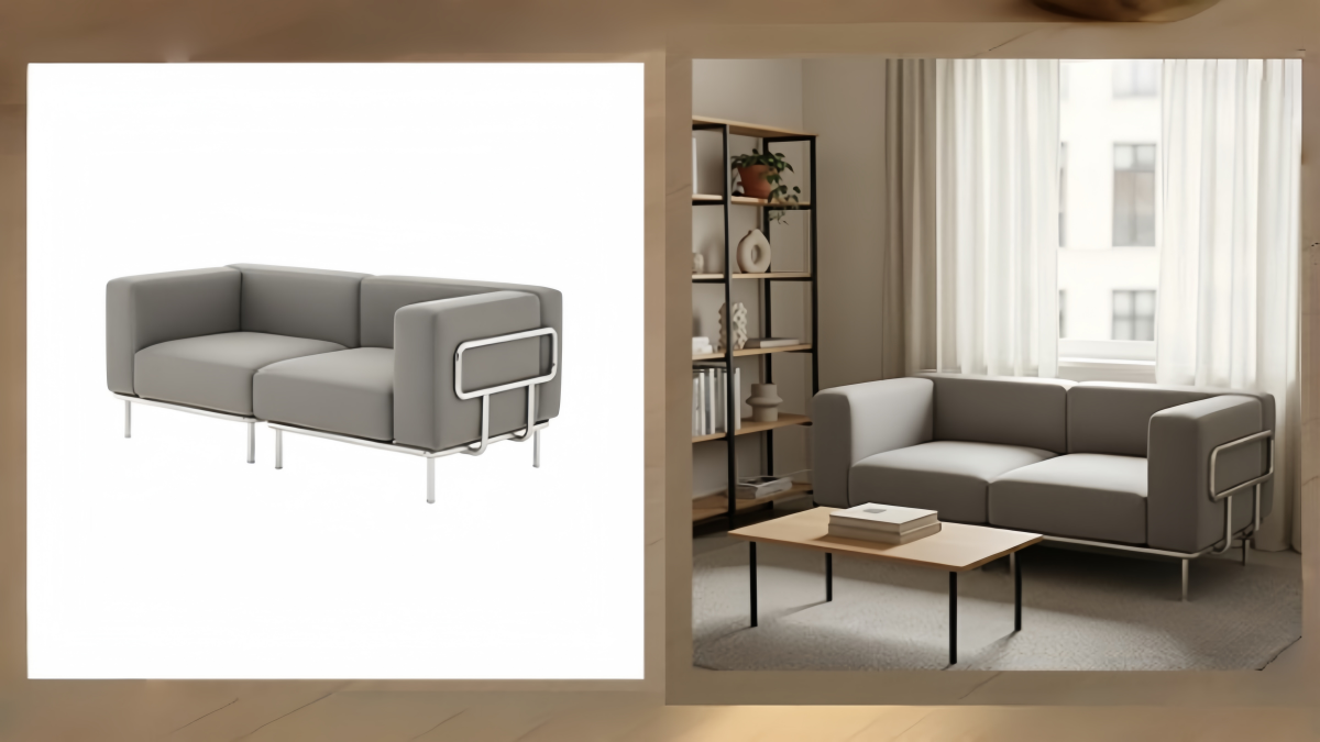
Turn White Background Images into Lifestyle Amazon Listings

Fix Etsy Image Cropping: Optimize Listing Photos for Every Device

Amazon Listing Images: Essential Shot List & Optimization Guide

How to Create Lifestyle Product Images Without a Studio
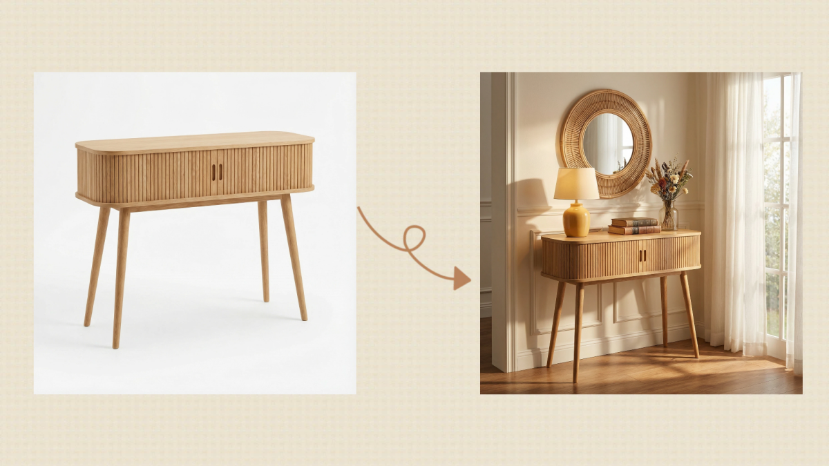
10 High-Converting Lifestyle Product Images for Amazon Listings
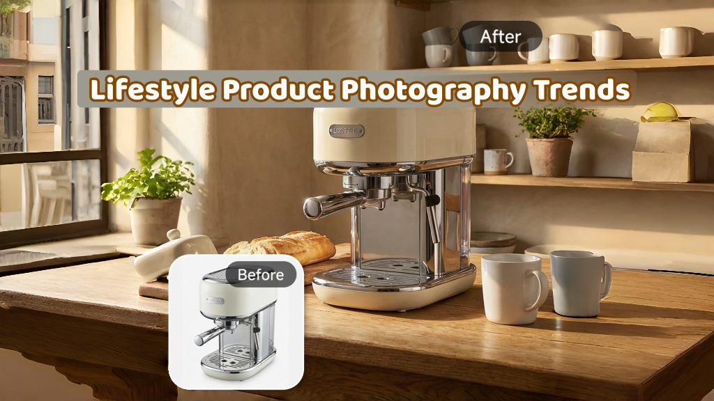
Lifestyle Product Photography Trends 2026: Authentic Looks at Scale
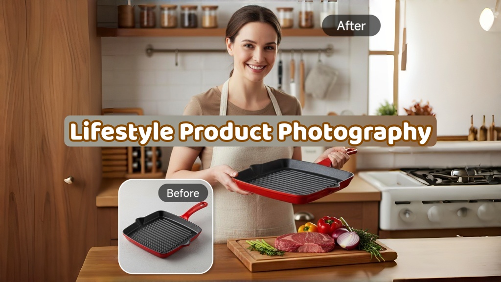
How to Master Lifestyle Product Photography in 2026

Amazon Listing Images Guide 2026: 7-Slot Strategy & Requirements
360 Product Photography Guide 2026: Setup, Shoot and Workflow
Beginner's Guide to Generate Product Photos from Different Angles
AI Product Photography: Create Ecommerce Images Without a Photoshoot

How to Create Realistic AI Product Photos: Step-by-Step Pro Guide
Keep AI Product Images Consistent Across SKUs: Lighting, Color, Background

How to Use AI for Spring Product Photography: 2026 Amazon Guide

How to Scale E-commerce with a Product Image Generator
Amazon Spring Sale 2026: Create High-Converting Listing Images (Guide)
How to Create a Budget Home Product Photography Setup with AI

How to Achieve Professional Product Photography Standards in 2026

How to Take Product Photos with Phone: Pro Guide for Amazon & AI

6 Best AI Product Image Generators in 2026
Amazon Photography Service vs. AI Generator: Best Choice for Sales
What Is Product Photography? Angles, Lighting & Editing Guide

AI Agents Transform Amazon Product Photography in 2026

2026 Amazon Image Trends Shaping Seller Success and Conversions
Amazon Photoshoot in 2026: Do You Still Need a Studio?

11 Must-Have Tools for Amazon Product Photography in 2026
Amazon Product Photography Requirements & Best Practices 2026
Bring Your Back-to-School Ads Together
Create consistent ads for every channel and shopping stage.