
Minimalist Poster Design: How to Make a Clean Poster That Actually Works
This guide explains what makes minimalist poster design work, simple ideas you can use, mistakes to avoid, and how to create a clean first draft with AI.


You have probably seen a poster that grabbed you with almost nothing on it. One word. One image. A whole lot of empty space. It looks so simple you figure it must have been easy to make. Here is the funny thing: that kind of simple thing is really hard to get right.
But don't worry, you don't need fancy software or a design degree to make a great minimalist poster. Mostly, you just need to know what to leave out. In this guide, we will look at what makes these posters work, simple ideas you can use, the little mistakes that trip people up, and how an AI tool can help you generate a clean first draft before refining the text, spacing, and color.
What Makes a Poster Minimalist
A minimalist poster is all about one clear message. Instead of filling every inch, it keeps things open and uses only a few colors, so your eye goes straight to the main thing. The empty space is not there because someone got lazy. It is doing real work, holding the design together and pushing everything unimportant off the page.
So how is a minimalist poster different from a plain simple poster? A simple poster just means there is not much on it. It might be clean because someone kept it basic, and sometimes it is simple almost by accident. A minimalist poster is a deliberate style. Every piece that stays has a reason to be there, and everything else was taken out on purpose. So a minimalist poster is almost always simple, but a simple poster is not always minimalist.
Why Minimalist Poster Design Is Harder Than It Looks
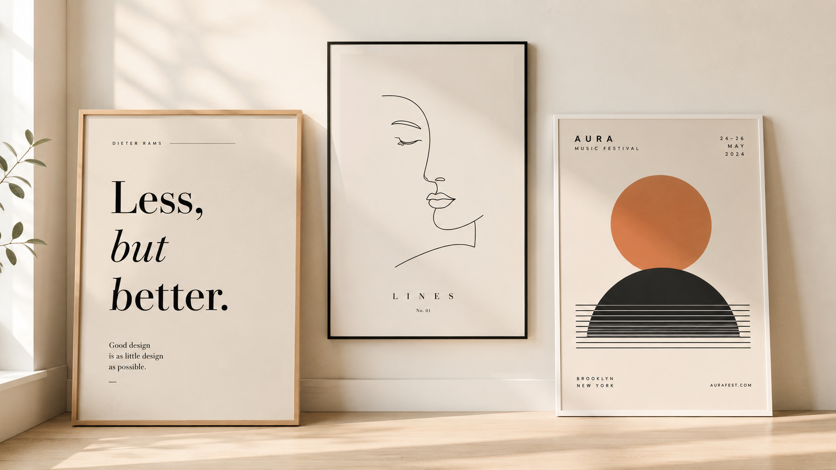
Most people assume that fewer things means less work, but it usually goes the other way. When only a few pieces sit on the page, each one is fully exposed, so a slightly off font or an odd color has nowhere to hide. The same mistake you would never notice on a busy poster becomes the first thing people see on a clean one.
That is also why a good minimalist poster feels so sharp. Since people only glance at a poster for a second or two, whether it is on a wall or moving past in a feed, you have just that tiny moment to land your point. Keep everything clean and pared back, and the one thing you want people to remember is the thing that actually sticks.
The Basics of Simple Poster Design
The good news is that a few simple habits fix most of what makes minimalist posters fall apart.
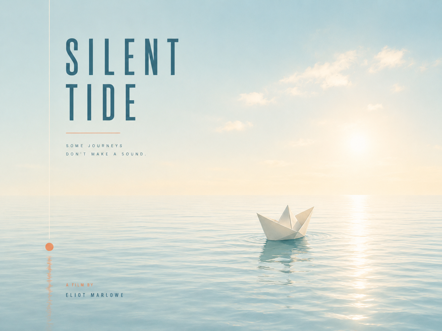
Let the empty space breathe. Those blank areas are not gaps you need to fill. They point the eye toward what matters and keep the whole thing feeling calm. A lot of famous minimalist movie posters lean on this—one tiny image floating in a big open space, and you still catch the whole story.
Go easy on color. One background color plus one bold accent almost always looks cleaner than a full rainbow.

Choose one focal point. Decide the one thing you want people to see first before you add anything else. The moment two elements fight to be the star, the poster gets confusing fast.
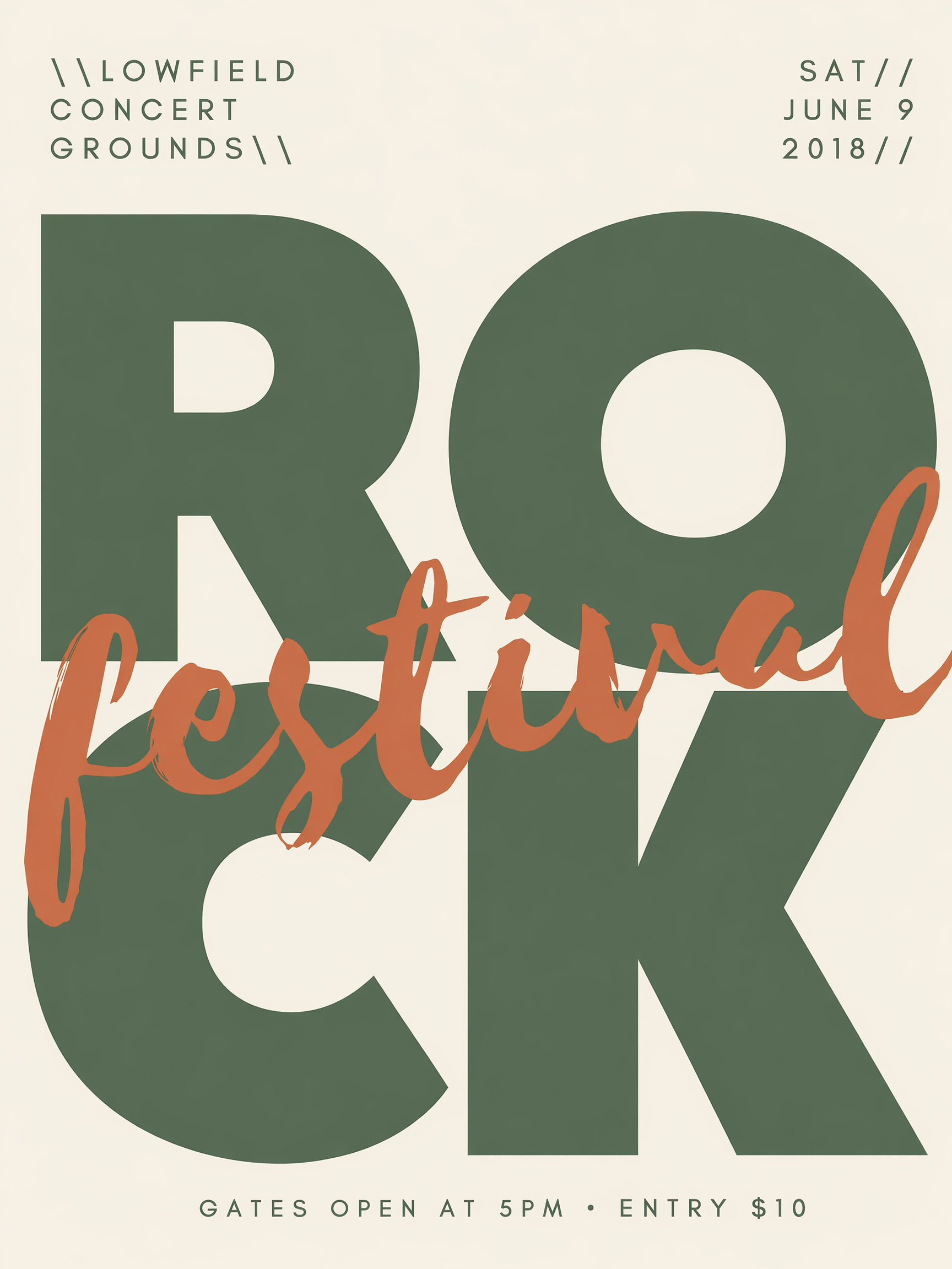
Keep typography simple. In a minimalist poster, the words often stand in for the picture. Stick with one or two fonts and play with size and weight rather than piling on more typefaces.
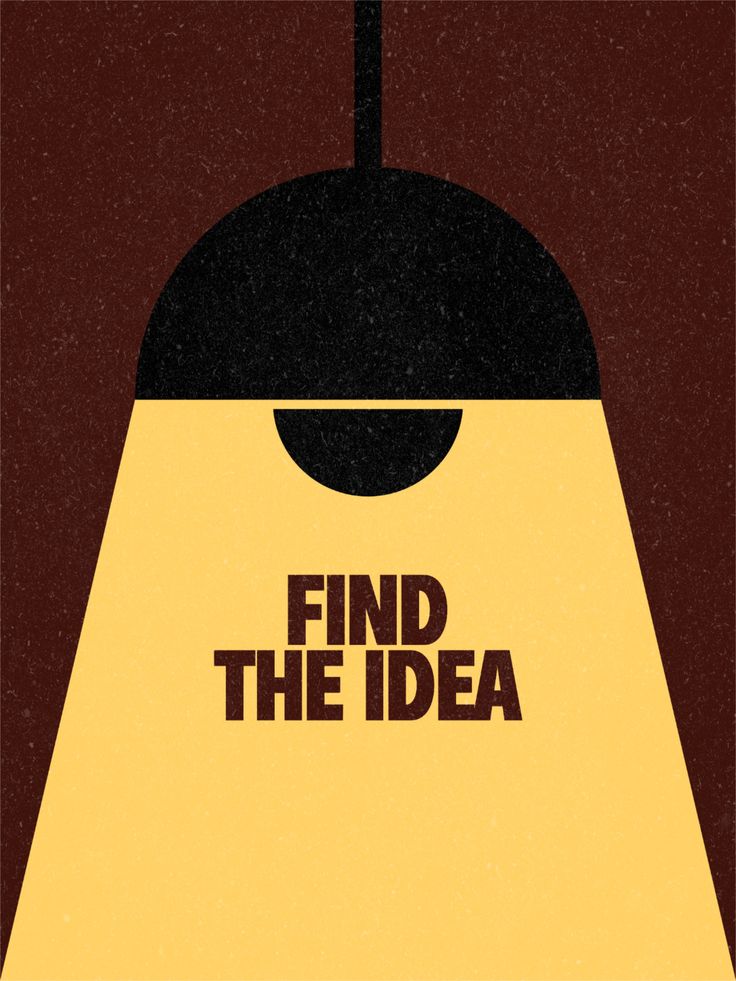
Align everything deliberately. With so little on the page, even slightly messy spacing jumps straight out. Line things up on purpose—accidental gaps just look unfinished.
Simple Poster Ideas for Minimalist Designs
If you are not sure where to start, here are a few simple poster ideas that work again and again. Each one leans on a single idea, which is what keeps it clean.
Text-Only Minimalist Poster
Sometimes the words are the whole design. Pick one short line, make it big and bold, and give it plenty of empty space. This works great when your message is really a statement and does not need a picture at all.
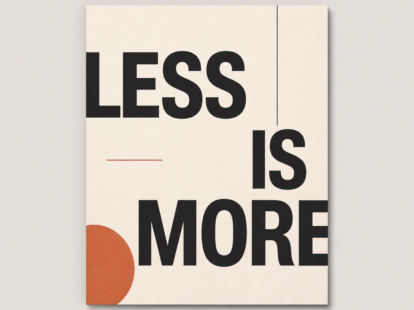
Minimalist Movie Poster
These take one small symbol that stands for the whole film and drop it into open space. You catch the reference right away, even with no face or title. It is a fun way to show off a favorite story with almost nothing on the page.
Line Art Poster
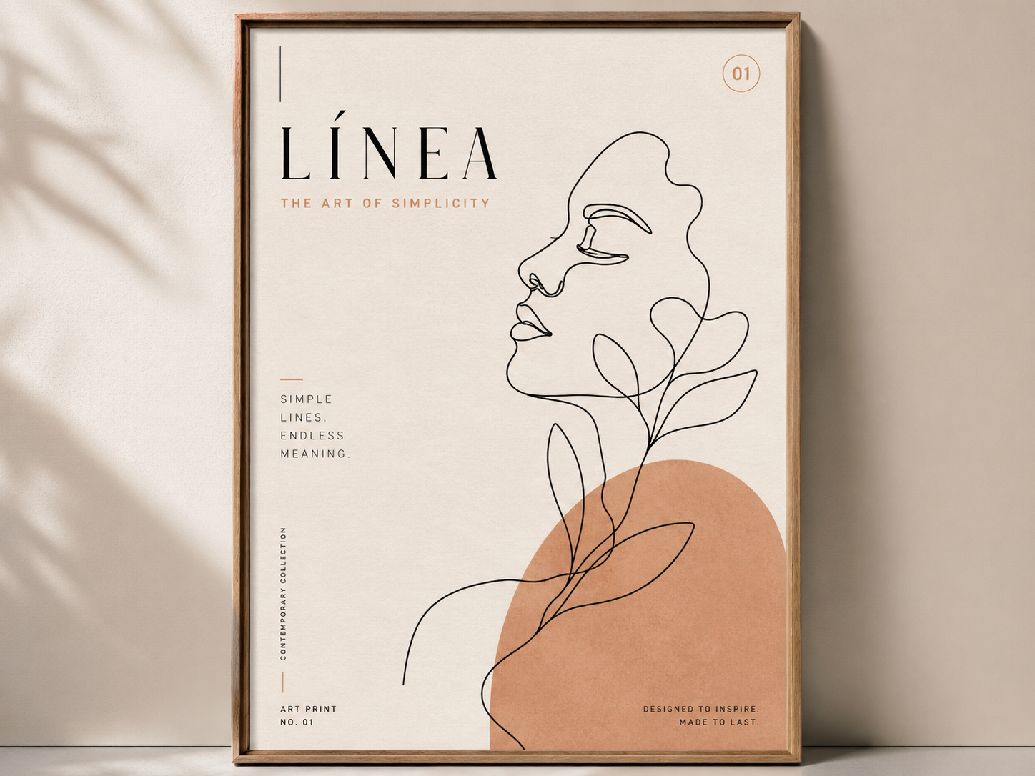
Line art turns your subject into a few clean, continuous strokes. It feels modern and light, but still reads from across the room. A single line drawing can give the poster a clear subject without making the layout feel heavy.
Minimalist Event Poster
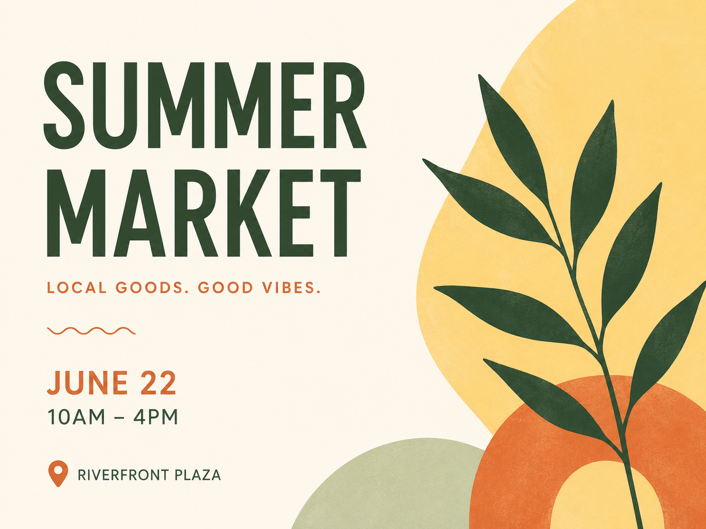
An event poster has a job to do, so keep the important stuff clear. Use one headline, a bit of open space, and the date and place in smaller text near the bottom. The less you crowd it, the faster people catch when and where.
Minimalist Quote Poster
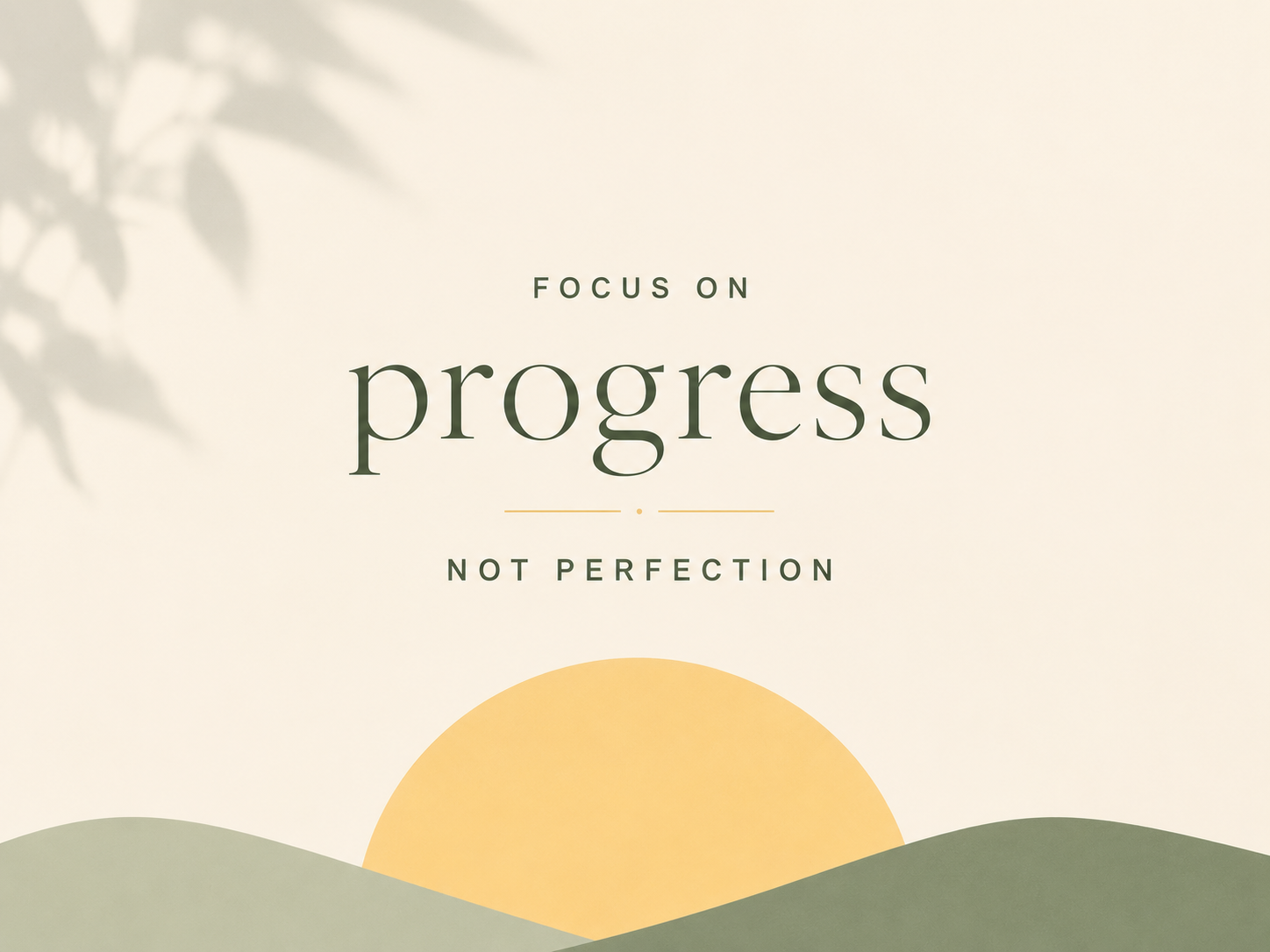
A quote poster is one short line you want people to remember. Center it, pick one or two fonts, and let the empty space carry the rest. These are quick to make and look right at home on a wall or in a feed.
Minimalist Product Poster
Show one product with room to breathe. Put it on a plain background, add a short tagline, and stick to a couple of soft colors. It is a clean way to make something feel premium without a busy studio shot.

How to Make a Minimalist Poster with Designkit
Once you know the main message, the hardest part is finding a layout that does not feel empty or crowded. Designkit helps you get that first structure in place, then refine it into a cleaner poster. That is where an AI tool saves you time. Here is a simple flow from idea to finished poster in Designkit.
Step 1 Start with One Main Message
Before anything else, decide the one thing people should notice first. Is it a word, a date, or an image? Write it down. Everything else on the poster is just there to back it up, and knowing that from the start makes every later choice easier.
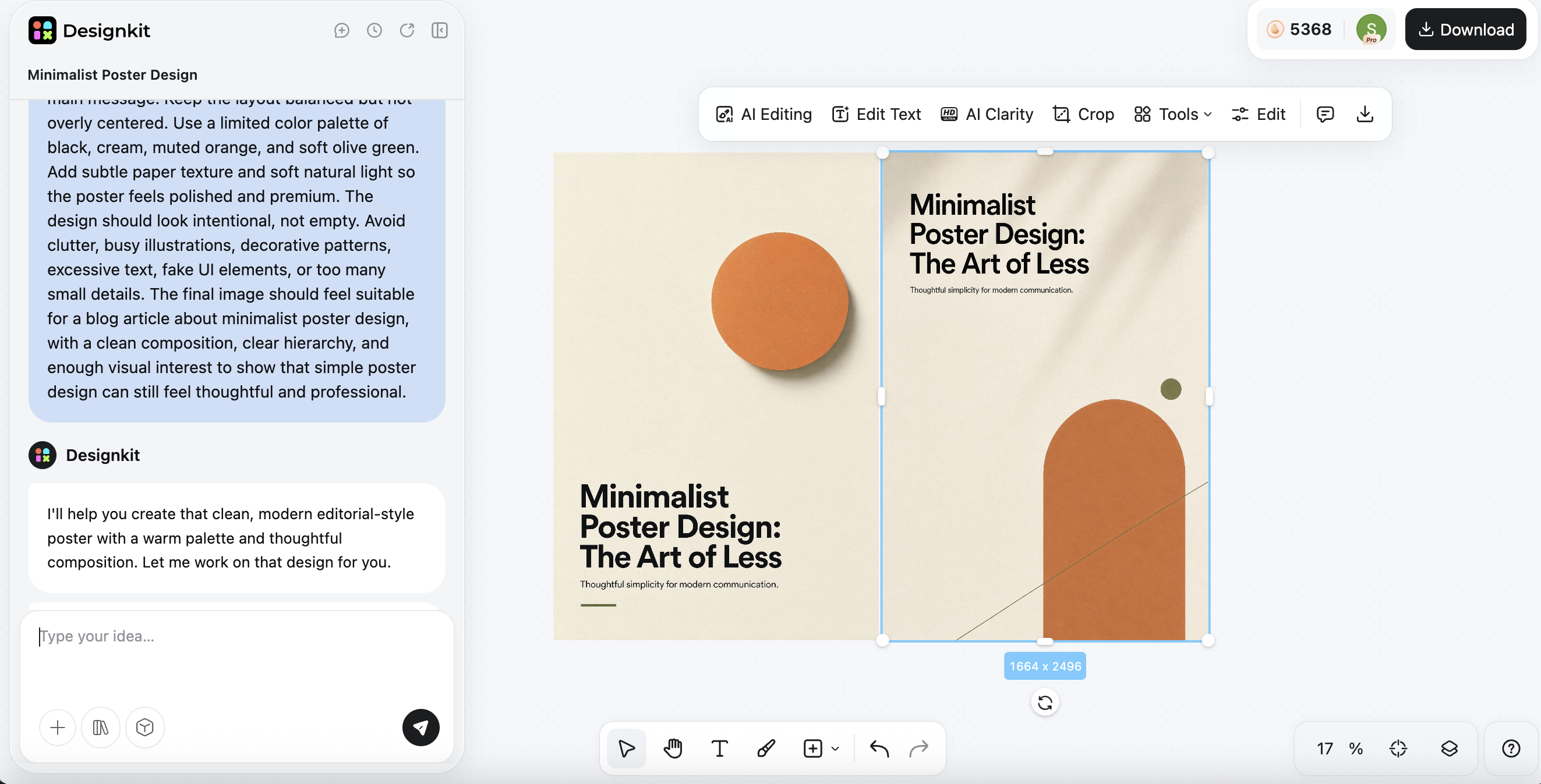
Step 2 Generate a Clean Poster Layout
Instead of staring at a blank page, let Designkit's AI Poster Generator build the first version for you. Tell it what the poster is for, the words you want, and the style you like, and it hands you a clean layout to work from. There are also dedicated poster tools for different use cases, so you can start from a format that already fits your goal.
Step 3 Refine the Text, Color, and Spacing
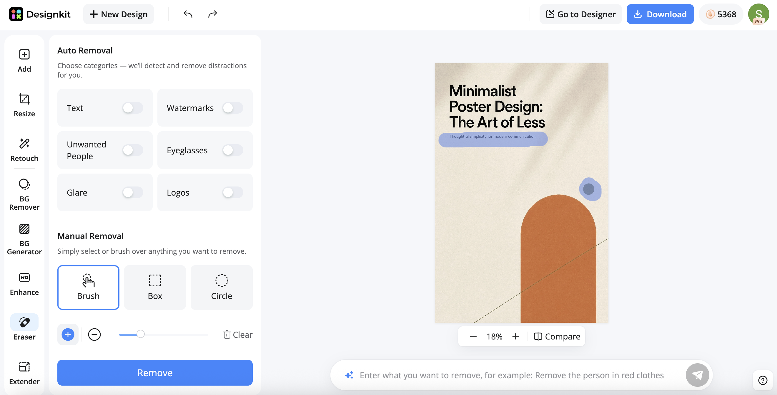
Now shape that draft into something that feels like yours. In Designkit's AI Photo Edito, the Eraser handles most of the cleanup: brush over any stray object, shadow, or mark that pulls attention away, and it lifts out cleanly. The Extender can then add a little more open space around your subject. Keep pulling things back, and take out anything the poster still works without.
Step 4 Change the Poster's Style or Color
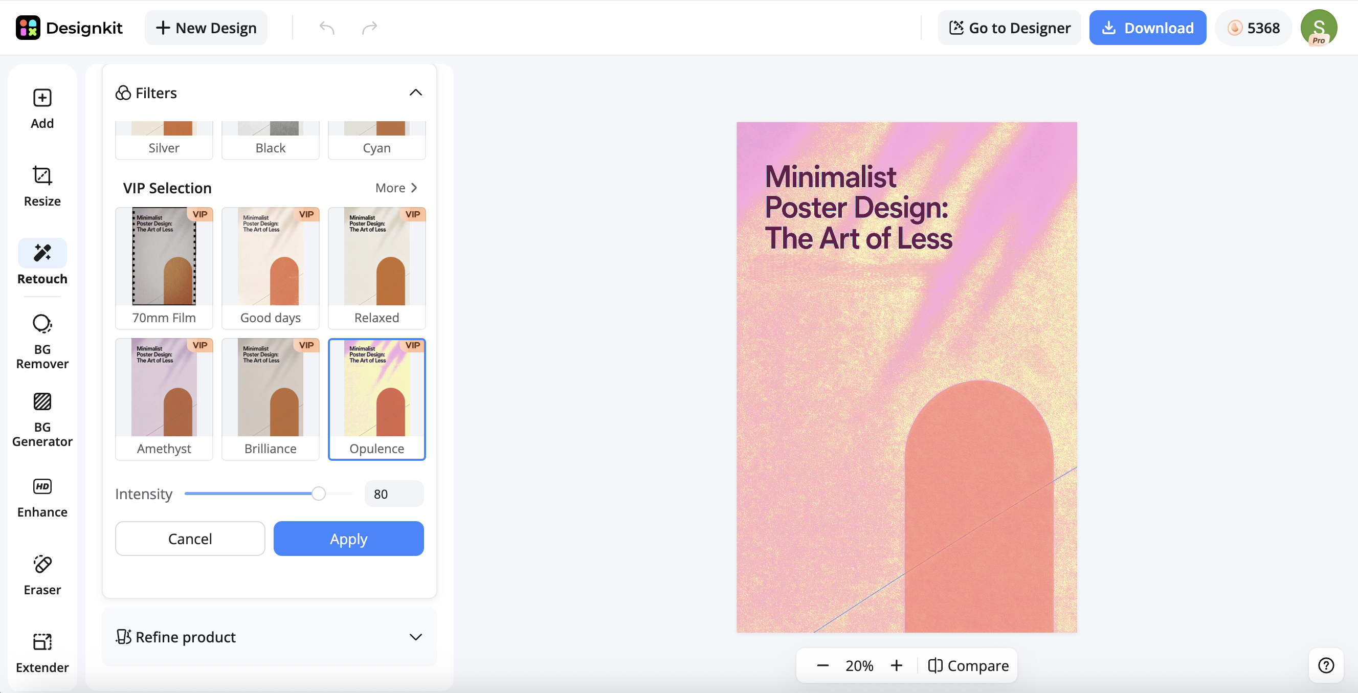
Want to give your poster a different mood or shift its whole color scheme? A filter is the fastest way to do it. Designkit's Image Filter pulls the design into one consistent, muted tone, so the colors sit together instead of clashing and the poster still feels calm and minimal.
Step 5 Export for Print or Social Media
Last step: set the size for wherever the poster is headed. A printed poster and a social post are rarely the same shape, so pick the right one before you export. Take one more look as if you were a stranger seeing it for the first time, then save it and share or print.
Minimalist Poster Prompt Examples
Now, if you are not sure what to type into the generator, here are a few prompts you can copy, tweak, and run. You can swap in your own words and colors to make them yours.
- Minimalist Event Poster Prompt: Minimalist poster for a summer jazz night. Cream background, one thin serif headline, lots of empty space, a small saxophone icon, and the date and venue in small text at the bottom.
- Simple Quote Poster Prompt: Simple quote poster with the line "Keep it simple." Black background, bold sans-serif text, centered, plenty of open space, no images.
- Minimalist Product Poster Prompt: Minimalist product poster for a ceramic coffee mug. Soft beige backdrop, the mug centered with a long shadow, one short tagline, muted earthy colors.
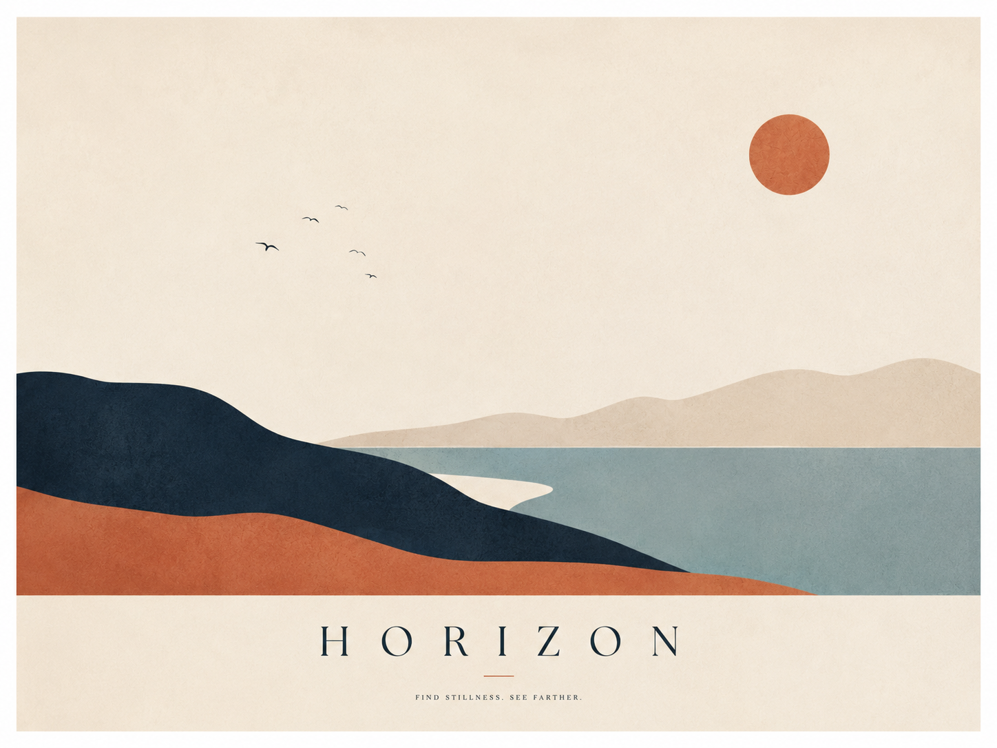
- Line Art Poster Prompt: Line art poster of a single mountain drawn in one continuous black line on an off-white background, a small title underneath, and wide margins.
Common Mistakes to Avoid
-
Most minimalist posters go wrong in the same few ways.
-
Adding too much. It sneaks in slowly, one little thing at a time, until your message is buried. When in doubt, take something out rather than pile more on.
-
Using too many fonts. More than one or two typefaces makes a clean poster look messy and unplanned. Change the size or weight instead of switching fonts.
-
Choosing low contrast. Light text on a light background might look nice on your screen, then vanish the second you print it or step back. Give your words enough weight to stand out.
-
Treating empty space like leftover space. Open space only helps when you put it there on purpose. Gaps left over from things being lined up badly just look unfinished.
Conclusion
A great minimalist poster is not about doing less. It is about making every choice count, from your main message to the space around it. Figure out what matters most, give it room, keep your colors and fonts simple, and drop anything that is not pulling its weight. Do that, and even a really plain poster can look sharp and stay in people's heads.
So start with one message, generate a clean layout in Designkit, then adjust the text, color, and spacing until everything on the page has a reason to be there.
Frequently Asked Questions
What makes a poster minimalist?
Can I create a minimalist poster with AI?
Yes, and it is one of the easiest ways to start. Designkit's AI Poster Generator builds a clean first layout from a short prompt, so you skip the blank page and just refine from there. You describe the message and style, and you tidy up the text and spacing afterward.
What are some simple poster ideas?
A few reliable ones are a text-only poster, a line art design, and a quote poster. A single product on a plain background works well too. They all lean on one strong idea and a lot of open space, which is what keeps them looking clean instead of busy.
What should I avoid in minimalist poster design?
Avoid cramming in too much, using more than one or two fonts, and putting light text on a light background. Also watch your spacing, since gaps that were not placed on purpose can make a simple poster look unfinished.
How do I make a simple poster for free?
Start with a tool like Designkit. Tell the poster generator what the poster is for and what it should say, get a first draft, then edit the words and spacing until it feels clean. Tidy up the image, set the size, and download it. No design skills needed.
What size should a minimalist poster be?
For printing, A2 and A3 are common. For social media, 1080 by 1350 pixels works well. Whatever you pick, set the size before you start designing so nothing gets stretched or cut off later.
You May Also Like

Aesthetic Poster Ideas: Find Your Style and Create Printable Art

How to Create Amazon Summer Sale Posters and Banners with AI

Father's Day Gift Ideas: Personalized Card, Poster and Video
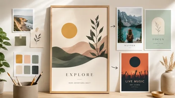
How to Make a Custom Poster That Is Ready to Print

Father's Day Card Ideas: Messages, Printable and Personalized Cards

Product Photography Ideas: Creative Tips & Techniques for Better Shots

20 FIFA World Cup Merchandise Ideas That Fans Actually Buy
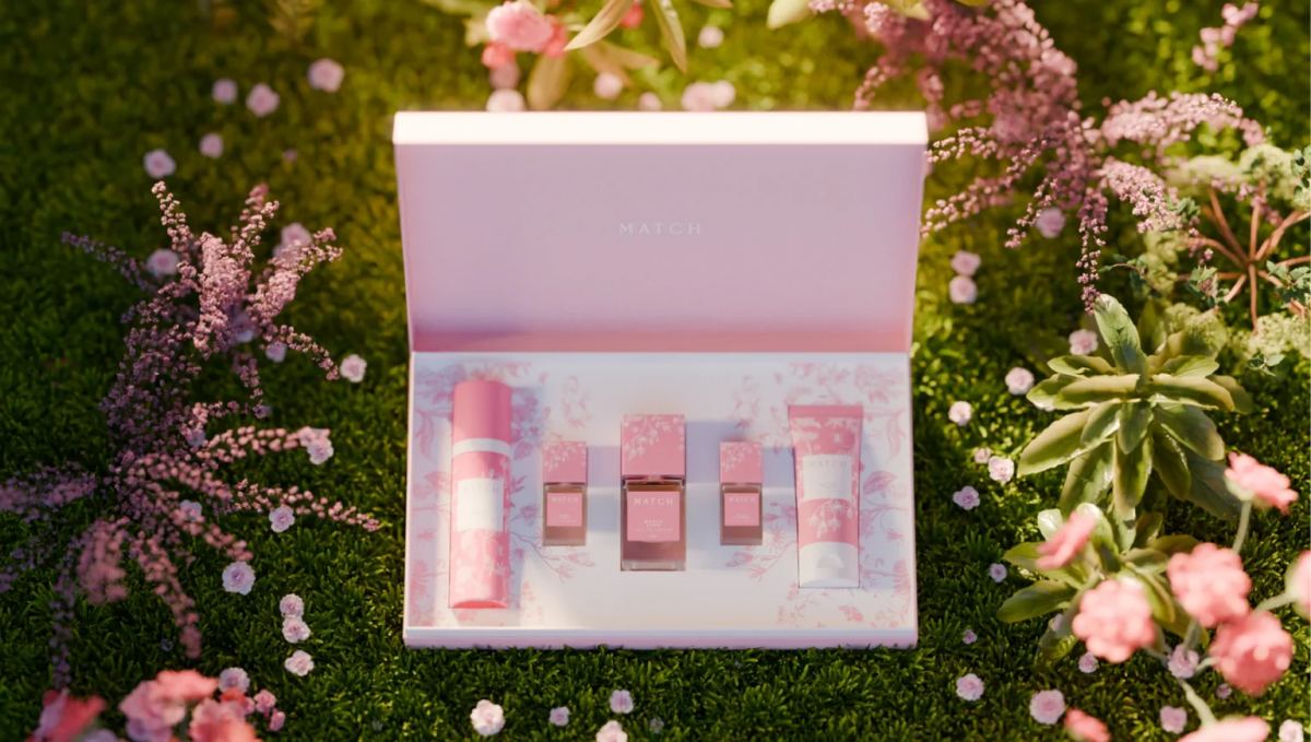
How to Use AI for Spring Product Photography: 2026 Amazon Guide
Ready to Design Your Own Minimalist Poster?
Start with one clear message and let Designkit's AI Poster Generator build a clean first layout in seconds. Then refine the text, color, and spacing until every element on the page has a reason to stay.