Aesthetic Poster Ideas: Find Your Style and Make It Printable
Find your aesthetic style, match colors and moods, and create printable posters that actually fit your space.

Choosing aesthetic posters sounds easy until you actually start doing it. You save a few designs you like, but once they sit together on the same wall, something feels off. The problem is usually not that you have bad taste. It is that you are choosing by single images instead of choosing by mood, color, and style.
A good aesthetic poster does not have to be complicated. It just needs to match the feeling you want in the room. Once you can name the style you like and spot what makes it work, it becomes much easier to choose or make posters that look intentional.
This guide is not just a list of aesthetic poster ideas. It is a way to build your eye, choose a style, and make posters that fit your space.
Why Aesthetic Posters Are Hard to Get Right
Aesthetic posters are hard to get right when you treat “aesthetic” like one fixed style. Most of the time, it is only a loose feeling. You may like one poster because the color feels soft, another because the type looks old, and another because the image matches a room mood. Those reasons can all make sense on their own, but they do not always work together on the same wall.
That is where the design starts to feel off. The problem is usually not one bad poster. It is that the posters are pulling the room in different directions. One may be doing all the visual work, while another is too quiet to hold its place. The wall starts to feel random because nothing is deciding what should stand out and what should stay in the background.
A better way to get aesthetic posters right is to give each piece a job. One poster can be the main focus. Another can support the color palette. A smaller one can fill space without asking for too much attention. Once you know what each poster is supposed to do, it becomes much easier to tell if it belongs in the room.

Start with the Mood, Not the Poster
Before picking a poster style, decide what kind of room you are trying to make. The mood is your filter. It helps you notice which ideas belong, and it also helps you leave out designs that are nice but wrong for the space.
For a calm room, the poster probably needs softer contrast and more breathing room. For a warmer corner, the color can do more of the work. For a wall that already has a lot going on, the safest choice may be a quieter poster rather than another strong image. The point is not to follow a fixed style rule. It is to ask what the room can actually handle.
Saved poster ideas are useful when you treat them as references, not designs to copy. Look for the part that made you stop scrolling. It might be the contrast between the text and background, the amount of empty space, or the way the image sets the mood before you read anything. Once you know what actually caught your eye, you can reuse that decision in a new poster instead of rebuilding the same design.
That is also the part worth bringing into a poster generator. Instead of asking for a general aesthetic poster, describe the detail you actually liked: the mood, the color contrast, the type style, or the amount of space in the layout. Designkit's AI Poster Generator also has different poster generators for more specific needs, so an aesthetic wall print does not have to be handled the same way as an event poster, school poster, cafe poster, or motivational poster.

Learn a Few Poster Styles Before You Design
You do not need to know fifty design styles to make a good aesthetic poster. A few clear style words are enough to help you choose better images and write better prompts.
Minimalist is useful when you want the poster to feel calm, but it should feel edited, not empty. The design still needs a clear center of attention, even if the colors and shapes are quiet.
Vintage or retro works better when you want the poster to bring in a little story. The key is not to add old-looking effects everywhere. A faded color palette or one nostalgic type choice is usually stronger than making the whole design look artificially aged.
Cute aesthetic posters need the most restraint. Cute can come from one soft detail, like rounded lettering or a small illustration. Once the design relies on too many tiny decorations, it stops feeling intentional.
Bold graphic posters are the opposite problem. They can make a wall feel more alive, but they also take up more attention. If the poster already has strong type or heavy contrast, the rest of the wall needs room to breathe.
Style words help you control the look of an aesthetic poster, but the poster's purpose still matters. A wall print can stay quiet because it only needs to shape the room. When the poster is built around an image or artwork, the layout has a different job: the visual needs a clear center, and the style should support it rather than compete. Designkit's AI Art Poster Generator is a better starting point for that kind of layout, because it keeps the image and the surrounding space working together.

Cute Aesthetic Poster Ideas That Do Not Look Too Busy
Cute poster ideas are popular because they make a space feel more personal, but they are easy to overdo. The design starts to fall apart when every detail is trying to be charming at the same time.
A cute aesthetic poster usually works better when one soft choice carries the mood. It could be the lettering, the color, or a small illustration, but the rest of the layout should stay quiet enough to support it. That restraint is what keeps the poster from looking like a sticker sheet.
The same rule applies if you are making a set of cute aesthetic posters. Do not try to make every poster equally busy. Let one design carry the main detail, then make the others simpler so the set has rhythm. They do not need to match exactly, but they should feel like part of the same set.

Pink Aesthetic Posters to Print for a Soft Room Look
Pink aesthetic posters are easy to like because the color already gives the design a mood. The tricky part is making that mood hold up after the poster is printed and placed in a real room. A soft pink that looks perfect on screen can turn weak on paper, while a stronger pink can start to dominate the wall if the layout is too full.
For printable pink aesthetic posters, the first thing to check is contrast. If the background is light, the text needs enough weight to stay readable. Darker lettering, a clearer border, or a slightly warmer pink can help the poster keep its shape after printing.
It also helps to give pink something to lean on. A neutral background, a darker title, or one quiet accent color can stop the design from feeling too sweet. The poster can still be cute, but it needs one clear focus instead of a collection of pretty details.
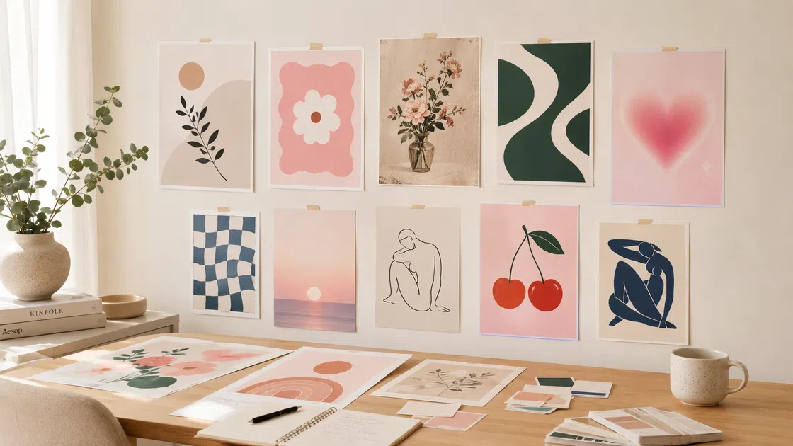
Aesthetic Wall Posters for Bedrooms, Desks, and Gallery Walls
Aesthetic wall posters need to work with the place they are going into. A print above the bed usually becomes part of the main room mood, so it can be larger, quieter, and easier to live with every day. A desk wall has more room for personality, because the poster is shaping one corner instead of the whole room. A gallery wall is different again: the posters are not judged one by one, but as a group.
That is why it helps to test the set before printing. Put the designs side by side and look for the one that feels off. It may be too dark, too crowded, too pale, or simply too different from the others. You do not have to make every poster match, but the wall needs one shared decision, such as a similar color tone, a repeated border, or the same kind of type.
If the posters still feel random, remove one before adding more. A cleaner wall is usually not made by finding another perfect print. It is made by deciding which poster should lead, which ones should support it, and which one does not belong.

Printable Aesthetic Posters: Size, Color, and Paper Tips
Printable aesthetic posters are practical, but print can expose problems that are easy to miss on screen. Start with the final size. If you already have a frame, design for that frame first. If you are making a gallery wall, plan the size mix before printing instead of resizing each poster separately.
Resolution and color need a quick check too. A blurry image will look worse once it is printed larger, and very soft colors can come out flatter on paper. If the background is light, give the text more weight or deepen the main color slightly so the poster still has shape after printing.
Paper changes the result as well. Matte paper usually suits room posters because it keeps the surface calm and reduces glare. Glossy paper can work for photo-heavy designs, but it may pull more attention than you want on a bedroom wall.
Printing checks are not only for wall decor. They become more important when the poster needs someone to act on the information, not just enjoy the mood. An event poster still needs to look good, but the title, date, and key details have to stay clear after the design is printed or shared. Designkit’s AI Event Poster Generator is a better starting point for that kind of layout because it keeps the visual style tied to the information people need first.
DIY Aesthetic Poster Ideas: Board, Collage, and Hand-Drawn Looks
Some aesthetic poster ideas are not meant to be polished wall prints. Poster boards, collages, and hand-drawn designs can look good when they have a clear system.
For aesthetic poster board ideas, the main thing is structure. A board can have a lot of material on it and still look good, but only if the viewer knows where to look first. Give the title a clear place, keep related content together, and leave enough space between sections so the board does not feel like everything was pasted down at once.
For aesthetic posters to draw, do not start with too many details. Decide where the main words or drawing will sit before you fill the page. A simple hand-drawn poster usually looks better when the layout is planned first, even if the final lines are loose or imperfect.

How to Create an Aesthetic Poster with an AI Tool
Once you know the mood and style you want, Designkit’s AI Poster Generator can help turn that direction into a first draft.
Start with the poster’s purpose: a soft wall print, a cute quote poster, a pink printable design, or an image-led art poster. Then describe the mood, style, color, and main text in plain language. A prompt like “soft pink minimalist quote poster for a bedroom wall” gives more direction than “aesthetic poster.”

After generating the first version, adjust the text, spacing, image placement, and size. Before exporting, check if the poster still fits the room, stays readable, and works for print. Try not to stack too many style words into one prompt. Pick the few details that matter most and keep the design focused.

Conclusion
Aesthetic posters work best when the design has a reason behind it. Once you know the mood you want, the style that fits, and the place the poster is going, the rest of the decisions get easier. Start from that direction, and the wall will take care of itself.
Frequently Asked Questions
What are aesthetic posters?
How do I choose an aesthetic poster for my room?
Start with the room mood. A calm bedroom may need softer colors and more blank space. A desk wall can handle more personality. A gallery wall needs repeated colors, frames, or typography so the posters look connected.
What colors work best for aesthetic posters?
Pink, cream, beige, brown, sage green, dusty blue, black, and white are easy to use because they work with many room styles. For cute posters, try pink with cream or peach. For cleaner wall posters, use beige, black, and one accent color. For printable posters, avoid text colors that are too pale.
Can I print aesthetic posters at home?
Yes. Use a high-resolution file, choose the correct size, and leave enough margin for your printer. Matte paper is a good choice for soft, vintage, cute, and minimalist posters.
What size should printable aesthetic posters be?
8x10 inches works well for small frames, shelves, and desk walls. 11x14 inches or 12x16 inches works better for bedroom walls. A4 and A3 are also practical if you print at home or use standard paper sizes.
How do I make cute aesthetic posters?
Use one main idea, soft colors, rounded type, and enough blank space. A short quote, small illustration, or simple pattern can be enough. Cute posters look more polished when they are not overloaded with too many tiny details.
You May Also Like

How to Create Amazon Summer Sale Posters and Banners with AI

Father's Day Gift Ideas: Personalized Card, Poster and Video
Product Photography Ideas: Creative Tips & Techniques for Better Shots

20 FIFA World Cup Merchandise Ideas That Fans Actually Buy

Father's Day Card Ideas: Messages, Printable and Personalized Cards

How to Use AI for Spring Product Photography: 2026 Amazon Guide

How to Create AI Fashion Models: Complete Step-by-Step Guide
Create Printable Aesthetic Posters That Match Your Style
You already know the mood, the style, and the colors you want. The next step is turning that into a real design. Describe your idea in Designkit and adjust the layout, text, and size until it fits your wall or print file.