
How to Add Text to a Photo That Feels Part of the Image
Learn how to position, style, and format photo text for clear, polished results, then add or update your wording with Designkit.


Words bring instant context to an image and convey messages a picture cannot express alone. The photo itself dictates layout, contrast, font choice, and visual hierarchy. Whether you create a social post or a promo graphic, the final design must work at a single glance. This guide shows how to plan your message, add text to photo projects, and preserve high legibility.
What to Consider Before Adding Text to a Photo
Before you add text to a picture, keep these 3 key considerations in mind:
1. Decide What the Words Must Say: A headline, a caption, a label, and a promotional message all behave differently on the same photo, and each needs different space. Naming which one you are writing settles length and prominence together.
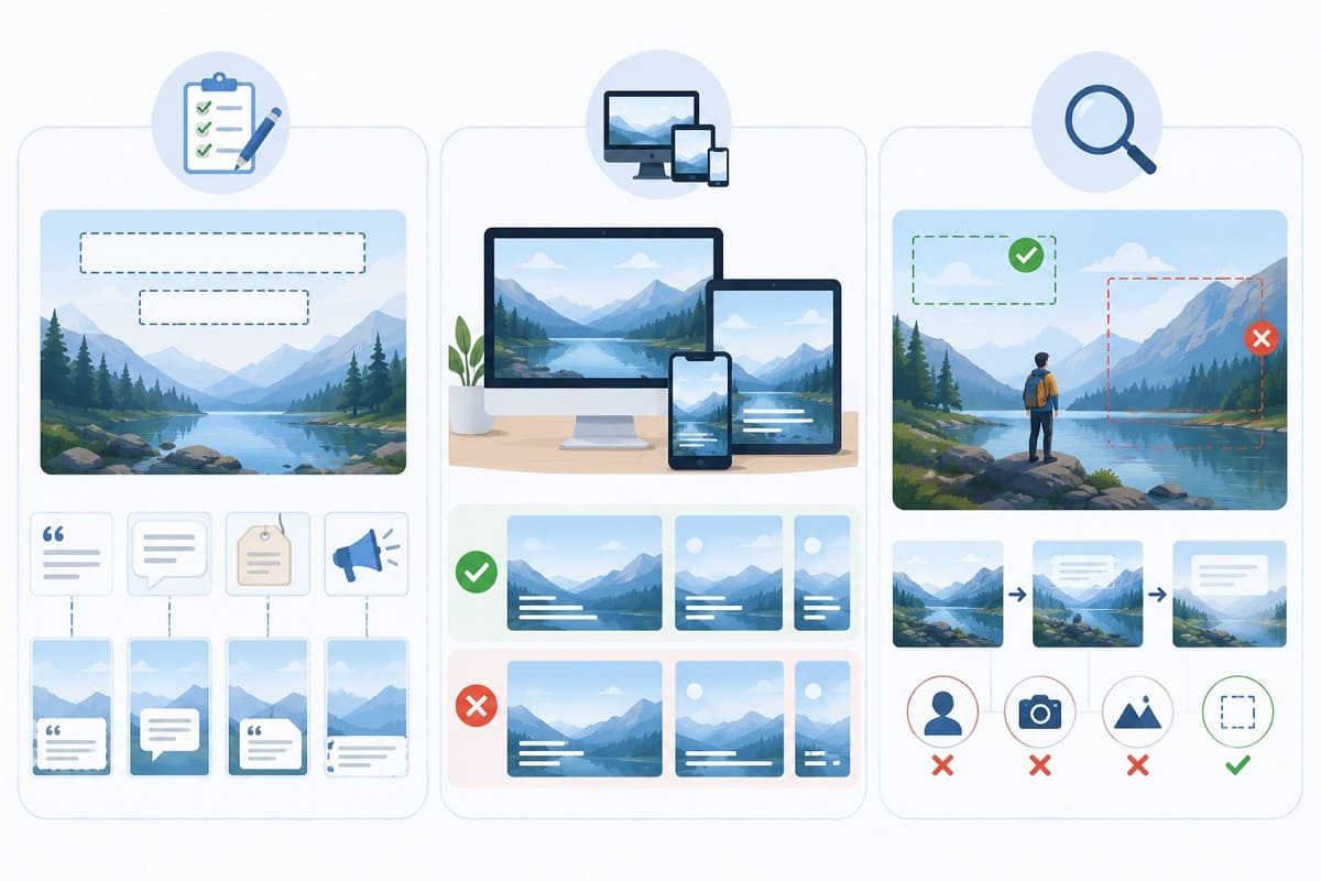
2. Check Where the Image Will Appear: A post read on a phone needs larger, shorter text than a graphic viewed on a desktop screen. The same file rarely serves both well, so pick the destination before you write.
3. See What the Photo Allows: Find the open areas that can hold words, and note the faces, products, or details that must stay uncovered. Photos that look spacious often lose most of that room once text sits on them. If what is left is tight, cut the copy rather than shrinking the type.
How to Style Different Types of Photo Text
Knowing how to add text to an image is only the first step. Styling determines how well that text fits its purpose and the overall design. With the basics covered, here is how to style each type of photo text effectively.
1. Headlines
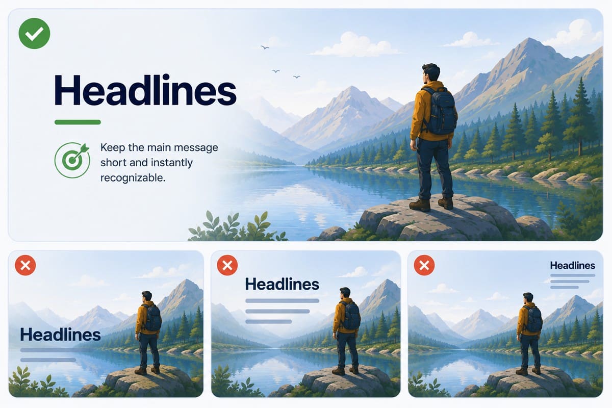
Keep the main message short and instantly recognizable. A headline earns the strongest visual emphasis on the image, and it should sit where it supports the composition instead of competing with the subject. Limit the supporting detail around it so it stays the clear entry point for everything else.
2. Photo Captions
Captions supply context a photo cannot communicate by itself. When placing text over image designs, keep captions readable while letting the photo remain dominant, so use modest rather than tiny type. Anyone learning how to add captions to photos in a series should keep the position consistent. Readers then know where to look across each image.
3. Labels and Callouts
Each label belongs close to the detail it explains, and the connection between the two should need no explanation. When several appear together as you add text to image, keep the font, color, and spacing identical so they read as one set. Short wording matters more here than anywhere else, since labels crowd an image quickly.
4. Promotional Text
Give the offer the highest priority and keep supporting information smaller and visually separate. Contrast and hierarchy then guide readers from the main message to the next detail. Anything that does not need to sit on the image belongs in the surrounding post or page copy.
Text baked into a photo can complicate resizing, translation, and assistive access and may require alternatives, concerns W3C addresses under images of text.

8 Ways to Make Text on a Photo Clear and Readable
A finished image is not always easy to read. After you write text on an image, a few design choices can make the message clearer. Here are 8 practical ways to improve text readability:
1. Use the Photo's Negative Space
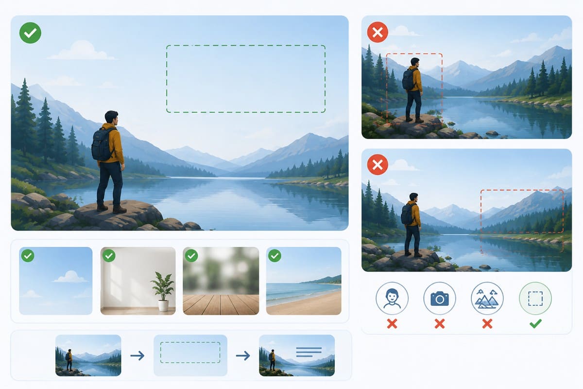
Most images already contain a quiet area, and that is usually where words belong. Look for open sky, a plain wall, blurred background, or an empty stretch of surface. Let the composition decide the position rather than forcing a spot you had in mind. Keep words off faces, products, and the details that explain the photo.
2. Create Clear Contrast with the Background
Light text belongs over dark areas and dark text over light ones. Accessibility standards put real numbers on this. The W3C's contrast minimum guidance asks for a ratio of at least 4.5:1 for normal text. Large text at 18 points, or 14-point bold, needs at least 3:1.
Photos complicate that, since brightness shifts across an image, so check the whole area behind the words. When contrast stays weak, a thin outline or soft shadow separates the letters without altering the background. Keep it subtle enough to help rather than distract.
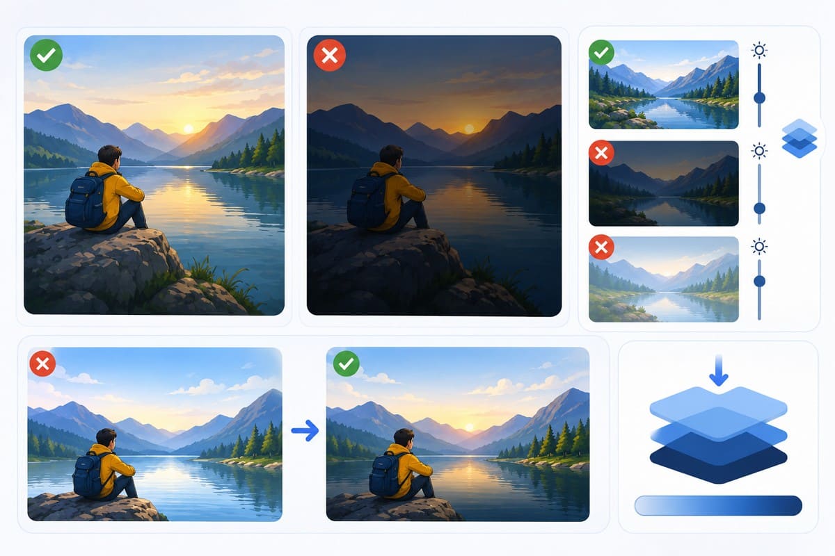
3. Add a Subtle Overlay or Gradient
When the colors behind your words vary too much for one text color to work, a light or dark overlay evens the surface out. A gradient does the same for a single section after you add text on photo, which suits a photo needing help only along the bottom.
An overlay heavy enough to guarantee contrast can also flatten the photo you chose, so stop at the point where the important details still read.
4. Place a Shape Behind the Text
Sometimes an overlay changes more of the image than you want. When learning how to add text to image designs, a solid or slightly transparent box can create contrast without affecting the entire photo. Leave enough padding around the words so they do not feel cramped. If the photo contains several related text groups, use the same box style for each to keep the design consistent.
5. Simplify a Busy Background
Detail competing with letters is a documented readability failure, not just an aesthetic complaint. The W3C notes that features of a background image can be confused with the text itself. That is exactly what happens over foliage, crowds, and patterned surfaces.
Try relocating the words to a calmer area first. If nothing quieter exists, soften or blur the area behind them. Either way, avoid pairing detailed lettering with an equally detailed background.
6. Choose a Legib le Font
Plain typefaces suit long text best when you add text on image, while decorative fonts fit short titles. Stick to 2 font styles at most to keep the design cohesive. Match the image mood, but never sacrifice overall readability.
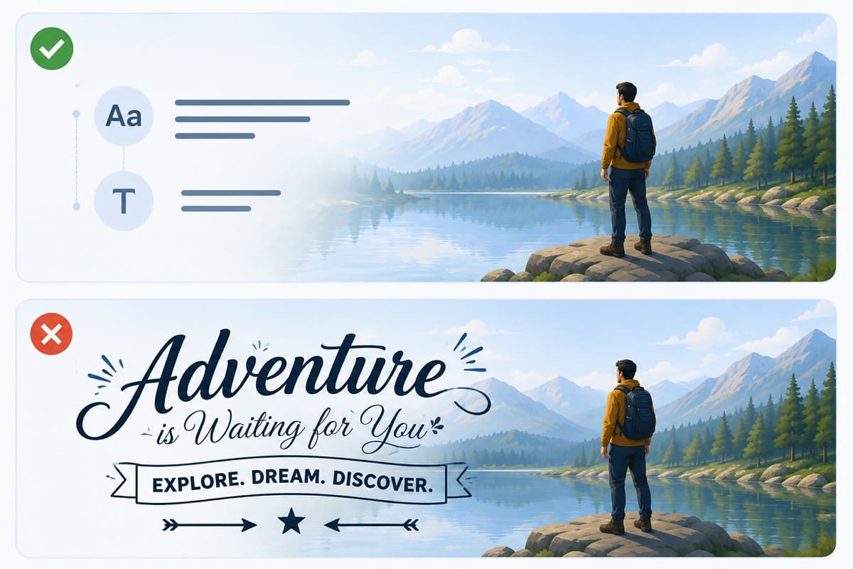
7. Create Hierarchy with Size and Weight
Clear visual structure guides the reader immediately. Set your main message apart with strong contrast in size, weight, or color, so the primary point stands out. Equal emphasis on every line confuses the viewer and slows down comprehension. Group related text blocks together so the audience grasps your full message at a single glance.
8. Check the Final Display Size
Everything above can look correct in an editor and still fail in a feed. Review the image at the size viewers will actually see, paying attention to small captions and mobile graphics. When text turns unclear at that size, shorten the copy, increase the type size, or strengthen the contrast. Check the edges too, since text sitting close to a border often disappears into a platform's crop.
How to Add Text to a Photo with Designkit
With the message and the space settled, it's easy to add text to an image. Designkit's Image Text Editor handles both jobs this article covers. It lets you add fresh text to a photo or update wording already built into the image.
Step 1: Upload Your Photo
Open the “Image Text Editor ” and press the “Upload Image” option to write text on an image. Choose a photo that shows the main subject clearly and leaves suitable room for the message you planned.

Tip: Look over the frame and identify which areas can carry text. The goal is a spot that holds words without covering visual information the viewer needs.
Step 2: Add and Position the Text
Press the “+Add Text ” button, type the text in the given box, and edit it from the right toolbox. Set the font, size, color, spacing, and alignment, then check the balance between the words and the photo underneath.
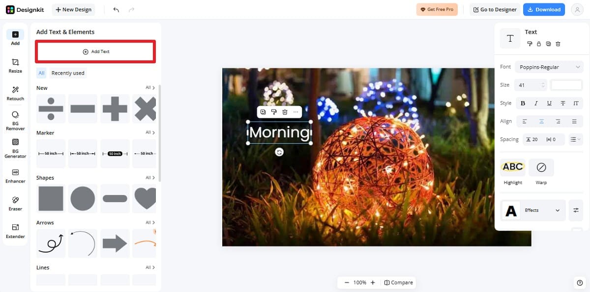
Tip: Margins matter more than they look. Leave enough room around the edges so the words never feel cramped, and so a platform crop cannot clip them on a smaller screen.
Step 3: Adjust the Text and Download
Once you add and edit the text, click “Download,” choose the format, and press “Download ” to save the image with text.
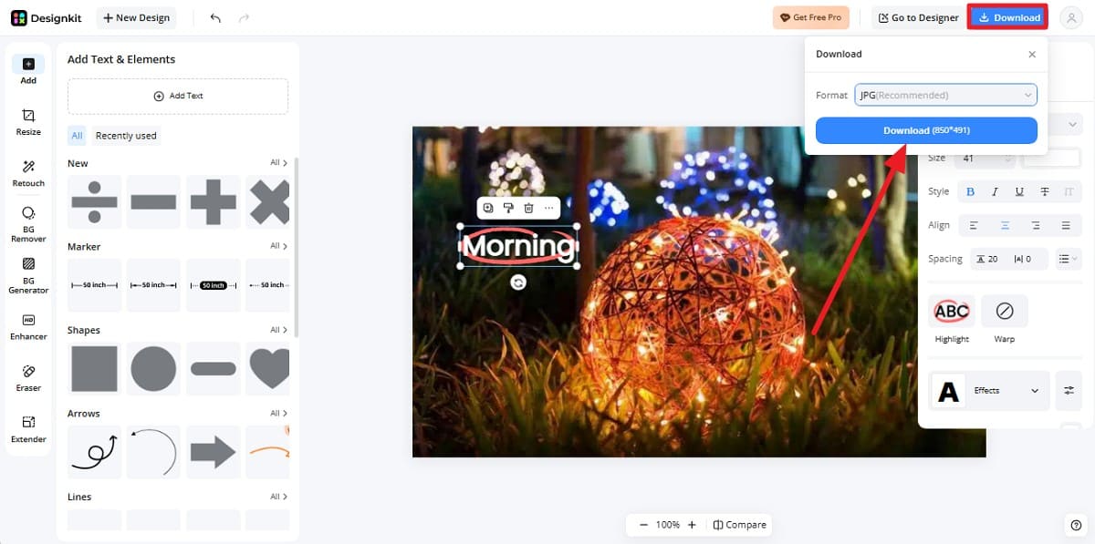
Tip: PNG keeps text edges sharp, while JPG gives you a smaller file when photo quality matters more than crisp lettering.
Adding New Text vs Editing Existing Text
Everything so far assumes you are adding words for the first time. Correcting an image that already contains text is a different task. Adding text to a picture means placing a new element over the original photo while leaving the photo itself unchanged. The table below highlights the key differences between these two actions:
|
Comparison |
Adding New Text |
Editing Existing Text |
|---|---|---|
|
What Changes |
A new text element is placed over the photo |
Existing text within the image is replaced or removed |
|
Original Photo |
Remains unchanged underneath |
Changes where the existing text is edited |
|
Typical Case |
Adding a caption to a new social post |
Updating details on an existing graphic |
|
Starting File |
Any photo that needs new text |
A finished image containing text that needs editing |
|
After Export |
New text becomes part of the exported image |
Edited text becomes part of the exported image |
A layered file lets you revise the wording next season, or make a second version for another platform. Once embedded text is replaced and exported, the previous wording is gone unless you keep the original. Designkit's Image Text Editor supports both, so a photo needing new wording and one needing corrected wording follow the same route.
Conclusion
The action to add text to a photo comes down to 4 things. Plan what the words must say and place them where the composition allows. Give them enough contrast to separate from the background, then build a hierarchy that tells readers where to begin.
Check the finished image at its real display size before publishing, since that is where most problems surface. When you are ready to add text to photos or update wording already sitting in one, Designkit's Image Text Editor covers both.
Frequently Asked Questions
How do I add text to a photo?
How do I add text to a picture without hiding the subject?
Place the words in the photo's negative space, meaning open areas such as sky, walls, or blurred background. When none exists, add a subtle overlay or a shape behind the text instead.
How do I make text on image designs easier to read?
Contrast does most of the work. Use light text on dark areas and dark text on light ones, then add an outline or overlay when the background varies. Larger types and shorter copies help too.
How do I add a caption to a photo?
Write the context the image cannot show on its own, then place it consistently, usually along the bottom. Keep captions readable but secondary, so the photo stays dominant.
Can I edit text that is already part of an image?
Yes. Editing embedded text means replacing or removing wording already baked into the file, rather than adding an element on top. It suits a graphic needing new details while the visual stays unchanged.
Should I put text over an image or in the caption below it?
Put only what the image must communicate on its own over the photo. Longer detail belongs in the post copy, since text embedded in an image cannot be resized, translated, or read by assistive technology.
You May Also Like

Remove.bg Shutting Down Dec 1, 2026: What Users Are Saying

7 Best Remove.bg Alternatives in 2026: Free & Paid Tools

Instagram Carousel: What It Is, How to Post & Create One
Nano Banana Prompts: 20+ Examples for Better AI Images

Ideogram AI Review 2026: Features, Pricing & Alternatives
Free Mac Photo Editor: 5 Tools Compared for Mac Users
How to Crop a Photo Into a Circle Online (Keep Quality)
How to Make an Image Transparent Online (AI Guide)
Pixlr Background Remover Review 2026: Features, Pricing & Alternatives

How to Fix Overexposed Photos: Recover Highlights Fast
OpenArt AI Review 2026: Features, Pricing & Alternatives
Best AI Headshot Generator: 9 Tools Compared for 2026
Best Stencil Maker Tools 2026: Turn Photos Into Stencils
Pixelbin Watermark Remover Review: Image & Video Results Tested
How to Make a Sticker on iPhone: Easy Step by Step Guide

Best AI Logo Generator in 2026: 10 Tools Compared
How to Turn a Photo Into a Cartoon: A Beginner-Friendly Guide
Landscape vs Portrait: Key Differences & Best Uses in 2026
How to Remove Watermark From Photo: AI, Photoshop & More
How to Fix Pixelated Photos: Photoshop, AI Tools & Tips

Bing Image Creator: How It Works, Features, Uses & Alternatives
How to Remove People from Photos with AI: A Step-by-Step Guide

How to Increase Image Resolution: AI, Photoshop & PPI

How to Add Text to a Photo: 8 Tips for Better Results
How to Fix Grainy Photos: Easy Ways to Clear Images

Creative Profile Picture Ideas for Every Style and Platform
Evoto AI Review 2026: Features, Pricing, Pros & Cons

Pixlr Photo Editor Review: Features, Pricing & Alternatives
Best AI Image Extender Tools in 2026: Expand Photos with AI
How to Make a Collage on iPhone: Easy Guide for 2026
How to Sharpen an Image in Photoshop (Smart Sharpen and Unsharp Mask)
Best Image Background Remover Tools in 2026: AI Tools Compared
How to Make Transparent Background in Paint: Step-by-Step Guide
How to Resize an Image: Best Methods, Tools & Quality Tips
Best AI Image Generator Tools in 2026: Top AI Platforms Compared

Remove.bg Review 2026: Features, Pricing & Is It Worth It?

Luminar Neo Photo Editor Review 2026: AI Features, Price & Pros

How to Post Multiple Photos on Instagram (2026 Guide)

25 Facebook Cover Photo Ideas for Personal & Business Pages

What Is a PFP? Meaning, Examples & How to Create One
Can You Edit an Instagram Post After Posting?

11 Best Canva Alternatives in 2026 for AI Design & Marketing

8 Best Midjourney Alternatives in 2026: Features, Pricing & Comparison
How to Restore Old Photos: AI Tools, Tips & Best Methods

Pixelcut AI Review 2026: Features, Pricing, Pros, Cons & Alternatives
How to Apply Watermark to Photos: Methods, Tips & AI Tools
How to Remove a Background in Illustrator: 4 Easy Methods
How to Change Background Color on Instagram Story (Easy Guide)

8 Best AI Poster Generators in 2026: Create Posters Faster with AI
10 Best AI Image Enhancers in 2026: Tested & Compared
10 Best AI Image Editors in 2026: Features, Pricing & Comparison
7 Best AI Background Changer in 2026: Remove & Replace Photo Backgrounds
Luminar Neo vs Lightroom: Features, Pricing & Comparison 2026

Kittl Review 2026: Is It Worth It? Features & Pricing
How to Make a Blurry Image Clear: 5 AI & Manual Ways
How to Remove Background on iPhone: 5 Easy Methods (2026)
Photoroom Background Remover Review 2026: Features & Alternatives
How to Remove Background in Canva: A Step-by-Step Guide
How to Remove Background in GIMP: Beginner-Friendly Guide

Funny Dog Memes to Try: Doge Meaning and 10 Original Ideas
Back to School Checklist 2026: Supplies, Timeline, and Planning
Recraft AI Review 2026: Features, Pricing, Pros, Cons & Alternatives

How to Make an Image Transparent in Google Slides: Opacity & Background Removal

VanceAI Photo Enhancer Review: Features, Pricing & Alternatives in 2026
What Does Emojify Mean? Text, Photos, & Emoji Art Explained
Top 8 Online Background Removers for Ecommerce Photos (2026)
How to Remove Background in Photoshop: 7 Easy Methods
6 Best AI Image Upscalers 2026: Tools Tested & Compared
Project Indigo Review: Is It Better Than iPhone Camera?
How Big Is an 8x10 Photo? Size, Pixels & Frame Guide
How Big Is a 4x6 Photo? Dimensions, Pixels & Printing Tips
Picsart AI Review: Features, Pricing, Pros, Cons & Alternatives

Lovart AI Review: AI Design Agent Features, Pricing & Alternatives
Fotor AI Image Generator Review: Features, Pricing & Alternatives

How to Add Emoji to Photo Online for Free

Emoji Wallpaper Ideas & How to Make One Online (2026)
Minimalist Poster Design: How to Make a Clean Poster (2026)

How to Make a Custom Poster That Is Ready to Print
Instagram Image Size Guide 2026: Post, Reel, Story & Carousel Specs
LinkedIn Image Size Guide: Profile, Post & Banner Dimensions
YouTube Profile Image Size: Best Dimensions & Safe Area 2026

How to Edit Amazon Product Photos That Boost Sales Fast
Make Every Word Fit the Photo
Add a headline, caption, label, or promotional message to any photo. Adjust the placement and styling, then download a polished image that reads clearly at a glance.