
How to Apply Watermark to Photos Without Losing Image Quality
Apply watermarks to photos without hurting quality: types, placement, batch workflows, and Instagram tips for creators and brands.

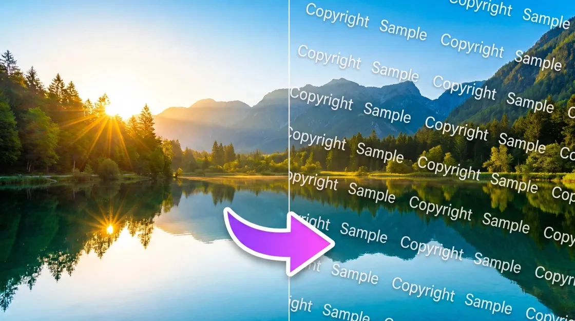
Ever stumbled on your own product shot sitting on a stranger's Instagram, no credit, no tag, nothing? That's usually the moment people finally sit down and figure out how to apply watermark to photos the right way. A good watermark does two things at once, it makes casual theft a little harder, and it drags your brand name along for the ride every time the image gets reposted somewhere new. The catch is that most watermarks look bad: too big, too dark, plastered right across someone's face. This guide covers the actual types worth using, the exact clicks in Photoshop and Lightroom, and where an AI tool like Designkit saves you from doing the same steps fifty times over.
Quick Summary
A watermark is a logo, signature, or bit of text layered onto a photo. You can add one by hand in Photoshop, batch it through Lightroom, or generate branded, watermark-ready visuals in bulk with an AI tool. Keep the opacity low, don't cover anything important, and export at a resolution that won't turn your logo into mush.
What Is a Watermark Photo?
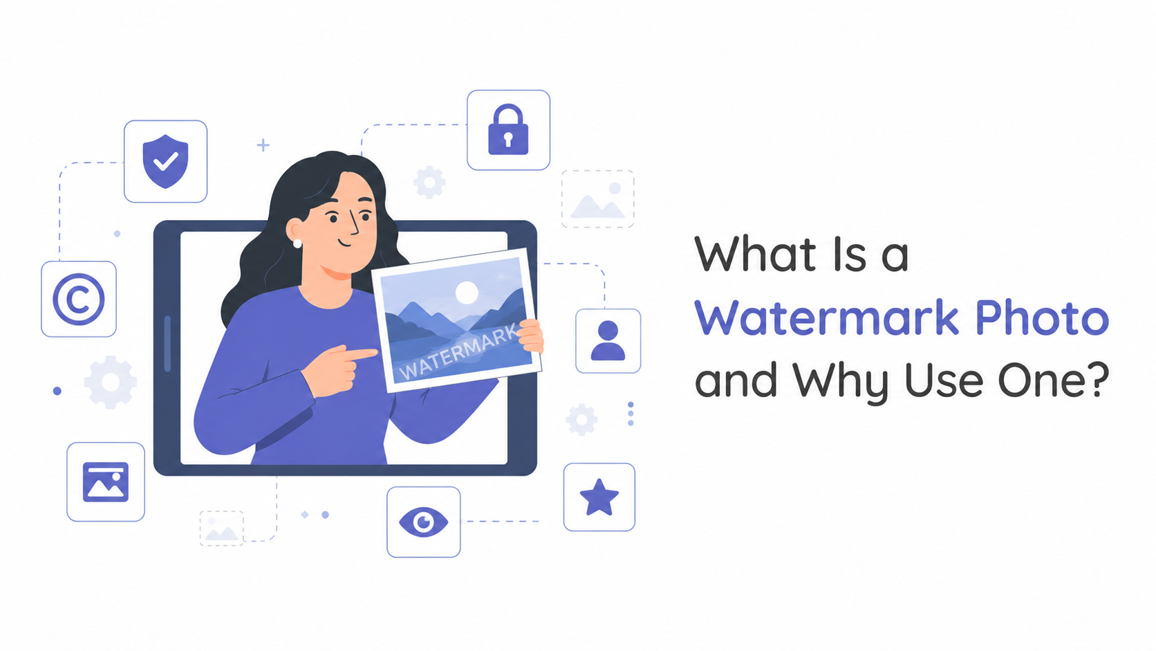
A watermark, at its simplest, is a logo, some text, or a pattern placed on top of an image, usually see-through enough that the photo underneath still reads clearly. If you've searched what a watermark photo is, you're probably picturing exactly that: an image someone has branded or claimed so it's obvious who it belongs to. Photographers, sellers, and creators all apply watermarks to photos for roughly the same two reasons. One, it discourages the lazy kind of theft. Two, it keeps your name attached to the image no matter where it ends up.
Protect Photos from Unauthorized Use
Nobody's watermark stops a determined thief with editing software and time to burn. What it does stop is the easy stuff, the right-click-save-and-repost crowd who won't bother if there's a name stamped across the corner.
Build Brand Recognition across Platforms
Every repost, pin, or screenshot carries your branding with it, for free. A product photo or portfolio shot that circulates past its original platform is basically doing marketing on your behalf, as long as your name is actually on it.
Identify Ownership of Digital Assets
A visible mark is a decent first line of defense, but don't treat it as a legal shield. Hang onto your original master files and whatever metadata is embedded in them (EXIF, IPTC), that's your real backup if ownership ever gets disputed. Invisible or embedded digital watermarking is a different approach entirely, mostly used for large-scale copyright tracking rather than a single Instagram post.
Watermark Photos for Instagram and Social Media
Social platforms compress and crop images differently than whatever software you exported from, so a watermark that looks fine in Lightroom can end up half cut-off once it's actually live. When you watermark photos for Instagram specifically, plan around the platform's common ratios, 1:1 squares, 4:5 portraits, and factor in that the app will compress your upload no matter what.
Choose the Right Position for Mobile Viewing
Account for interface elements like the caption bar and profile icon overlay. A corner placement that looks clean on a desktop preview can get partially covered by app UI on someone's actual phone screen, worth testing the export on a device before it goes live.
Consider Platform Cropping
Keep your watermark well inside the safe area for both 1:1 and 4:5 crops. If it sits too close to an edge that gets trimmed on one aspect ratio, it just disappears on that version of the post, and you won't necessarily notice until someone points it out.
Keep Branding Visible Without Hurting Engagement
Subtle corner marks tend to work best for regular feed posts, where you don't want the branding competing with the photo for attention. Save heavier, more visible marks for client proofs or work-in-progress shares, not for shoppable product photos, where an intrusive watermark can genuinely undercut buyer trust.
Different Types of Photo Watermarks and When to Use Them
Before you learn how to put a watermark on a photo, you must choose the right style for your specific use case. Here is a breakdown of the most common formats and when to apply them.
Text Watermark
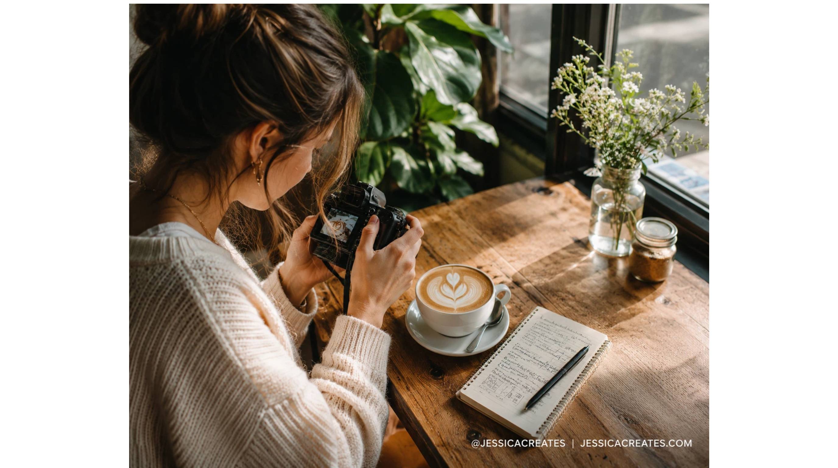
Best for bloggers and creators. It's the fastest option to set up, just your name or handle overlaid on the image, and it doesn't require a logo file at all, which matters if you haven't formalized your branding yet.
Logo Watermark
Ideal for businesses and ecommerce brands. If you already have a mark people recognize, this is the version worth reinforcing every time a product photo circulates.

Signature Watermark
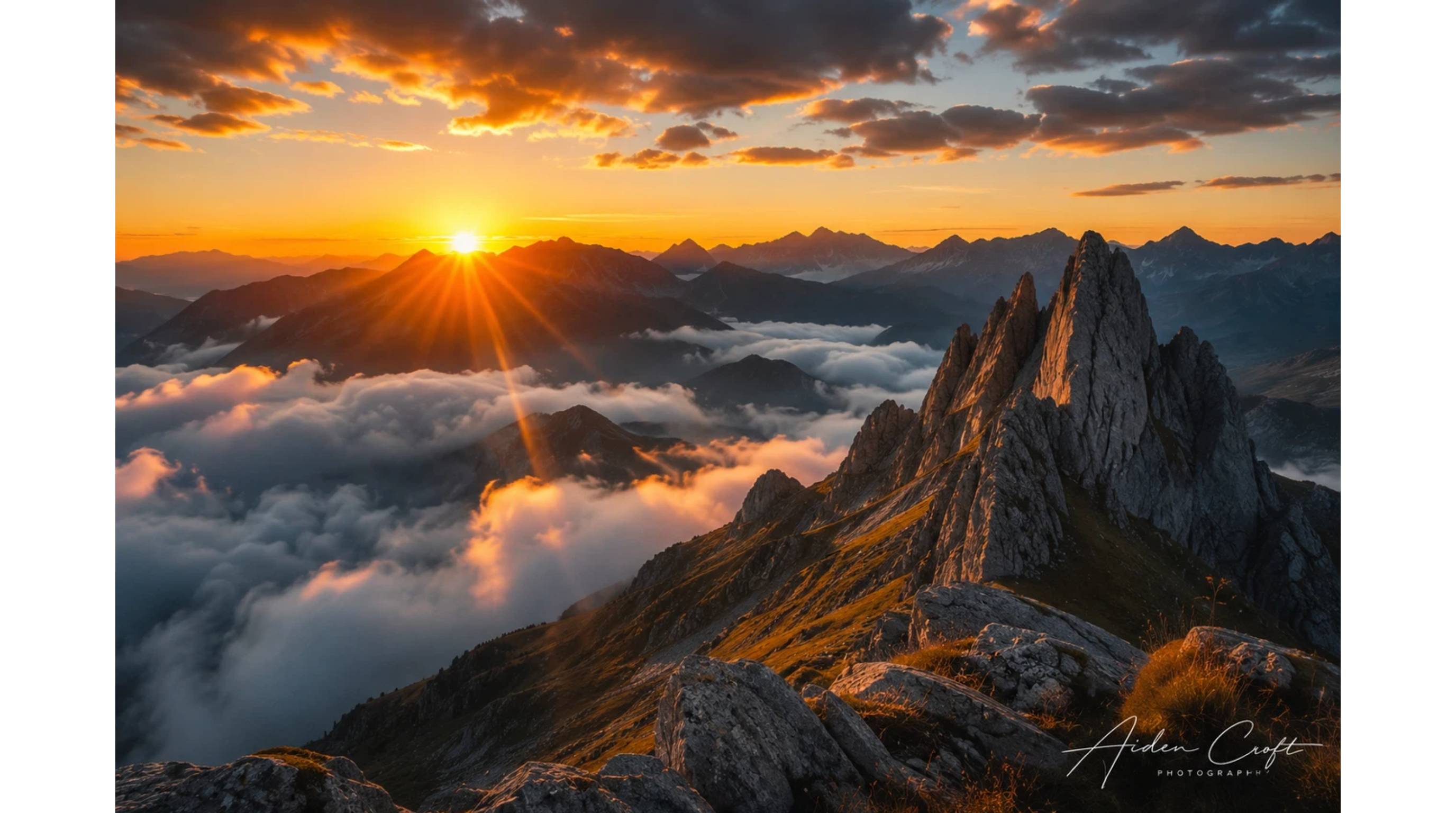
Popular among photographers, especially anyone selling prints. A handwritten-style signature carries a different kind of authority than a plain logo; it reads as personal rather than corporate.
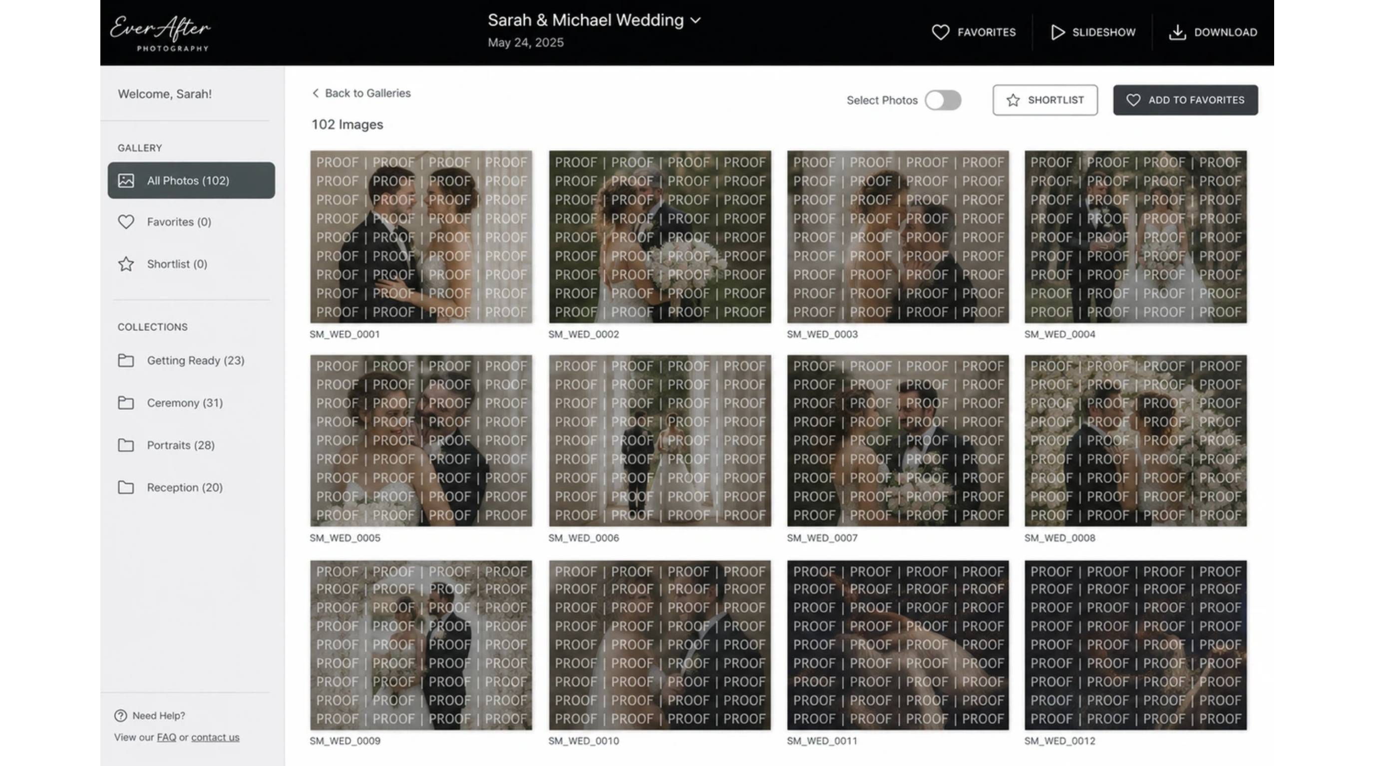
Pattern Watermark
Useful for client proofs and stock photography. This tiles across the whole frame instead of sitting in one corner, and honestly, the goal here is to make the image annoying enough to steal that nobody bothers.
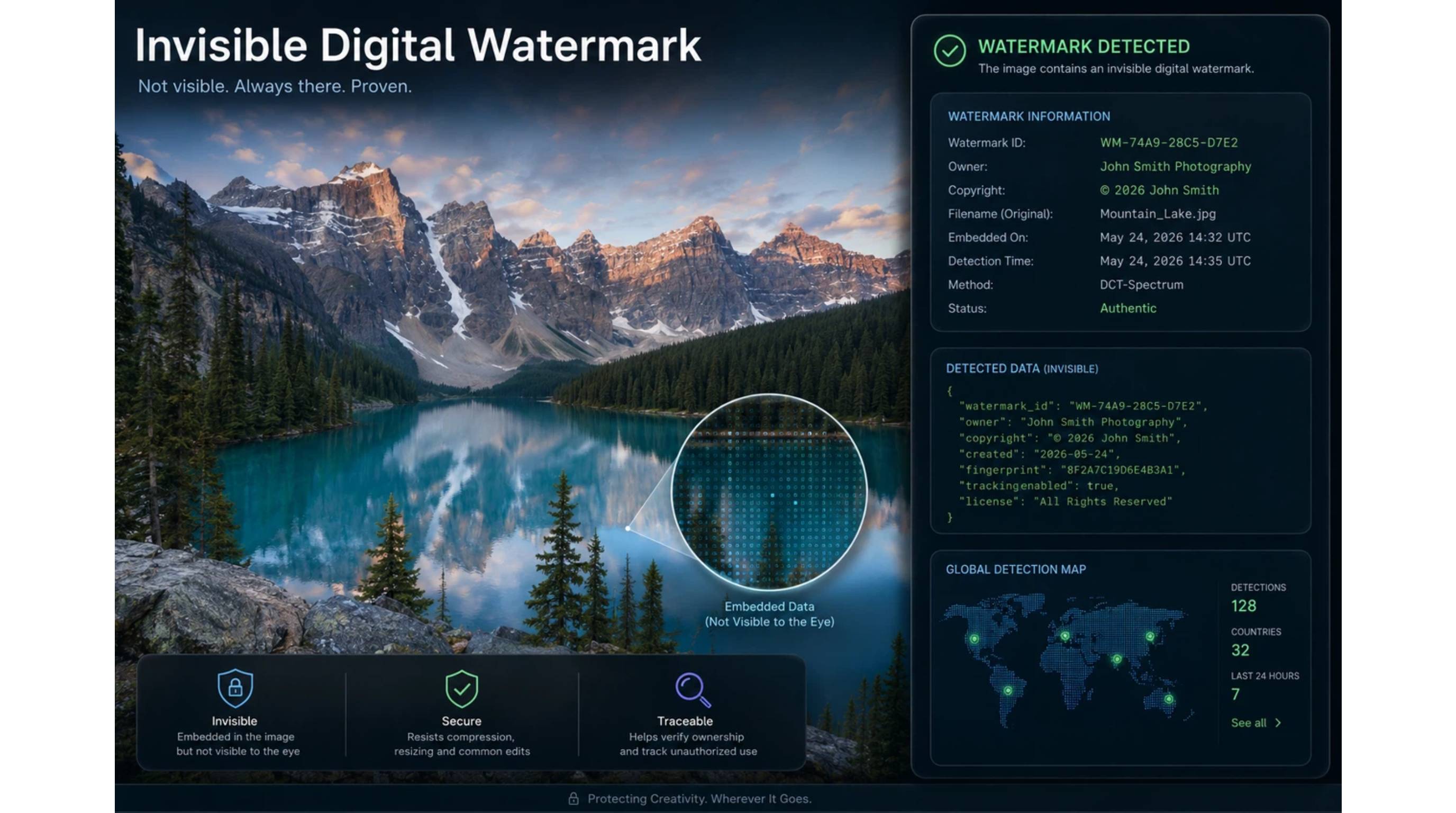
Invisible Digital Watermark
For copyright tracking and ownership verification. This sits underneath the visible options entirely, embedded data invisible to the eye, built for large-scale tracking rather than everyday social posts.
How to Apply Watermark to Photos Step by Step
Common Ways to Add Watermarks to Photos
Depending on your batch size and workflow needs, here is a breakdown of the most effective methods to apply watermarks to your images.
1. Using Photoshop
Pros:
-
Full control over layer opacity, blending modes, and pixel-precise placement.
-
You can save the whole setup as a reusable action.
Cons:
-
Manual process that requires editing one image at a time (unless you build a batch action yourself).
-
It gets extremely slow once you're past a handful of photos.
Best for: Photographers and designers who want fine control over a small batch of hero images.

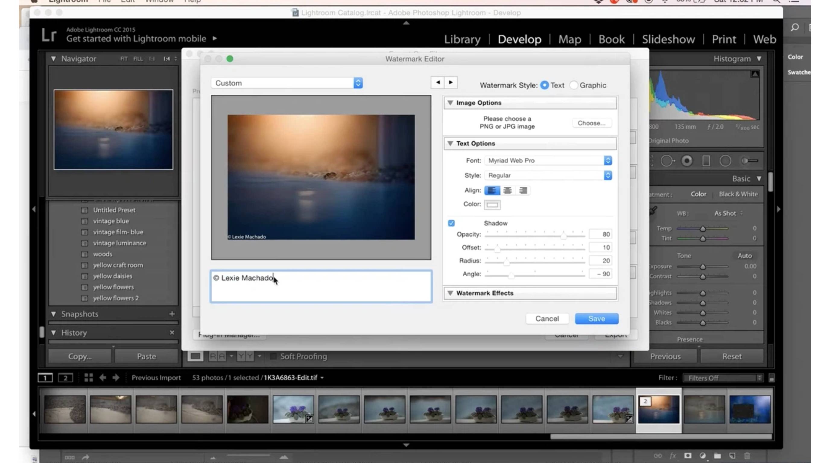
2. Using Lightroom Batch Watermarking
Pros:
-
A saved watermark preset applies across an entire export batch in one pass.
-
Far faster than Photoshop for volume work.
Cons:
-
Fewer creative controls than Photoshop.
-
Mostly limited to a basic text or graphic overlay, positioning, and opacity adjustments.
Best for: Photographers exporting large galleries, like a full wedding or event shoot, where consistency across hundreds of images matters more than fine-tuning any single one.
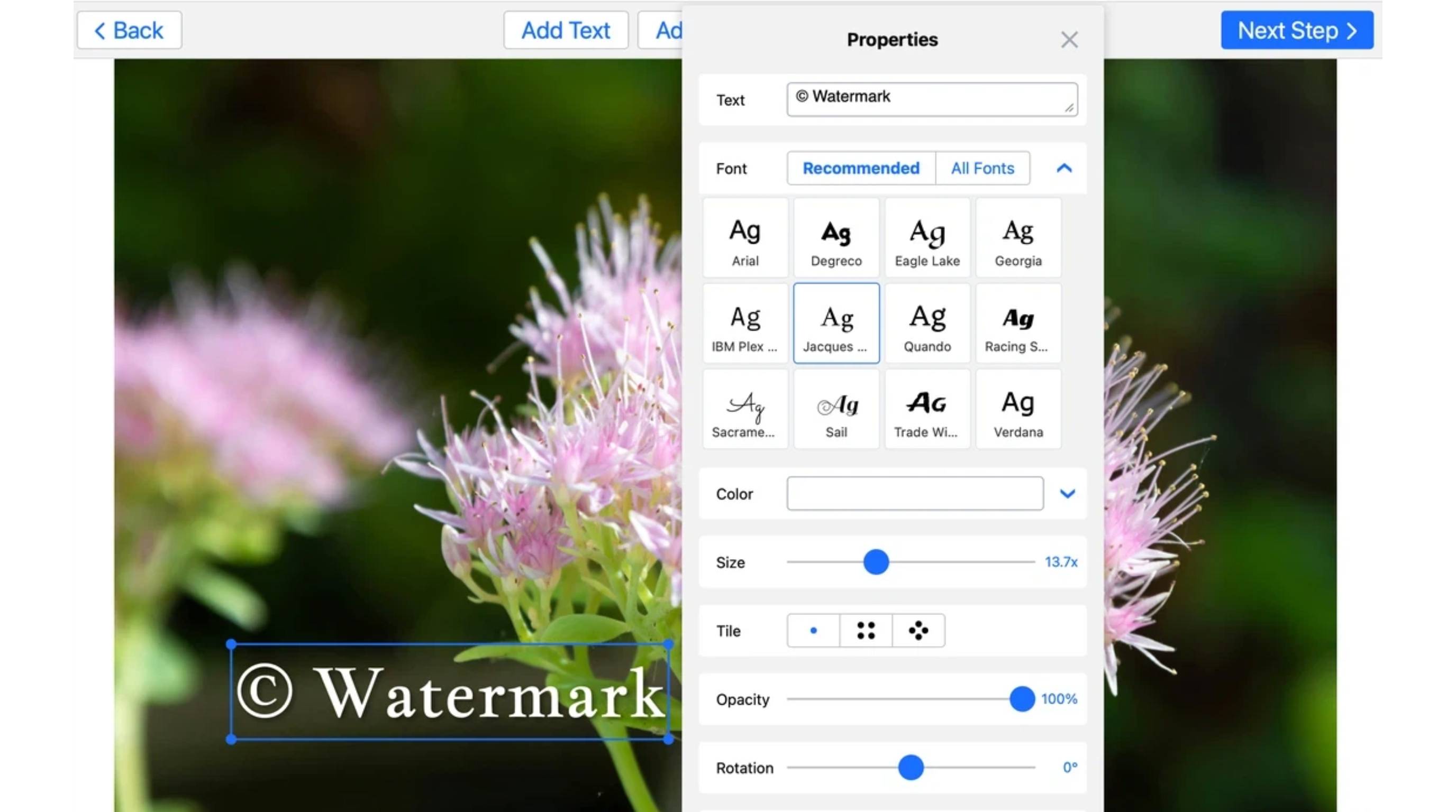
3. Using Online Watermark Tools
Pros:
-
No software installation required.
-
Quick and easy for a simple, one-off job.
-
Usually free or highly affordable for basic use.
Cons:
-
Highly limited customization options.
-
Many free tools quietly compress the image on export, which can hurt quality without you noticing right away.
Best for: Casual users watermarking a handful of images without a design background.
4. Using AI-Powered Watermark Workflows
Pros:
-
Built specifically for commercial scale.
-
Brand parameters, logo placement, and export sizing get set once.
-
Brand rules are automatically applied across an entire product or campaign batch, saving you from repeating the same clicks fifty times.
Cons:
-
Best suited to teams generating images regularly.
-
Not really worth the initial brand kit setup for just a single, one-off photo.
Best for: Ecommerce and marketing teams producing ongoing batches of branded product or campaign visuals. Designkit's bulk image editing tools handle exactly this, consistent logo placement across a full batch in one pass.
|
Method |
Speed for Batches |
Creative Control |
Best For |
|---|---|---|---|
|
Photoshop |
Slow (manual) |
Highest |
Hero images, small batches |
|
Lightroom |
Fast |
Moderate |
Large photo galleries |
|
Online tools |
Fast (one-off) |
Low |
Single, casual images |
|
AI workflows (Designkit) |
Fastest |
Moderate–High |
Ongoing ecommerce/product batches |
Apply Watermark to Photos Step by Step
If you are using standard photo editing software, the fundamental workflow remains similar. Follow these steps to watermark a photo manually.
Step 1: Choose Your Watermark Style
Logo, text, or signature, depending on what the photo is for. Product shots usually call for a logo. Portfolio or blog images often work better with a name or signature, since the person matters more than the brand there.
Step 2: Upload Your Photo and Add the Watermark
Open the image in whatever editor you're using, then bring in your watermark:
-
Upload the image you want to watermark
-
Add your logo or text as a new layer or overlay
-
Adjust the size so it stays proportional to the photo, a watermark that dwarfs the image pulls attention away from the thing you actually wanted people to look at
Step 3: Adjust Opacity and Placement
-
Keep it visible but subtle, around 20–40% opacity is a fair starting point
-
Avoid covering important details like faces or product features
-
Maintain a consistent position across your catalog or portfolio so the mark starts to feel intentional rather than random
Step 4: Export Your Watermarked Image
-
Use PNG when you need transparency in the watermark file itself
-
Use JPG for general sharing, since it keeps file sizes reasonable for web and social
-
Export at a high enough resolution that the watermark doesn't pixelate or blur once it's live
Create Branded, Logo-Ready Visuals Faster with Designkit
Photographers who need classic export watermarks are usually well served by Lightroom or Photoshop. But ecommerce and brand teams producing dozens or hundreds of product and campaign images run into a different problem: watermarking after the fact gets repetitive fast.
Designkit is built to work the other way around, baking branding into the visual set as it's generated instead of stamping it on afterward.
Worth being upfront here: Designkit isn't an invisible copyright-tracking system, and it isn't marketed as a specialist watermark-only app, it's a broader AI design agent, and watermarking is one piece of a larger asset workflow.

How to Watermark Your Photos with Designkit
Step 1: Upload Your Raw Visual Assets
Head to the "AI Photo Editor" tool and "Upload" from the Designkit home screen and select your full-resolution product or campaign photos (PNG, JPG, JPEG,HEIC, WEBP supported). Uploading original files ensures the best quality throughout the process.

Step 2: Set Your Brand Parameters
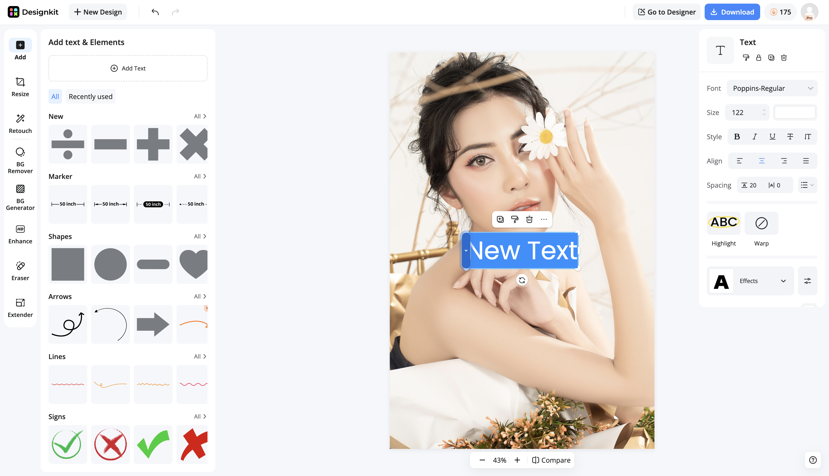
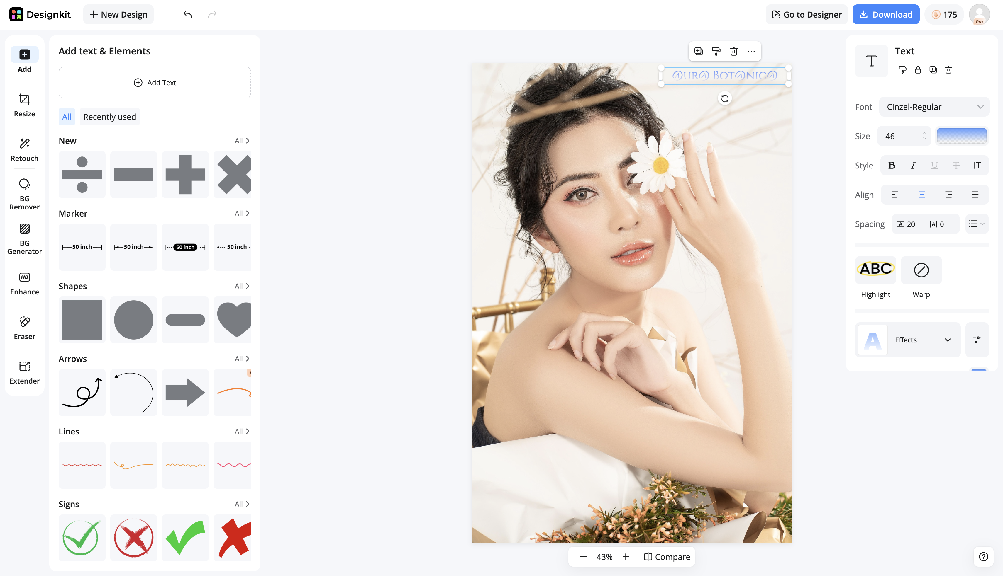
Use the "Add Text & Elements" panel on the left to click "Add Text." In the center canvas, type your watermark, such as your brand name (e.g., "AURA BOTANICA"). Then, use the styling panel on the right to adjust the Font, Size, and text properties.
Step 3: Export Your Protected Campaign Assets
Once the watermark's position and appearance are perfect, click the "Download" button in the top right. This saves your edited single photo. The editor works on one image at a time.
Designkit Features for Brand Protection
Consistent Brand Look Across Generated Visuals
Once your logo and placement are saved as a preset, every image that comes out of a batch carries the same mark, same spot, same opacity, no manual double-checking each file before it goes live. That consistency is what actually builds recognition over time; a mark that shifts slightly from photo to photo undercuts the whole point of having one.
Background and Scene Workflows for Product Images
A watermark stamped onto a flat, unedited product shot still looks like an afterthought. Designkit's background and scene tools let you generate the finished product image, proper backdrop, lighting, context, with the branding already built in, so the watermark reads as part of the shot rather than something bolted on after the fact.
Variations for Testing
Not every placement works for every product angle. Generate a few variations, different corner, different scale, different opacity, before you commit to one across your whole catalog. It's a lot faster than exporting five versions manually just to compare them side by side.
Multi-Format Export for Web, Social, and Ecommerce
Different platforms need different sizes, and a watermark placement that's perfect on a wide banner can get cropped off entirely on a square listing image. Exporting in multiple formats at once means you're not resizing and repositioning the mark by hand for every channel.
Best Practices for Watermarking Photos
Getting the balance right between protection and aesthetics is what separates a professional watermark from one that ruins the photo underneath it.
Keep Your Watermark Readable But Subtle
If someone has to squint to read it, it's too subtle to matter. If it's the first thing they notice, it's too loud. The right balance is usually narrower than people expect.
Match Your Brand Identity
Use your real colors, real fonts, the actual logo file, not a generic default thrown on at the last minute. A watermark that looks disconnected from your other branding weakens recognition instead of building it.
Use High-Quality Logo Files
A blurry, low-resolution watermark is arguably worse than no watermark at all, since it makes the whole image look unfinished. Start with a vector file or a high-resolution PNG so it scales cleanly across different photo sizes.
Place Watermarks Consistently
Pick one or two standard positions, bottom-right is common for a reason, and stick with them across your catalog or portfolio. Recognition builds through repetition, not variety.
Create Different Versions for Different Platforms
A placement that looks perfect on a wide banner can get cropped clean off a square Instagram post. Keep a couple of export variants on hand instead of relying on one file size to fit everywhere.
Common Watermark Mistakes to Avoid
Even if you are using the right tools, poorly executed watermarks can easily ruin the aesthetic and professional appeal of your images.
-
Making the Watermark Too Large: It should support the image, not take it over. If it's the first thing someone notices, it's already too big.
-
Using Low-Resolution Logos: Pixelation on the watermark undermines the professional look you were going for in the first place, it gives away that no one checked the file before uploading it.
-
Placing Watermarks Over Important Details: Faces, product features, key text, anything a viewer actually needs to see should stay clear of the mark.
-
Using Inconsistent Watermark Styles: Switching fonts, sizes, or positions from photo to photo reads as unplanned rather than intentional, even if nobody can quite say why it looks off.
-
Exporting Over-Compressed Images: Heavy compression can distort the photo and the watermark together, so it's worth checking the exported file, not just the preview.
-
Assuming a Watermark Fully Prevents Theft: It slows down the lazy version of theft. That's it. Pair it with clear licensing terms, and for anything high-value, actual registered copyright.
Final Thoughts
Mastering how to apply a watermark to photos is a fundamental skill for anyone distributing visual content online. Getting it right means balancing protection with aesthetics, readable but not overpowering, consistent but adaptable to different platforms and crop ratios. Photoshop and Lightroom remain solid choices for photographers working image by image or exporting a single gallery. For ecommerce and marketing teams generating a steady stream of product and campaign visuals, tools like Designkit's bulk image editing workflow cut the repetitive work out of applying consistent branding across a full catalog.
Frequently Asked Questions
How do I apply a watermark to a photo?
What is the easiest way to watermark photos?
For a single image, an online watermark tool gets it done in a couple of minutes. For anything involving dozens of product or campaign photos, Designkit's watermark feature applies your branding across the whole set at once instead of one at a time.
Where should I place a watermark on an image?
A bottom corner is the most common choice since it stays visible without covering the subject. For proofs or stock images meant to deter theft outright, a centered or repeating pattern works better.
Does a watermark stop people from stealing photos?
Not fully. It discourages casual, low-effort reuse and signals ownership, but it won't stop someone determined to crop or edit it out. Metadata, licensing terms, and keeping your master files are the real backup.
Should I watermark product photos?
It really comes down to where the photo lives. Amazon and most marketplaces want listing images clean, no watermark, no logo, nothing. Your own site or social feed is a different story; a small brand mark there usually helps more than it hurts.
What opacity should a watermark be?
Somewhere around 20–40% is a reasonable starting point, visible enough to read, light enough not to obscure the photo. Adjust based on the image's contrast and how busy the background is.
Can I add watermarks to multiple photos at once?
You can. Lightroom's export panel handles batch watermarking on its own, no extra plugin needed. If the batch is bigger, think a full product catalog rather than one shoot, Designkit's image editing tools are built to push the same branding across the whole set in one go.
Should I watermark photos before posting on Instagram?
Up to you, really. It's not required, and plenty of people skip it. If attribution matters to you when a post gets reposted, a light corner mark is worth adding, just check it survives the app's cropping and compression before you roll it out across your whole feed.
You May Also Like

7 Best Remove.bg Alternatives in 2026: Free & Paid Tools

Instagram Carousel: What It Is, How to Post & Create One

Nano Banana Prompts: 20+ Examples for Better AI Images

Ideogram AI Review 2026: Features, Pricing & Alternatives
Free Mac Photo Editor: 5 Tools Compared for Mac Users
How to Crop a Photo Into a Circle Online (Keep Quality)

How to Make an Image Transparent Online (AI Guide)

Pixlr Background Remover Review 2026: Features, Pricing & Alternatives

How to Fix Overexposed Photos: Recover Highlights Fast
OpenArt AI Review 2026: Features, Pricing & Alternatives

Best AI Headshot Generator: 9 Tools Compared for 2026
Best Stencil Maker Tools 2026: Turn Photos Into Stencils
Pixelbin Watermark Remover Review: Image & Video Results Tested

How to Make a Sticker on iPhone: Easy Step by Step Guide

Best AI Logo Generator in 2026: 10 Tools Compared

How to Turn a Photo Into a Cartoon: A Beginner-Friendly Guide
Landscape vs Portrait: Key Differences & Best Uses in 2026
How to Remove Watermark From Photo: AI, Photoshop & More
How to Fix Pixelated Photos: Photoshop, AI Tools & Tips

Bing Image Creator: How It Works, Features, Uses & Alternatives
How to Remove People from Photos with AI: A Step-by-Step Guide

How to Increase Image Resolution: AI, Photoshop & PPI
How to Add Text to a Photo: 8 Tips for Better Results
How to Fix Grainy Photos: Easy Ways to Clear Images

Creative Profile Picture Ideas for Every Style and Platform

Evoto AI Review 2026: Features, Pricing, Pros & Cons

Pixlr Photo Editor Review: Features, Pricing & Alternatives

Best AI Image Extender Tools in 2026: Expand Photos with AI

How to Make a Collage on iPhone: Easy Guide for 2026
How to Sharpen an Image in Photoshop (Smart Sharpen and Unsharp Mask)
Best Image Background Remover Tools in 2026: AI Tools Compared
How to Make Transparent Background in Paint: Step-by-Step Guide
How to Resize an Image: Best Methods, Tools & Quality Tips

Best AI Image Generator Tools in 2026: Top AI Platforms Compared

Remove.bg Review 2026: Features, Pricing & Is It Worth It?

Luminar Neo Photo Editor Review 2026: AI Features, Price & Pros

How to Post Multiple Photos on Instagram (2026 Guide)

25 Facebook Cover Photo Ideas for Personal & Business Pages

What Is a PFP? Meaning, Examples & How to Create One
Can You Edit an Instagram Post After Posting?

11 Best Canva Alternatives in 2026 for AI Design & Marketing

8 Best Midjourney Alternatives in 2026: Features, Pricing & Comparison
How to Restore Old Photos: AI Tools, Tips & Best Methods

Pixelcut AI Review 2026: Features, Pricing, Pros, Cons & Alternatives
How to Apply Watermark to Photos: Methods, Tips & AI Tools
How to Remove a Background in Illustrator: 4 Easy Methods

How to Change Background Color on Instagram Story (Easy Guide)

8 Best AI Poster Generators in 2026: Create Posters Faster with AI
10 Best AI Image Enhancers in 2026: Tested & Compared

10 Best AI Image Editors in 2026: Features, Pricing & Comparison

7 Best AI Background Changer in 2026: Remove & Replace Photo Backgrounds
Luminar Neo vs Lightroom: Features, Pricing & Comparison 2026

Kittl Review 2026: Is It Worth It? Features & Pricing
How to Make a Blurry Image Clear: 5 AI & Manual Ways

How to Remove Background on iPhone: 5 Easy Methods (2026)
Photoroom Background Remover Review 2026: Features & Alternatives
How to Remove Background in Canva: A Step-by-Step Guide
How to Remove Background in GIMP: Beginner-Friendly Guide

Funny Dog Memes to Try: Doge Meaning and 10 Original Ideas

Back to School Checklist 2026: Supplies, Timeline, and Planning

Recraft AI Review 2026: Features, Pricing, Pros, Cons & Alternatives

How to Make an Image Transparent in Google Slides: Opacity & Background Removal

VanceAI Photo Enhancer Review: Features, Pricing & Alternatives in 2026

What Does Emojify Mean? Text, Photos, & Emoji Art Explained
Top 8 Online Background Removers for Ecommerce Photos (2026)
How to Remove Background in Photoshop: 7 Easy Methods
6 Best AI Image Upscalers 2026: Tools Tested & Compared

Project Indigo Review: Is It Better Than iPhone Camera?
How Big Is an 8x10 Photo? Size, Pixels & Frame Guide

How Big Is a 4x6 Photo? Dimensions, Pixels & Printing Tips

Picsart AI Review: Features, Pricing, Pros, Cons & Alternatives

Lovart AI Review: AI Design Agent Features, Pricing & Alternatives

Fotor AI Image Generator Review: Features, Pricing & Alternatives

How to Add Emoji to Photo Online for Free

Emoji Wallpaper Ideas & How to Make One Online (2026)

Minimalist Poster Design: How to Make a Clean Poster (2026)

How to Make a Custom Poster That Is Ready to Print

Instagram Image Size Guide 2026: Post, Reel, Story & Carousel Specs
LinkedIn Image Size Guide: Profile, Post & Banner Dimensions

YouTube Profile Image Size: Best Dimensions & Safe Area 2026

How to Edit Amazon Product Photos That Boost Sales Fast
Protect Your Images While Building Your Brand
Understanding how to apply watermark to photos ensures your creative assets are secure and properly attributed. With tools like Designkit, you can automate your branding process, protect your portfolio, and scale your content creation effortlessly.