
Instagram Carousel: What It Is, How to Create & Post One
An Instagram carousel is one feed post with up to 20 swipeable photos or videos. This guide covers the sizes and specs that matter, plus how to structure, make, and post a carousel without crop mistakes.

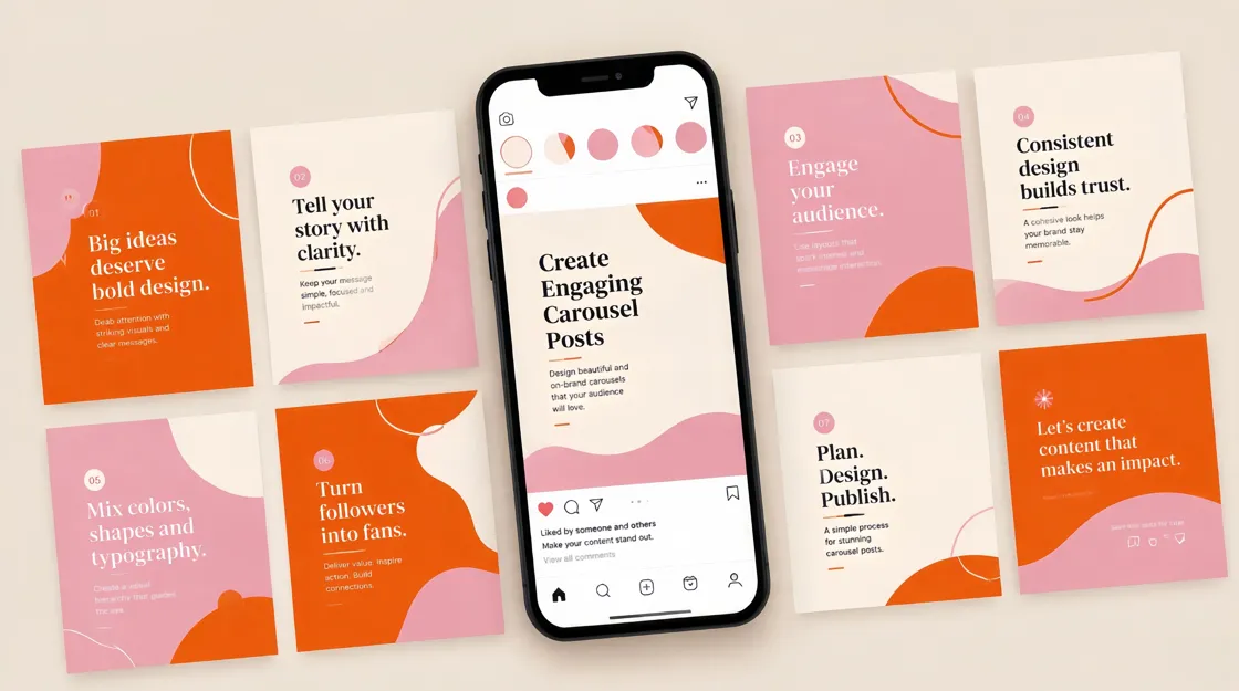
An Instagram carousel is one feed post with up to 20 swipeable photos, videos, or both. On mobile, viewers swipe left through the sequence, and dots under the post show where they are in the set. You choose the order when you publish, so the way someone moves through the post is part of how they experience your content.
Creators reach for carousels when a single image cannot hold the full idea. You might teach in stages, show more of a product, or tell a short visual story without cramming everything into one frame. That only works when the slides connect, though. If each frame feels unrelated, people stop swiping and the post reads like a pile of images instead of one idea.
Videos inside a carousel stay in the feed and are not treated as Reels, which matters when you want motion inside a post but do not need the Reels discovery flow. This guide covers the sizes and specs that matter, how to structure and make a carousel, and how to post it without common crop mistakes. Near the end, you will also see how Designkit's Carousel Maker can help once your message and sequence are already clear.
Key Takeaways
An Instagram carousel packs up to 20 photos or videos into one swipeable feed post.
Use it when the idea needs a short sequence, not when one clear image already does the job.
Keep the same aspect ratio on every slide. The first slide sets the crop for the rest.
Give each slide one job. Cut any frame that repeats the same point.
After you publish, you can reorder or remove slides. You cannot add new media to the same post.
Instagram Carousel Size and Specs
Before you design anything, pick one orientation and stick with it. Instagram uses the first slide to set the crop for the entire post, so every frame needs to match. If a later slide uses a different ratio, Instagram crops it to fit, and important text or product details can get cut off without you noticing until after publish.
Specification | Practical guidance |
|---|---|
Maximum slides | Up to 20 photos or videos |
Portrait | 1080 × 1350 px (4:5), usually best for feed space |
Square | 1080 × 1080 px (1:1), clean for product grids and graphics |
Landscape | About 1080 × 566 px (1.91:1); use only when width matters |
Aspect ratio | One ratio for every slide |
Media | Photos, videos, or a mix |
Video length | Keep each video slide short; many creators stay at or under about 60 seconds per slide |
Music | Eligible posts can add a track that plays while people swipe |
The first slide sets the cover and the crop
Portrait usually takes the most space in the mobile feed, so it is a strong default when you want attention. Square works well when your layout is simple and symmetrical. Landscape can look small on phones, though, so save it for content that genuinely needs width, such as a wide comparison or a panoramic shot.
Build the cover first, export the rest of the set to match, and preview the full sequence before upload. A slide that looks fine on its own can still get cropped once Instagram applies the first slide's ratio to the whole post.
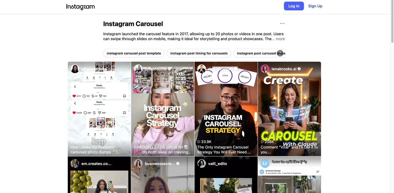
Source: Instagram
Instagram Carousel vs Single Image vs Reel
Choosing a format is less about picking the newest option and more about matching the post to the idea. A quote or one-line announcement usually lands faster as a single image because the viewer does not need to swipe to understand it. Reels fit content where watching movement or hearing audio is the point, like a quick product demo that would feel flat as static frames. In that case, a carousel may still be the better fit when you need more explanation room without building a full video workflow.
Format | Best for | Main advantage | Choose it when |
|---|---|---|---|
Single image | Quick announcements or one strong visual | Fast to understand | One frame already carries the message |
Carousel | Guides, product detail, comparisons, short stories | Information unfolds across slides | The topic needs a sequence |
Reel | Motion-led demos and discovery | Combines motion and audio | Movement or audio is the main point |
Carousels also fit tutorials, product walkthroughs, and before-and-after posts when each slide adds something new. If one image already says enough, or motion carries the point better as a Reel, use those formats instead. More slides are not better by default.
How to Structure an Instagram Carousel That People Want to Swipe
A strong carousel reads as one connected post from the first swipe to the last. Think of it as a short arc: the cover states what the viewer will get, the middle carries the information, and the final slide closes with a takeaway or next step that fits the topic. When those parts work together, the post feels like one idea instead of a folder of unrelated graphics.
Start with one clear promise
Write the topic as a specific payoff before you open a design tool. "7 Profile Mistakes That Quietly Cost You Followers" gives viewers a reason to keep swiping because they know what they will get if they stay. "Instagram Tips" does not, because it is too vague to create curiosity. Once you have a clear promise, every slide should support it rather than introducing a new topic halfway through the post.
Plan the slide order before you design
Outline the sequence in plain language before you touch a template. Most carousels need a cover that states the topic, a middle section that carries the main information, and a final slide that closes the loop. A product post might move from introduction to details to use case to CTA, while an educational post might move from problem to explanation to takeaway. The exact shape can change, but someone swiping through should still feel a clear direction.
One job per slide
Each frame should carry one main point. When a slide starts to feel crowded, split the information across two slides instead of shrinking the type or packing the layout. Carousels are read on phones, so dense text on a single frame often causes people to swipe away before they reach the useful part of the post.
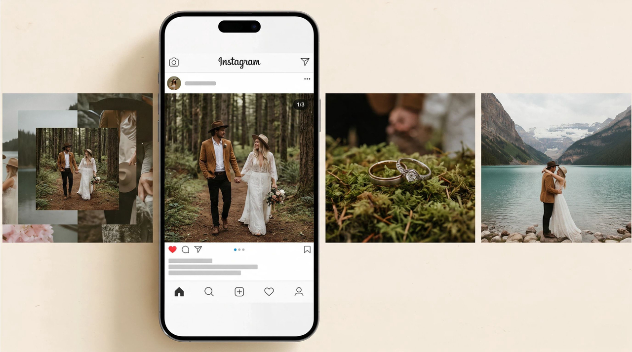
Make the first slide earn the swipe
The cover has a few seconds to explain what the post is about and why someone should keep going. Put the headline or hook front and center, and save supporting detail for later frames. Specific language about a problem, an outcome, or a number of tips usually pulls more swipes than a generic label.
Keep the set visually connected
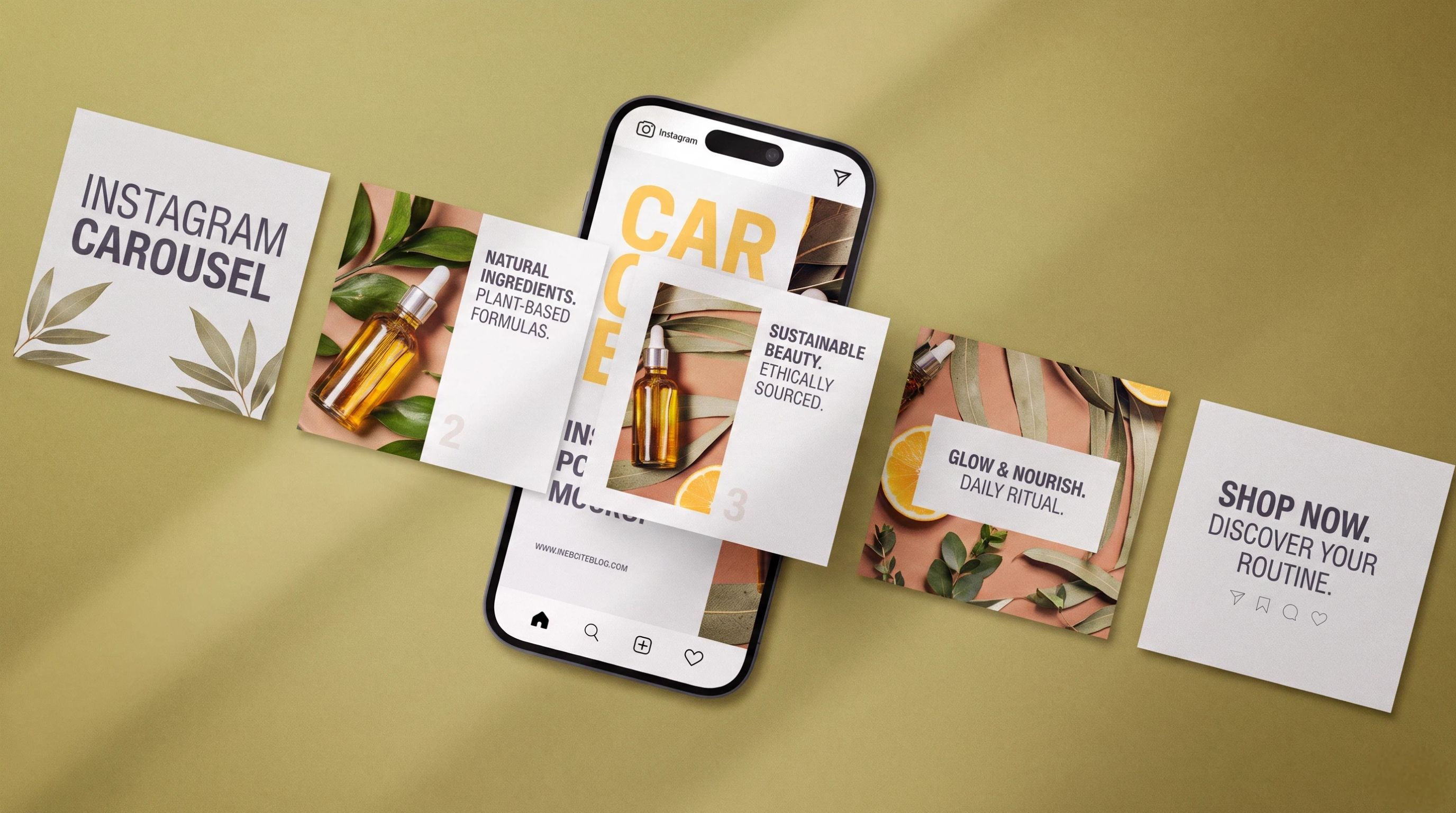
Consistency helps viewers recognize that the slides belong together. Keep the type, spacing, and color treatment steady across the set so the post feels intentional even when the content changes from slide to slide. Layouts can shift, but the visual system should stay recognizable from cover to close.
Design for a phone screen
Most people will see your carousel on a small screen, so readability matters more than desktop polish. Use large type, strong contrast, and enough empty space around the main message. Before you export, swipe through the full set at mobile size and check that nothing important sits too close to the edge or gets lost in a busy background.
How to Make an Instagram Carousel
The creation process goes much faster when the message and slide order are already clear. Jumping straight into design without that plan often produces attractive frames that do not add up to a coherent post.
Step 1: Define the goal
Decide what the carousel should achieve before you choose images or write slide copy. That goal might be education, product explanation, storytelling, or driving a save or profile visit. It tells you what belongs in the post and what you should cut, and it also gives you something concrete to measure after publishing.
Step 2: Plan the slide sequence
Write one line for each slide before you open your design tool. For educational content, that line might move from the main problem to the explanation to the takeaway. For a product showcase, it might move from introduction to the detail that matters most to the next step you want the viewer to take. Remove any line that does not move the viewer toward the final point.
Step 3: Choose the visual direction
Pick the aspect ratio and decide how much text each slide can hold before you design frame one. If you need supporting visuals, Designkit's AI image generator can help you keep the set on one visual track instead of mixing unrelated styles slide by slide.
Step 4: Design the slides
Build from the outline rather than designing each frame in isolation. Keep the cover sharp, the middle easy to scan, and the hierarchy obvious on a phone screen. Decorative elements are fine, but they should not make the main point harder to read.
Step 5: Review the full swipe
Read the set the way a stranger would. Does the cover create enough curiosity to swipe? Do the transitions make sense? Does the last slide deliver what the cover promised? An Instagram mockup can help you catch crop issues before upload, especially around the cover and any text near the edges.
How to Post a Carousel on Instagram
Posting a carousel is straightforward, but small mistakes show up quickly in the feed. Mixed aspect ratios, weak cover crops, and the wrong slide order are the ones we see most often, and they are usually fixable with a short check before you hit publish.
Step 1: Prepare the final slides
Export the full set at one aspect ratio and review spelling, image quality, and order. Preview the cover especially carefully because it sets the crop for every slide that follows. If anything looks off at this stage, fix it before upload rather than hoping Instagram will crop it kindly.
Step 2: Start a new post
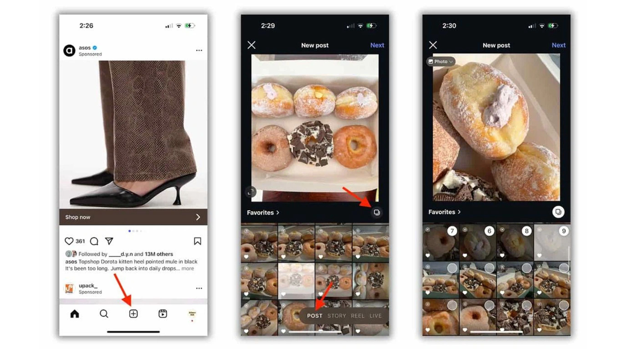
Open Instagram, tap +, choose Post, and select multiple photos or videos from your device. Pick files in the order you want people to see them. You can add up to 20.
Step 3: Arrange the slides
Put your strongest cover first, then reorder the rest until the sequence still reads cleanly as a tutorial, story, or product walkthrough. If a file needs resizing before upload, use Designkit's Instagram image resizer.
Source: Sprout Social
Step 4: Review the post
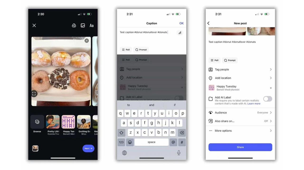
Swipe through the full set inside Instagram before you publish. Look for cut-off text, weak transitions, and slides that repeat the same point. Add music here only if the post supports it and the track actually helps the visuals rather than distracting from them.
Step 5: Add publishing details
Write a caption that adds context instead of copying the slides line for line. Add tags or location when they help discovery, and fill in alt text where you can so important information is not locked only inside the image.
Step 6: Publish, then measure
Share the post when the sequence reads cleanly. After it has had time to collect data, compare results to the goal you set before designing.
Source: Sprout Social
After publishing, Instagram lets you reorder slides or remove ones you no longer want. You still cannot add new media to that post, though. If you need an extra slide, create a new carousel.
How to Measure Instagram Carousel Performance
A carousel is easier to evaluate when you judge it against the job it was built to do. A post designed to teach may succeed because people save it, while a product-focused carousel may matter more for profile visits or other actions than for likes alone.
Goal | Useful metric | What it can signal |
|---|---|---|
Education | Saves | People want to revisit it |
Shareable advice | Shares | It felt worth passing on |
Discovery | Profile visits | Curiosity about the account |
Growth | Follows | The post converted interest |
Product promotion | Clicks or other actions | Commercial interest |
When you review performance, compare similar posts with each other rather than treating every format as a direct competitor. An educational carousel is easier to read against other educational carousels than against a product launch post. Over time, look for patterns in topics, hooks, slide length, and closing lines across the posts that performed better.
It also helps to look beyond the headline number. Strong saves often mean the middle slides delivered useful detail. Higher shares can point to a relatable hook or a takeaway people wanted to pass on. So compare the opening slide, structure, and CTA across your stronger and weaker posts, then carry the patterns that repeat into the next carousel.
Create Better Instagram Carousels With Designkit
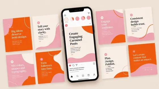
Once your outline is ready, Designkit's Carousel Maker in Skills helps you turn that plan into a connected slide set instead of designing each frame from scratch. It is most useful when you already know the message and slide order and need the visuals to match.
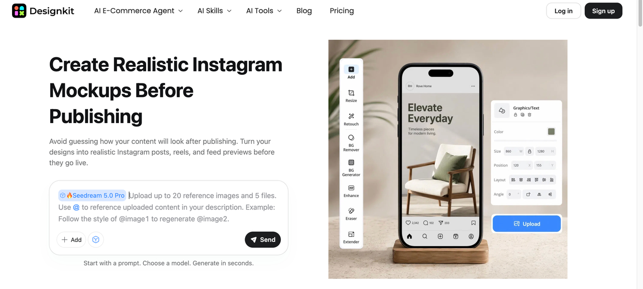
3 Step Designkit Workflow for Instagram Carousel Creation
Step 1: Open Carousel Maker
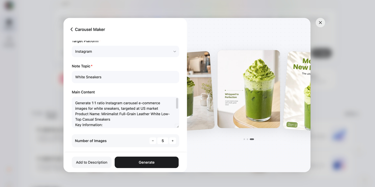
Go to Designkit, open Skills, and select Carousel Maker to start building the full sequence in one workflow.
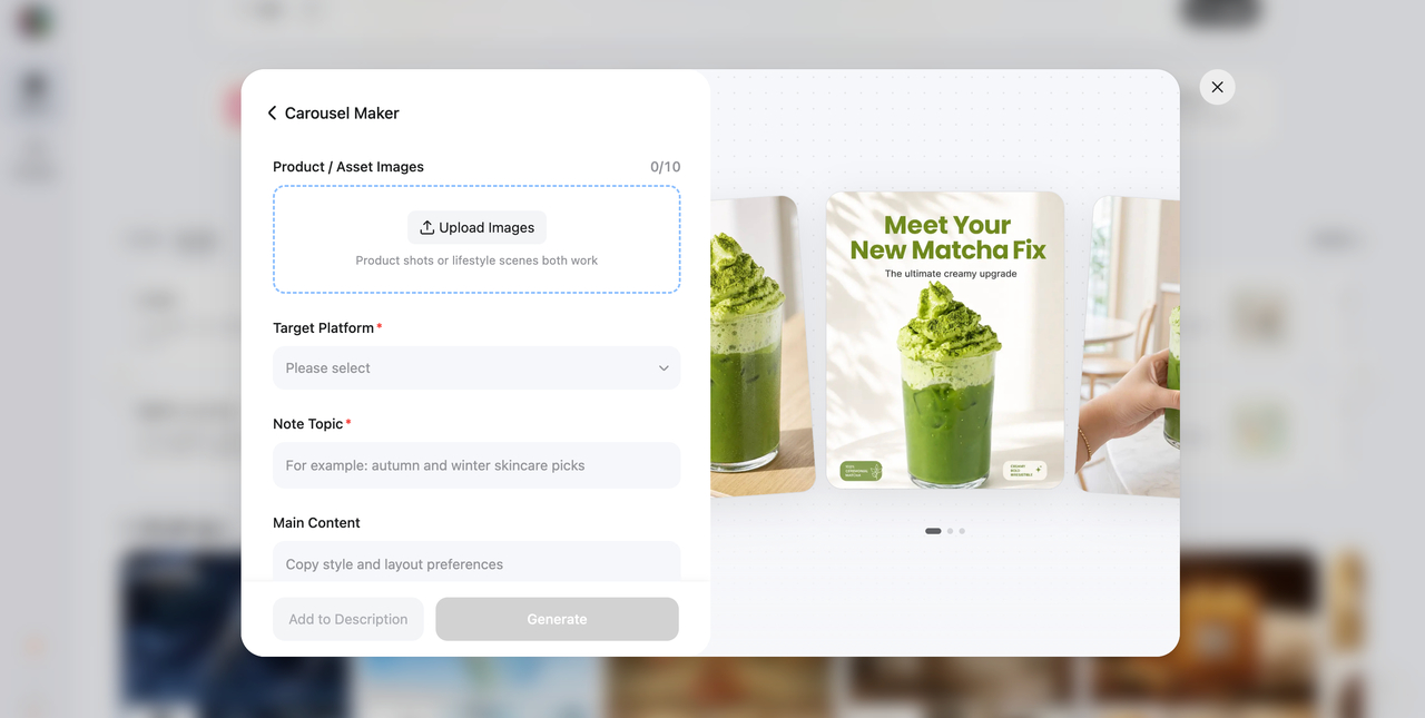
Step 2: Add your content direction
Enter your topic and audience first, then set the visual direction and slide order. Add the closing prompt last so the final frame matches the rest of the post.
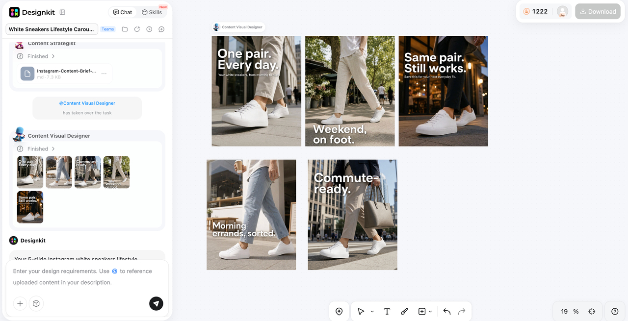
Step 3: Review and prepare
Check order, readability, and consistency on a phone screen. Refine the set, then export for Instagram once the full swipe reads cleanly.
Design Instagram Carousels Now
If a photo needs better framing before you assemble the set, use Designkit's image cropper.
Instagram Carousel Best Practices
These habits help once the structure is in place. They focus on common mistakes rather than repeating the slide-planning steps above.
Lead with the viewer
Open on the viewer's problem or the result they want. Branding can stay visible, but it should not take over the cover. A post that leads with a clear viewer benefit gives people an immediate reason to swipe. A cover that only promotes your company name usually does not.
Stay useful without packing the frame
Short lines read better on a phone. If a slide needs a paragraph, it probably needs another slide. Remove details that do not support the main promise so the carousel stays easy to scan from cover to close.
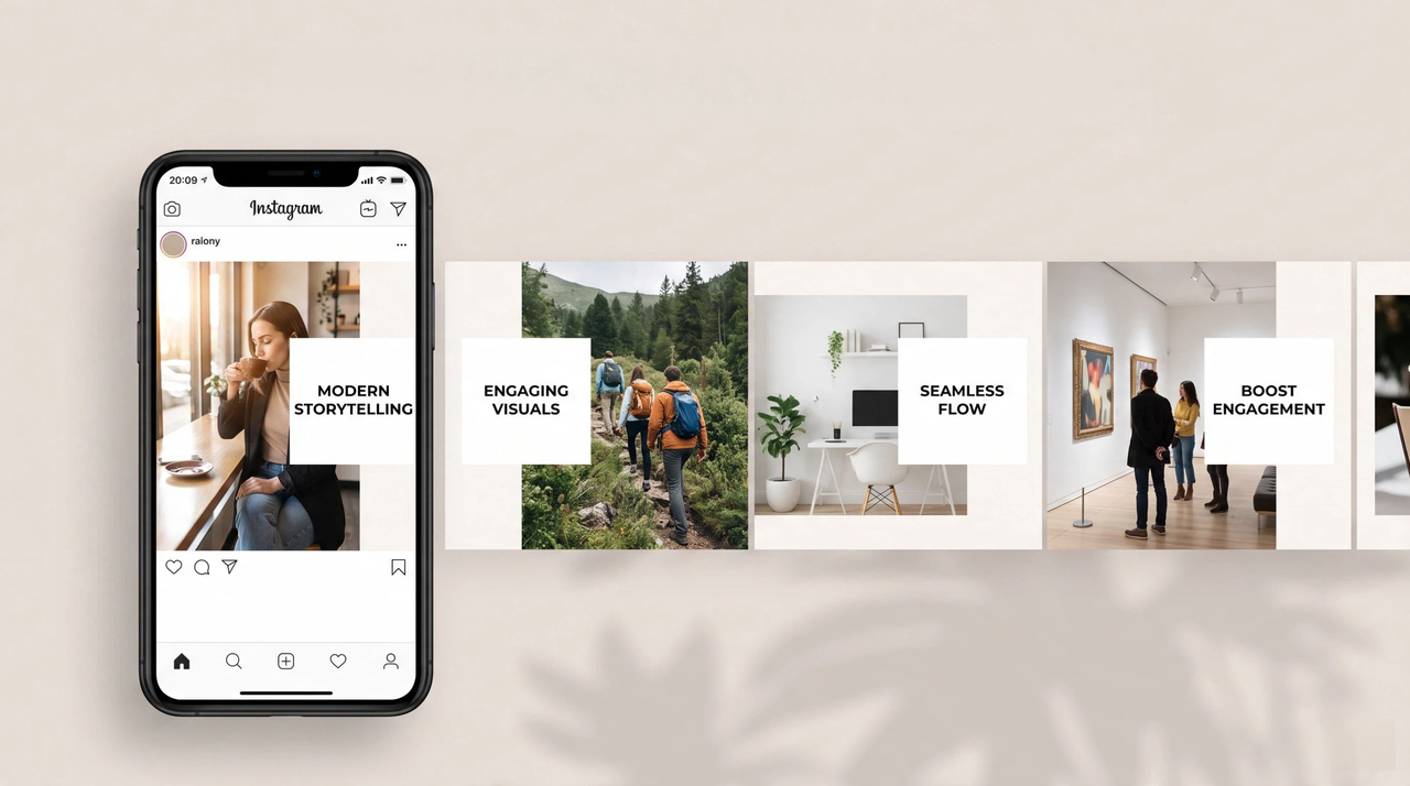
Show examples
A weak headline next to a stronger one teaches faster than another abstract tip. Product brands can show real use instead of relying only on broad claims about quality or value.
Design for swiping, not just individual slides
Treat the carousel as one connected experience rather than a set of standalone graphics. Each slide should build on what came before, and the final frame should give the viewer a clear conclusion or action. Subtle layout changes can keep the set from feeling repetitive while the type and spacing stay consistent.
Match the CTA to the content
The closing line should match what the viewer just read. Advice posts can ask for a save. Product posts can point to the profile or product page. An educational carousel that ends with an unrelated sales line usually feels disconnected, though, so keep the final ask aligned with the post.
Test a few formats
Try a short checklist one week and a product walkthrough the next. Compare saves, shares, and profile visits over time, then keep the formats your audience actually responds to.
Conclusion
An Instagram carousel works when multiple slides help someone understand one idea better than a single frame would. Get the size right, plan a short sequence, make the cover earn the swipe, and close with a next step that fits the post. After publishing, measure against the goal you set instead of looking at likes alone. When the outline is already clear and you need the visuals faster, Designkit's Carousel Maker can also help you build the set before upload.
Frequently Asked Questions
Can I add music to an Instagram carousel?
Should every slide have text?
No. Use text when it clarifies the point. A strong visual can carry the slide on its own.
How do I choose the first image?
Choose the slide that states the topic fastest. Check the crop before you lock the rest of the set to the same ratio.
How can I make slides look consistent?
Keep the same type, spacing, and color treatment across the set so the post reads as one piece of content.
What belongs on the last slide?
Restate the takeaway and give one next step that matches the post, such as a save prompt, profile visit, or product link.
How many slides should I use?
Instagram allows up to 20. Add a slide only when it introduces something new. Many strong posts use far fewer.
Can I edit a carousel after posting?
You can reorder or remove slides. You cannot add new media to the same post.
How can businesses use carousels for products?
Answer buyer questions across the sequence, then point to the next step on the final slide.
You May Also Like
Remove.bg Shutting Down Dec 1, 2026: What Users Are Saying

7 Best Remove.bg Alternatives in 2026: Free & Paid Tools
Instagram Carousel: What It Is, How to Post & Create One
Nano Banana Prompts: 20+ Examples for Better AI Images

Ideogram AI Review 2026: Features, Pricing & Alternatives
Free Mac Photo Editor: 5 Tools Compared for Mac Users
How to Crop a Photo Into a Circle Online (Keep Quality)

How to Make an Image Transparent Online (AI Guide)
Pixlr Background Remover Review 2026: Features, Pricing & Alternatives

How to Fix Overexposed Photos: Recover Highlights Fast

OpenArt AI Review 2026: Features, Pricing & Alternatives

Best AI Headshot Generator: 9 Tools Compared for 2026
Best Stencil Maker Tools 2026: Turn Photos Into Stencils
Pixelbin Watermark Remover Review: Image & Video Results Tested
How to Make a Sticker on iPhone: Easy Step by Step Guide

Best AI Logo Generator in 2026: 10 Tools Compared
How to Turn a Photo Into a Cartoon: A Beginner-Friendly Guide
Landscape vs Portrait: Key Differences & Best Uses in 2026

How to Remove Watermark From Photo: AI, Photoshop & More
How to Fix Pixelated Photos: Photoshop, AI Tools & Tips

Bing Image Creator: How It Works, Features, Uses & Alternatives
How to Remove People from Photos with AI: A Step-by-Step Guide
How to Increase Image Resolution: AI, Photoshop & PPI

How to Add Text to a Photo: 8 Tips for Better Results
How to Fix Grainy Photos: Easy Ways to Clear Images

Creative Profile Picture Ideas for Every Style and Platform

Evoto AI Review 2026: Features, Pricing, Pros & Cons
Pixlr Photo Editor Review: Features, Pricing & Alternatives
Best AI Image Extender Tools in 2026: Expand Photos with AI
How to Make a Collage on iPhone: Easy Guide for 2026
How to Sharpen an Image in Photoshop (Smart Sharpen and Unsharp Mask)
Best Image Background Remover Tools in 2026: AI Tools Compared
How to Make Transparent Background in Paint: Step-by-Step Guide
How to Resize an Image: Best Methods, Tools & Quality Tips

Best AI Image Generator Tools in 2026: Top AI Platforms Compared

Remove.bg Review 2026: Features, Pricing & Is It Worth It?

Luminar Neo Photo Editor Review 2026: AI Features, Price & Pros

How to Post Multiple Photos on Instagram (2026 Guide)
25 Facebook Cover Photo Ideas for Personal & Business Pages

What Is a PFP? Meaning, Examples & How to Create One
Can You Edit an Instagram Post After Posting?

11 Best Canva Alternatives in 2026 for AI Design & Marketing

8 Best Midjourney Alternatives in 2026: Features, Pricing & Comparison
How to Restore Old Photos: AI Tools, Tips & Best Methods

Pixelcut AI Review 2026: Features, Pricing, Pros, Cons & Alternatives
How to Apply Watermark to Photos: Methods, Tips & AI Tools
How to Remove a Background in Illustrator: 4 Easy Methods
How to Change Background Color on Instagram Story (Easy Guide)

8 Best AI Poster Generators in 2026: Create Posters Faster with AI
10 Best AI Image Enhancers in 2026: Tested & Compared
10 Best AI Image Editors in 2026: Features, Pricing & Comparison

7 Best AI Background Changer in 2026: Remove & Replace Photo Backgrounds
Luminar Neo vs Lightroom: Features, Pricing & Comparison 2026
Kittl Review 2026: Is It Worth It? Features & Pricing

How to Make a Blurry Image Clear: 5 AI & Manual Ways
How to Remove Background on iPhone: 5 Easy Methods (2026)
Photoroom Background Remover Review 2026: Features & Alternatives
How to Remove Background in Canva: A Step-by-Step Guide
How to Remove Background in GIMP: Beginner-Friendly Guide

Funny Dog Memes to Try: Doge Meaning and 10 Original Ideas
Back to School Checklist 2026: Supplies, Timeline, and Planning
Recraft AI Review 2026: Features, Pricing, Pros, Cons & Alternatives
How to Make an Image Transparent in Google Slides: Opacity & Background Removal

VanceAI Photo Enhancer Review: Features, Pricing & Alternatives in 2026

What Does Emojify Mean? Text, Photos, & Emoji Art Explained
Top 8 Online Background Removers for Ecommerce Photos (2026)
How to Remove Background in Photoshop: 7 Easy Methods
6 Best AI Image Upscalers 2026: Tools Tested & Compared
Project Indigo Review: Is It Better Than iPhone Camera?
How Big Is an 8x10 Photo? Size, Pixels & Frame Guide

How Big Is a 4x6 Photo? Dimensions, Pixels & Printing Tips
Picsart AI Review: Features, Pricing, Pros, Cons & Alternatives

Lovart AI Review: AI Design Agent Features, Pricing & Alternatives

Fotor AI Image Generator Review: Features, Pricing & Alternatives

How to Add Emoji to Photo Online for Free

Emoji Wallpaper Ideas & How to Make One Online (2026)
Minimalist Poster Design: How to Make a Clean Poster (2026)

How to Make a Custom Poster That Is Ready to Print
Instagram Image Size Guide 2026: Post, Reel, Story & Carousel Specs
LinkedIn Image Size Guide: Profile, Post & Banner Dimensions
YouTube Profile Image Size: Best Dimensions & Safe Area 2026

How to Edit Amazon Product Photos That Boost Sales Fast
Make Every Instagram Carousel More Engaging
Plan your slides first. Use Designkit's Carousel Maker in Skills to turn your outline into polished carousel visuals.