
Generate Typography Posters from Text and Font Ideas
Turn quotes and words into clean, editable typography posters with balanced fonts and clear layout.
Turn Words into Typography Poster Designs
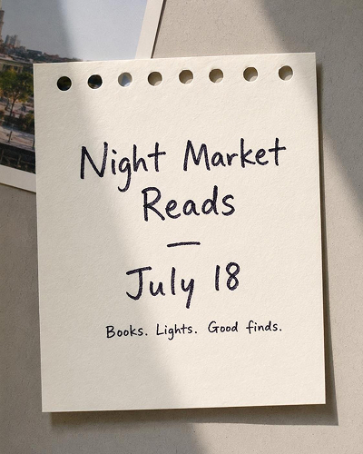
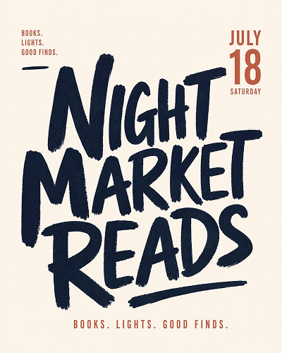
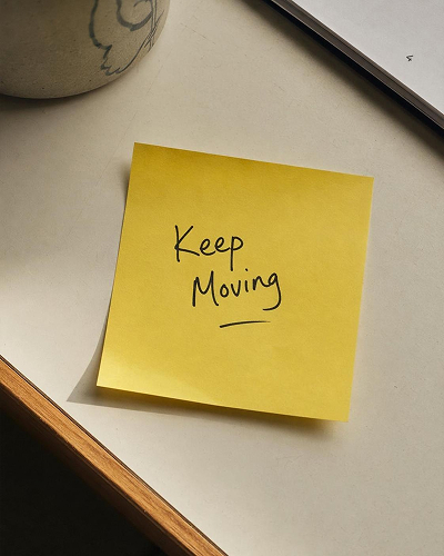
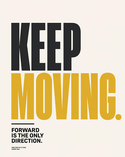
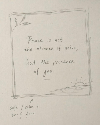
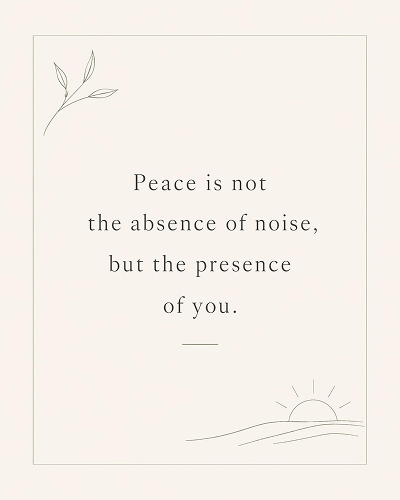
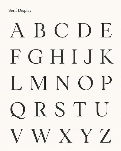
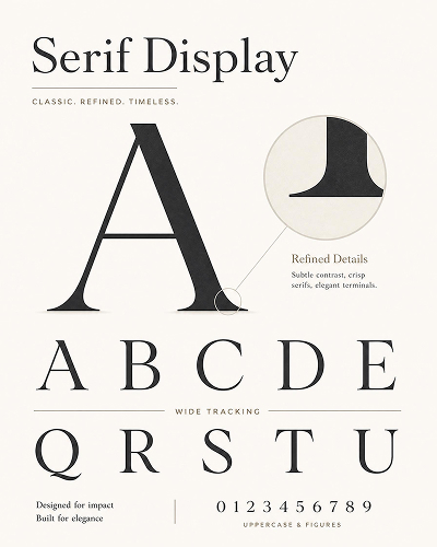
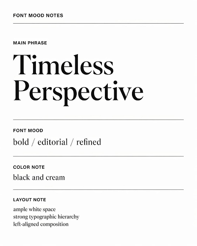
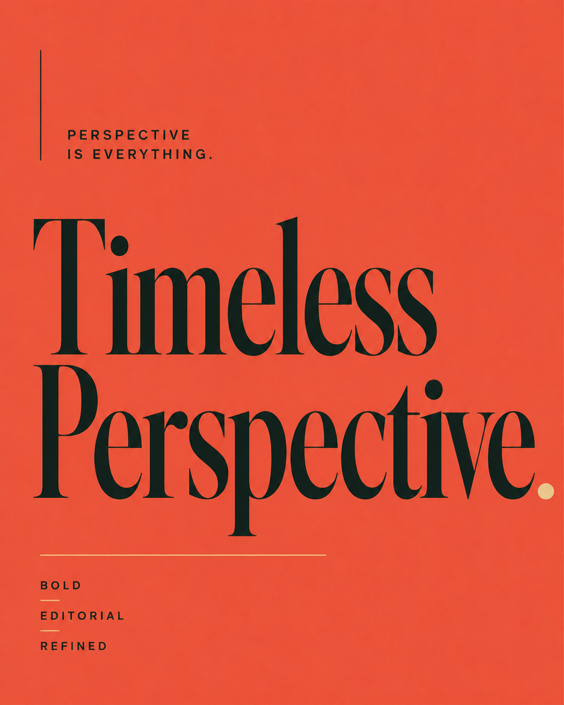
Choose a Typography Poster Style and Generate Your Own
Start from a text-led style, adjust the wording and look, then generate a typography poster in the workspace.
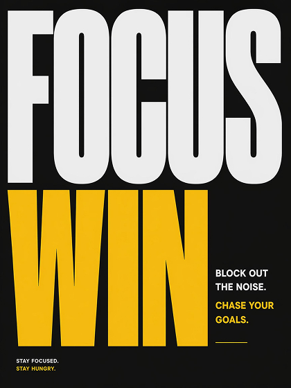
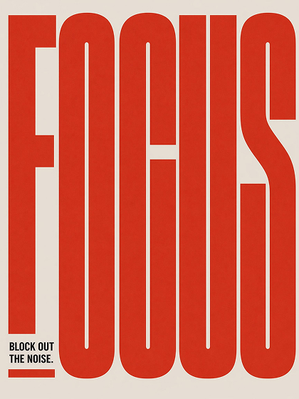
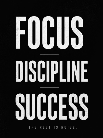
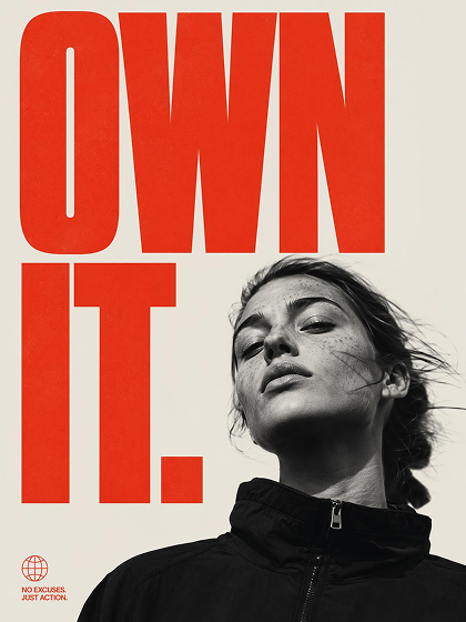
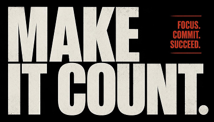
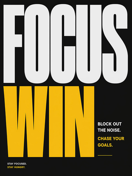 Quote Poster
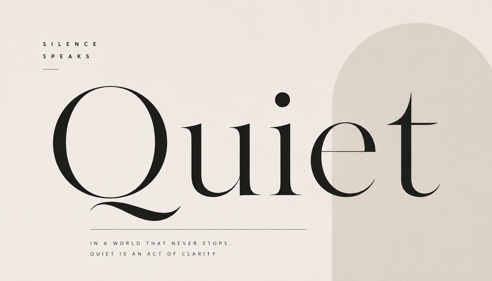
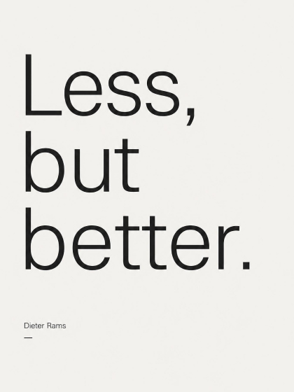 Font Poster
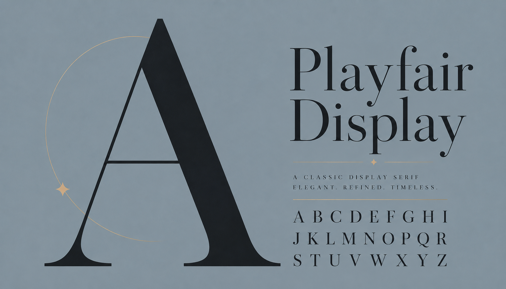
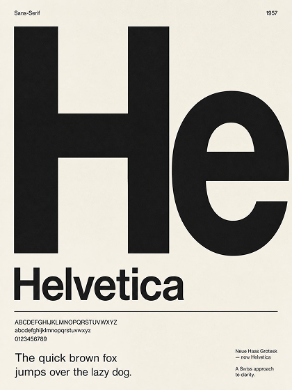 Typeface Poster
How to Create a Typography Poster With AI
Choose a Typography Poster Style
Pick a quote, font, or event typography style. The AI uses the selected style to guide the first layout, type scale, and visual rhythm.
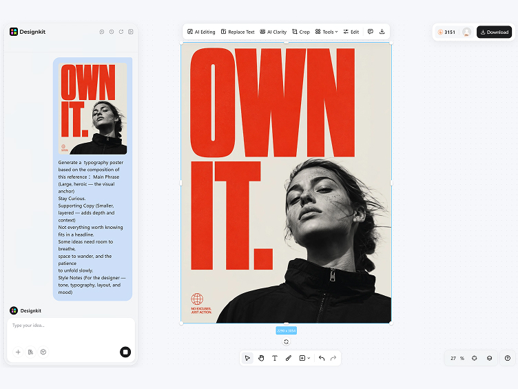
Add Your Poster Text
Enter the words you want to feature. The AI reads the text length and meaning, then shapes line breaks, spacing, and hierarchy around it.
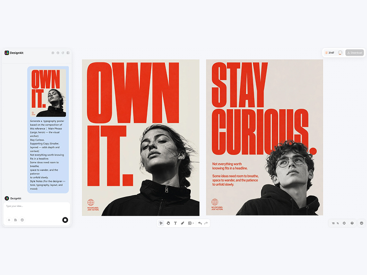
Generate, Edit and Export
Generate poster options, then adjust the wording, font direction, or layout balance in the workspace. When the design is ready, export as PNG for print or digital use.
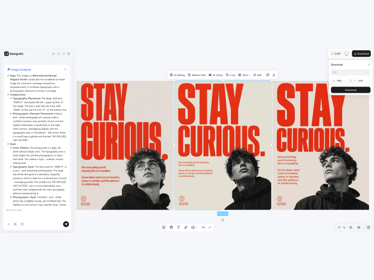
Make Typography Posters with Clear Type Logic
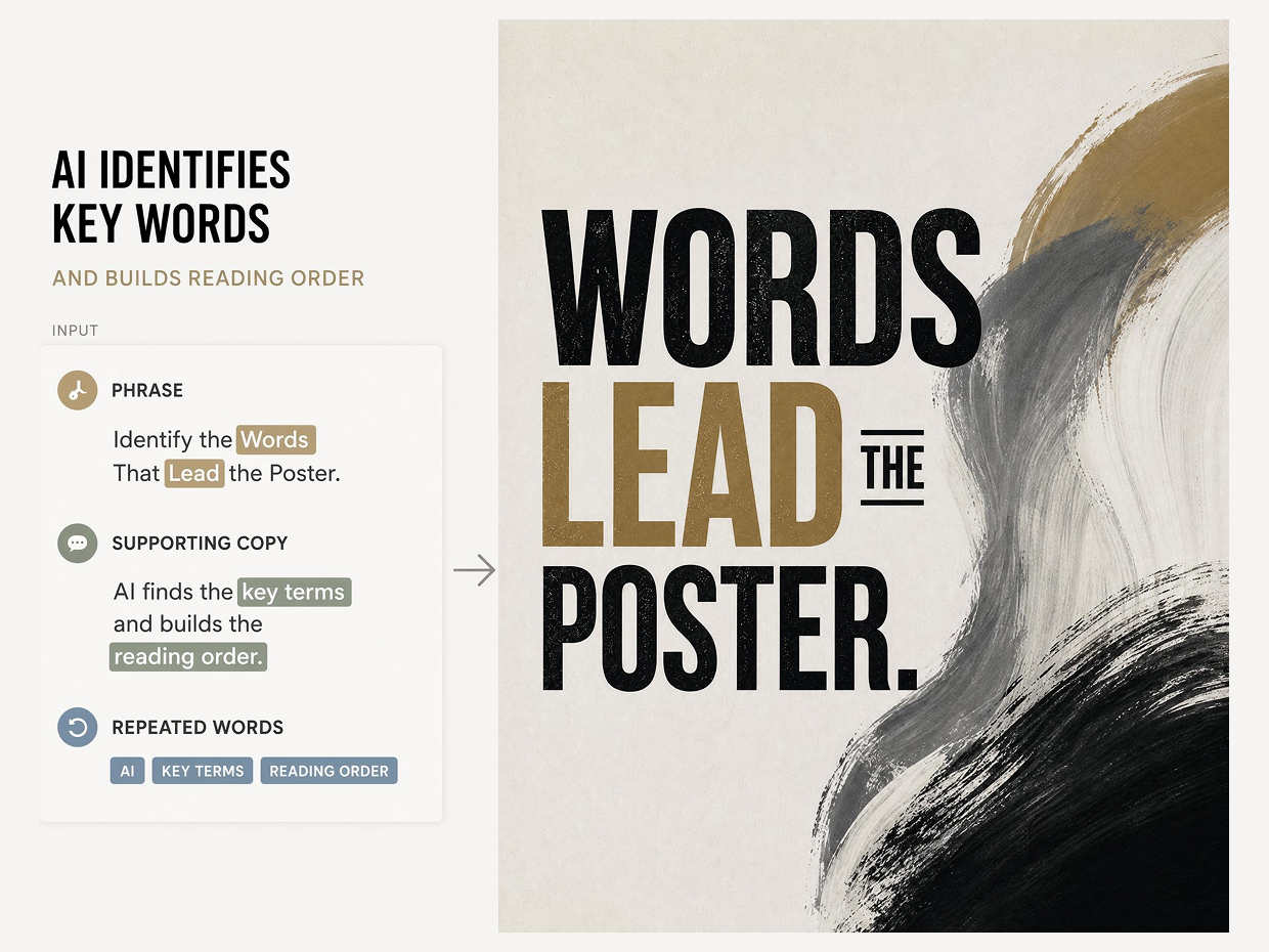
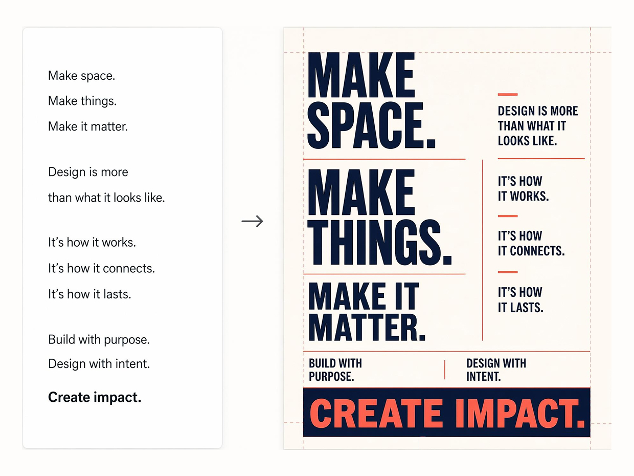
Design Layouts Centered on the Main Text
Designkit reads the text length, line breaks, and emphasis points, then arranges the words into a poster layout with a clearer reading order. Each element is placed to guide the eye from the most important phrase down through the rest.
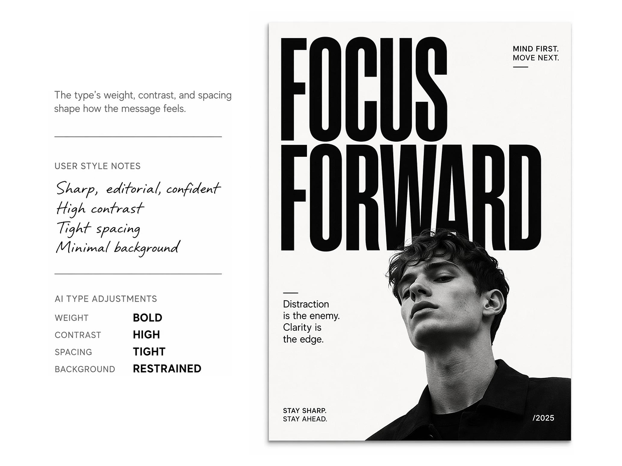
Match Font Style to the Poster's Mood
Describe the tone you want, whether minimal, bold, vintage, or editorial, and Designkit selects type styles that fit the mood. The result is a font direction that works with your words rather than against them.
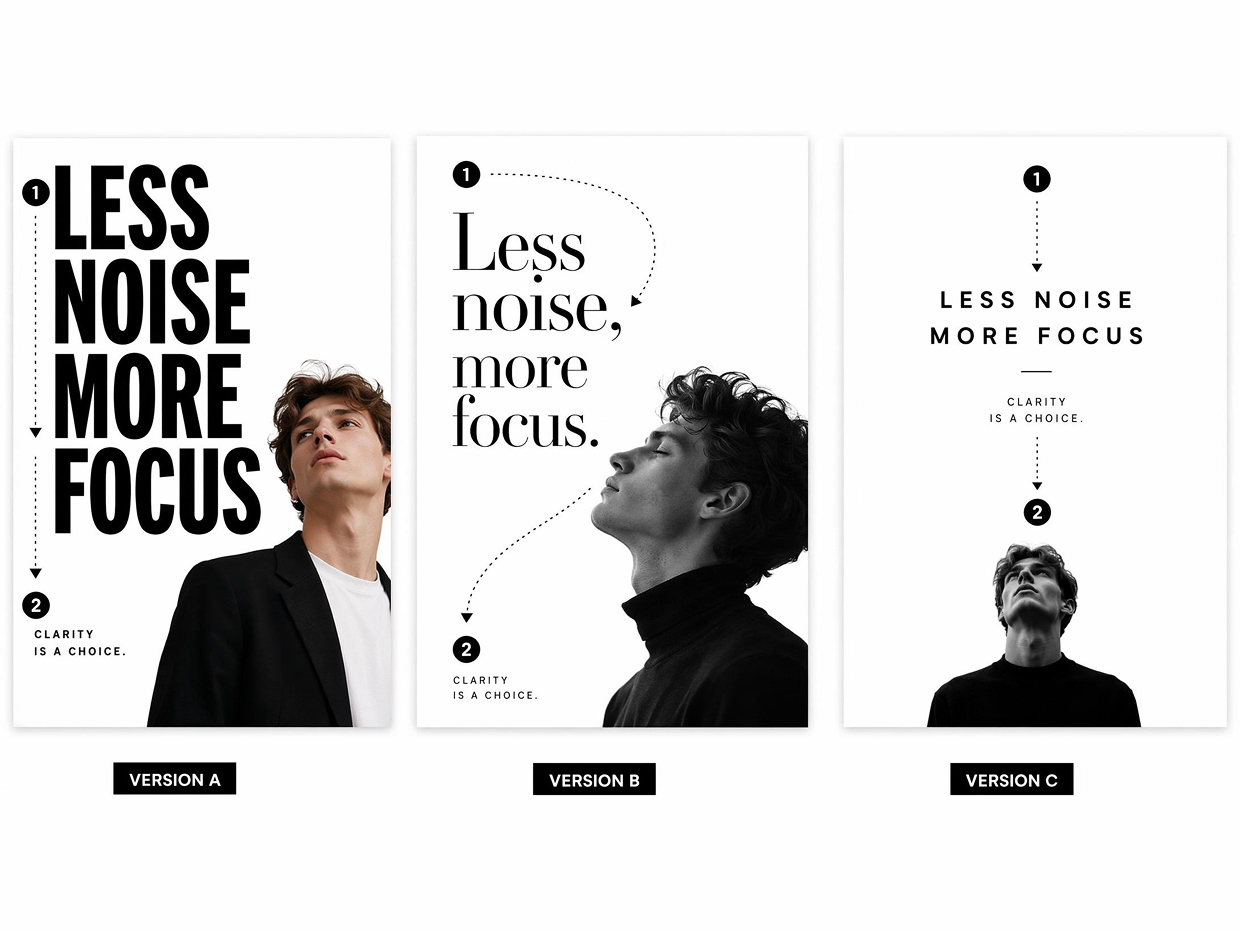
Generate Variations from One Message
Use the same text to generate several typography poster versions before choosing a final direction. Designkit adjusts composition, type scale, contrast, and spacing logic across each version, so you can compare bold, minimal, editorial, or expressive layouts while keeping the message consistent.
Fine-Tune the Poster After Generation
Designkit gives the first typography layout as an editable starting point. You can refine headline scale, line spacing, text balance, and color mood, so the final poster keeps the AI-generated structure while matching your own design judgment.
Poster Types You Can Create with Designkit
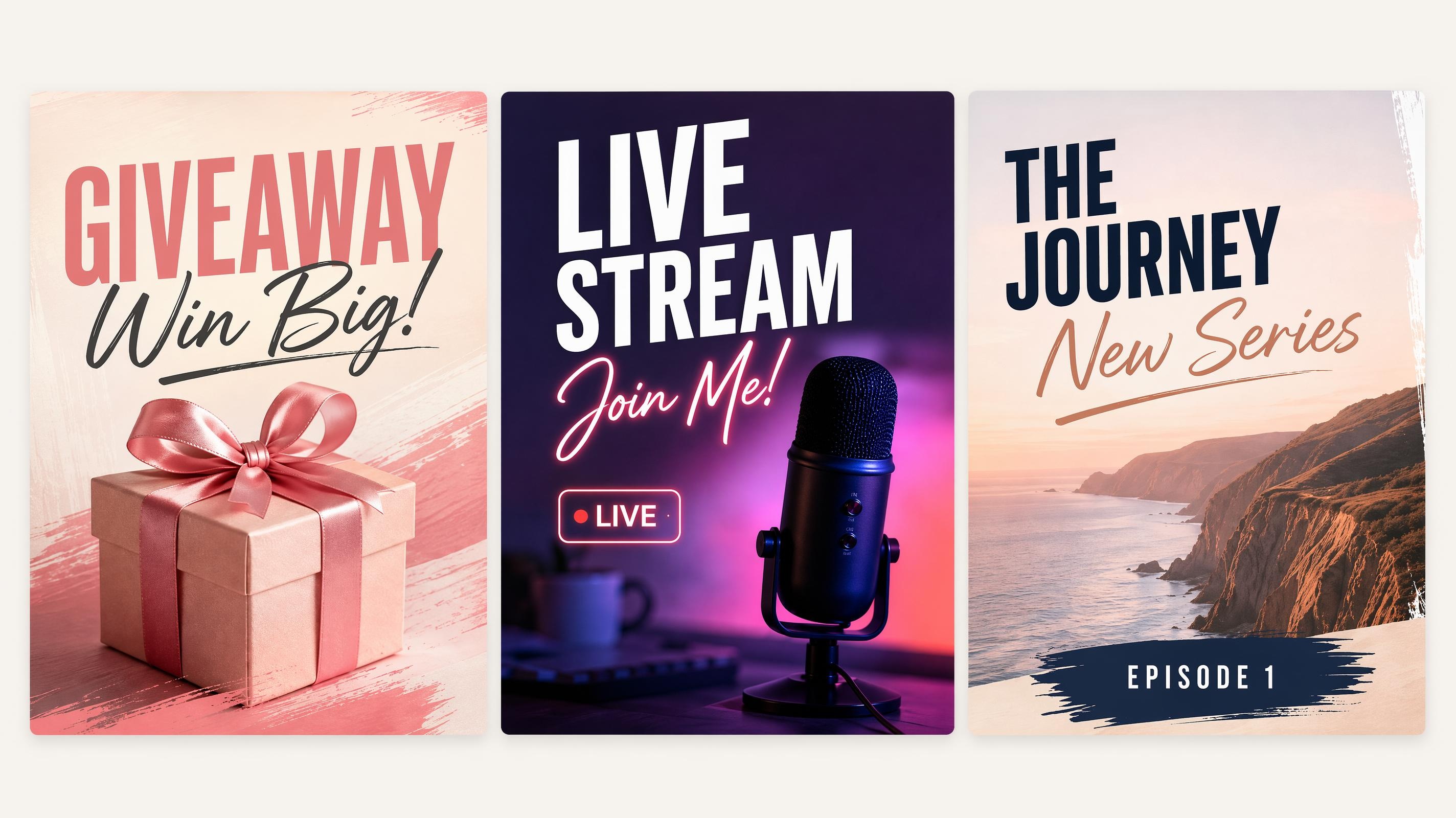
Social Media Poster
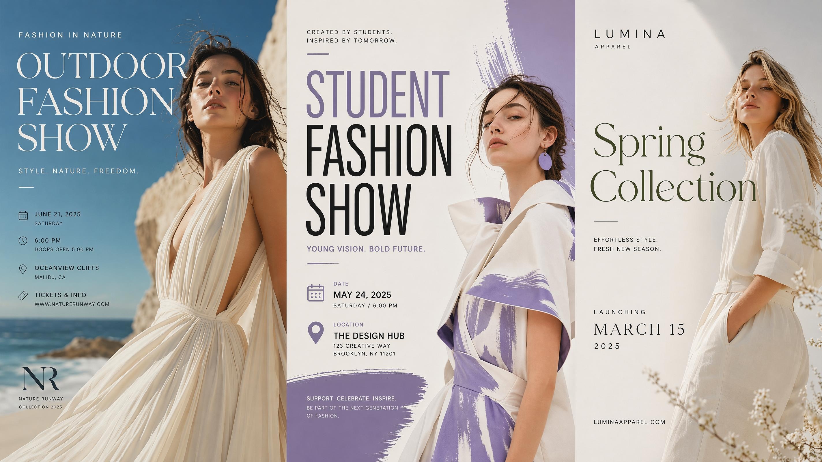
Fashion Poster
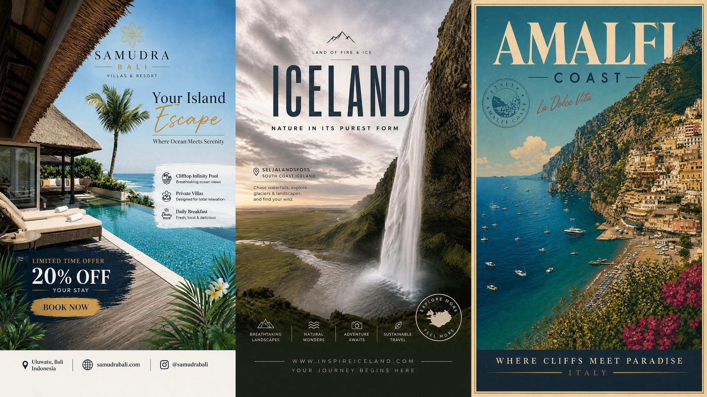
Travel Poster
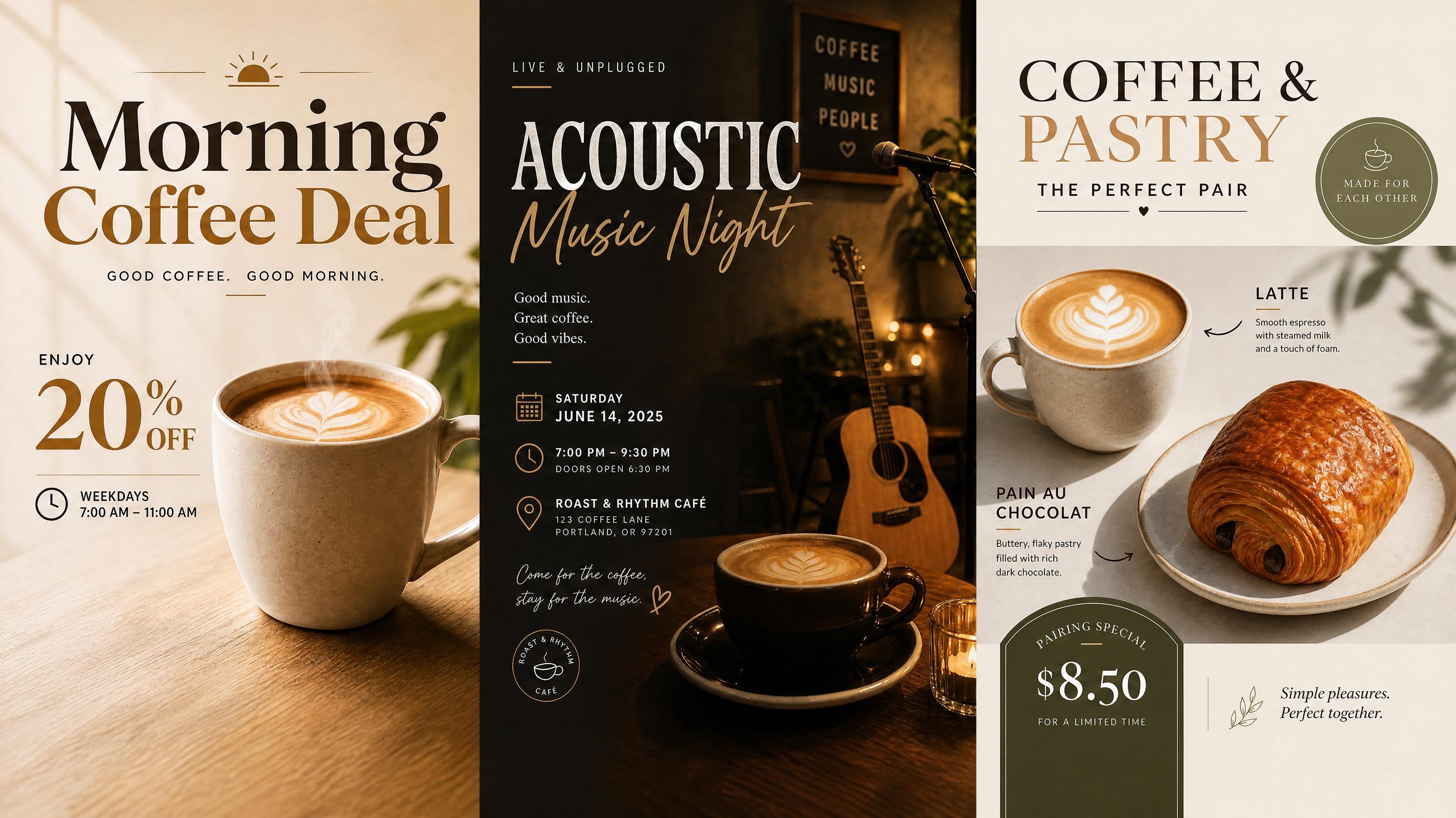
Cafe Poster
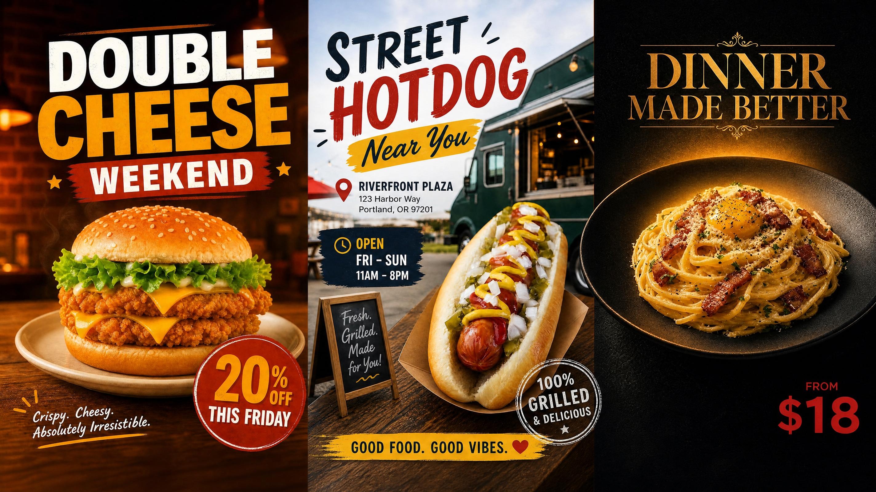
Food Poster
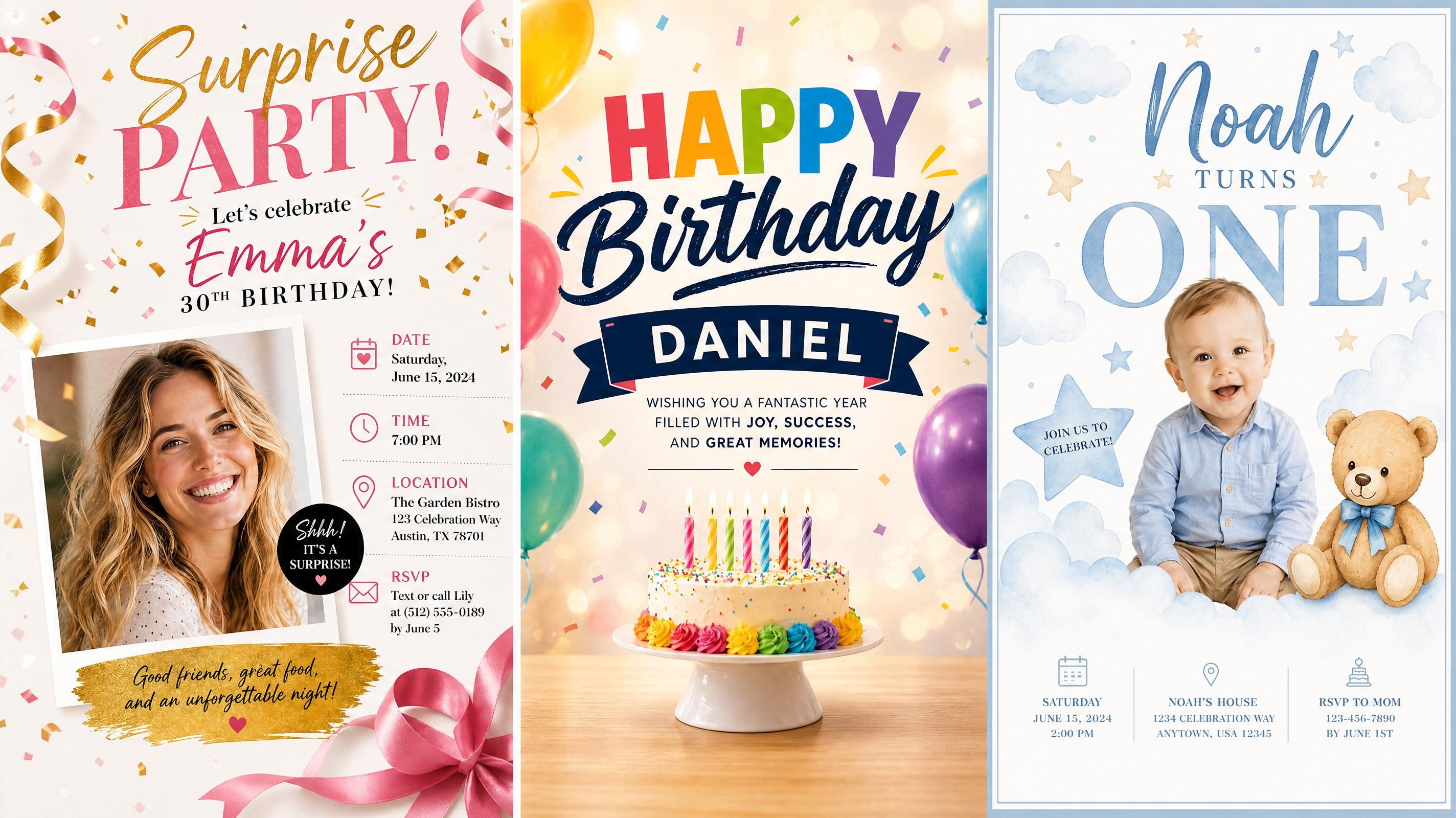
Birthday Poster
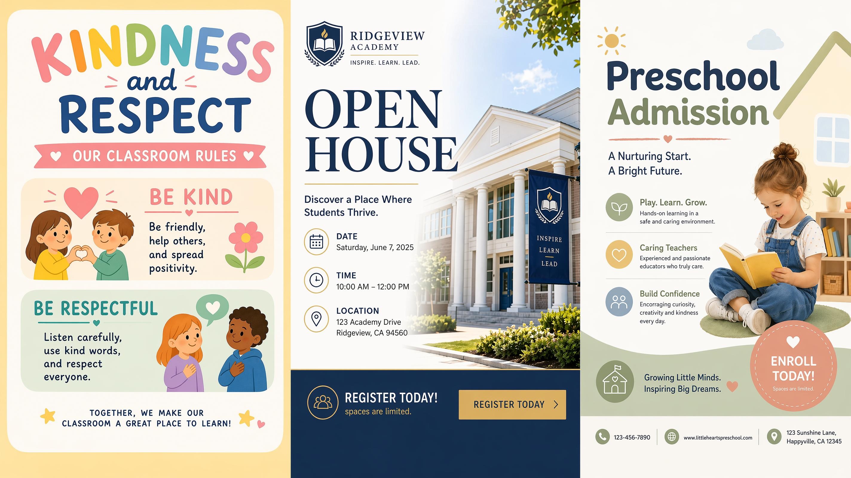
School Poster
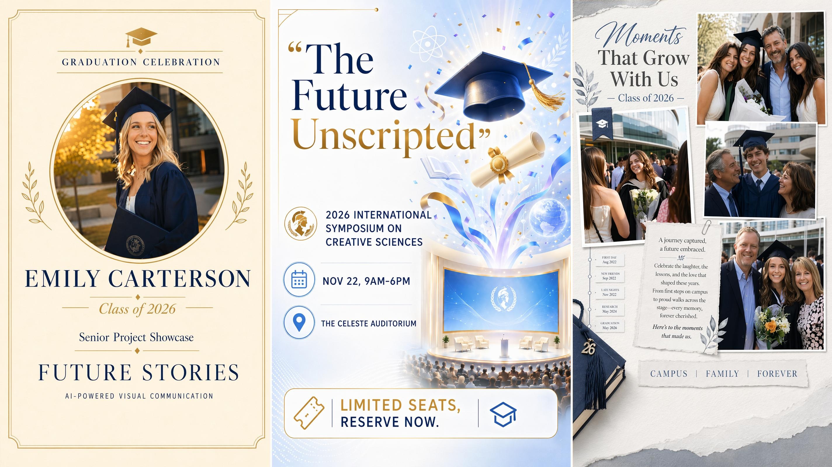
Graduation Poster
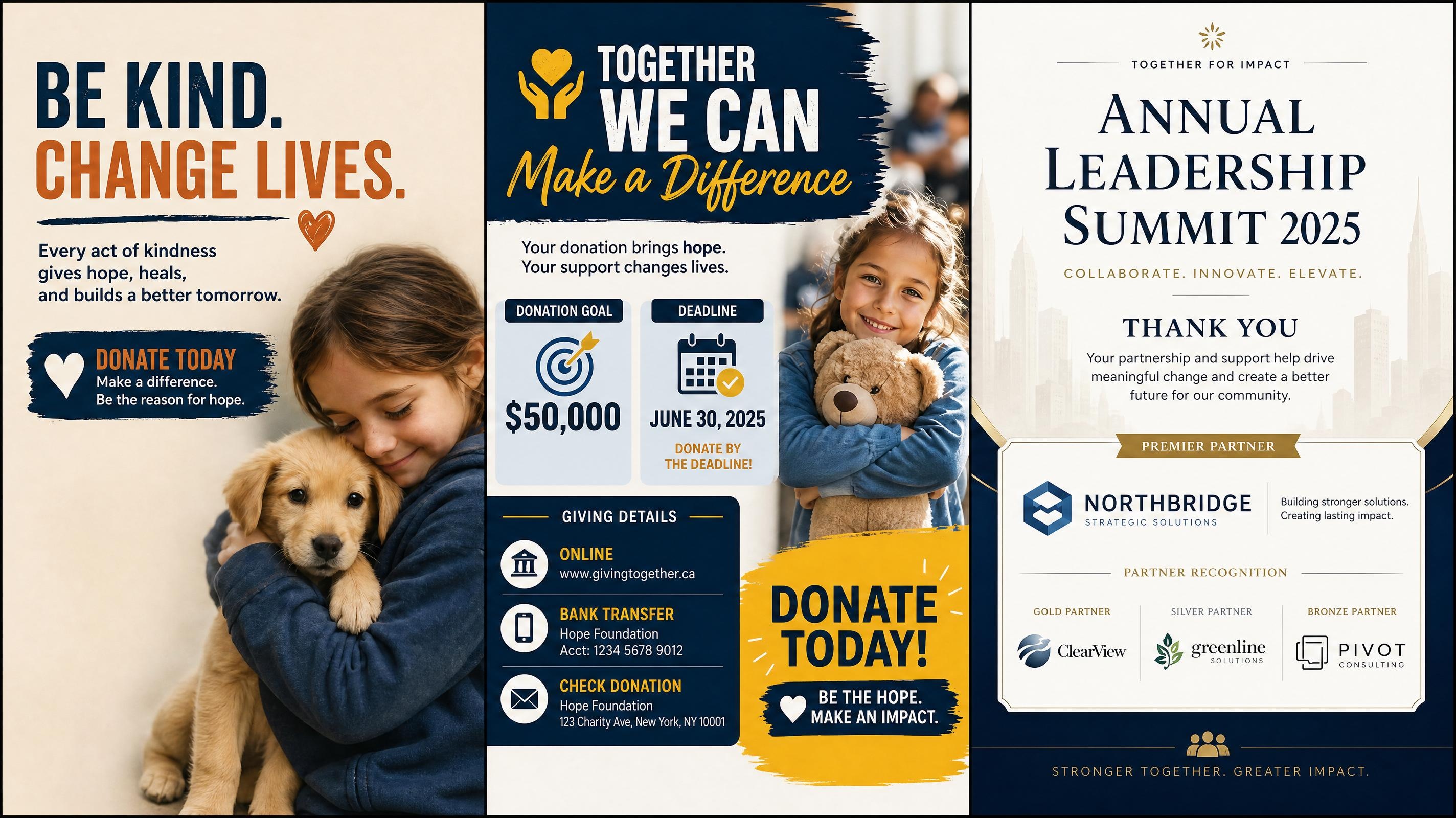
Fundraising Poster
Art Poster Generator
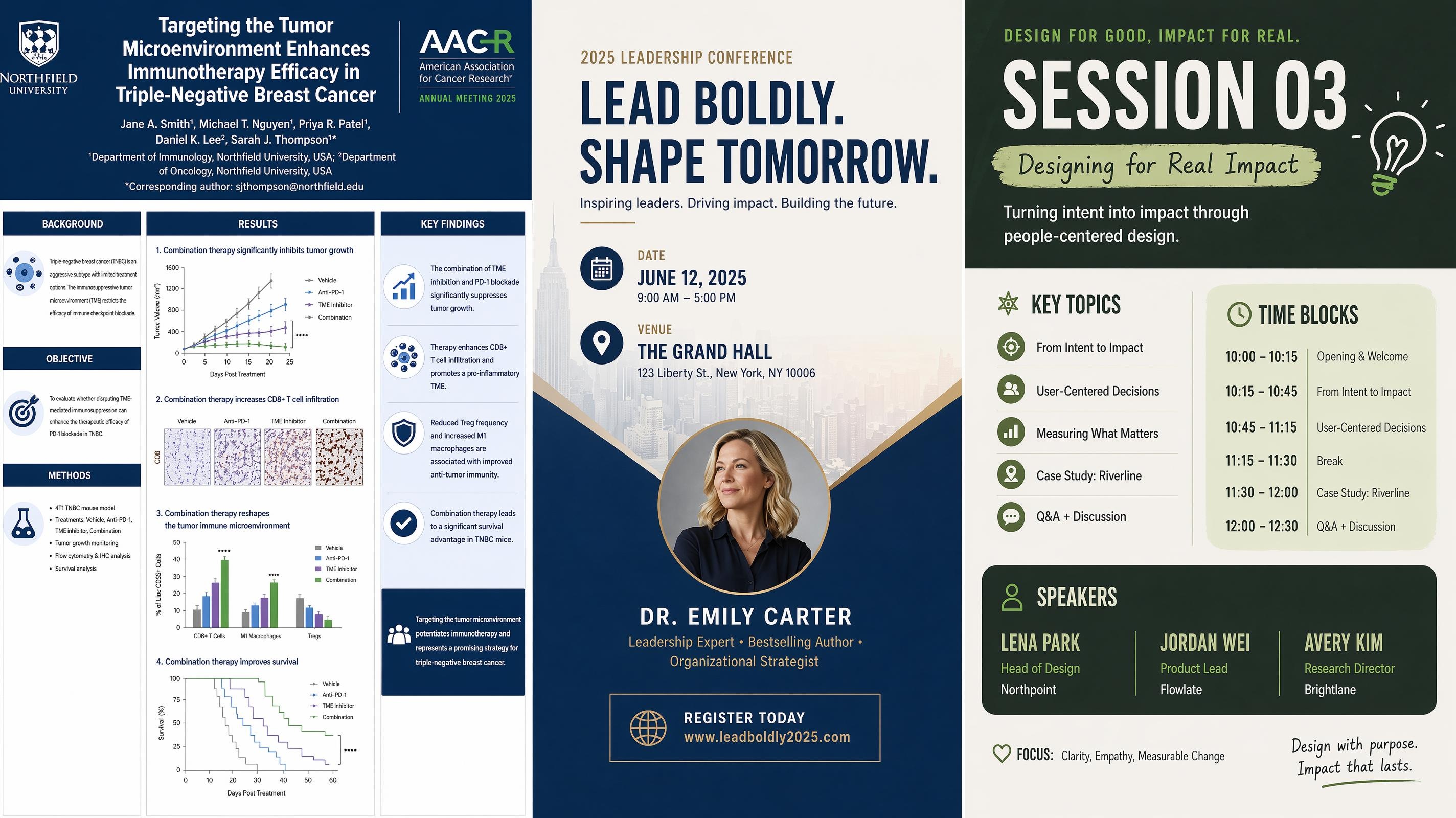
Conference Poster
Event Poster
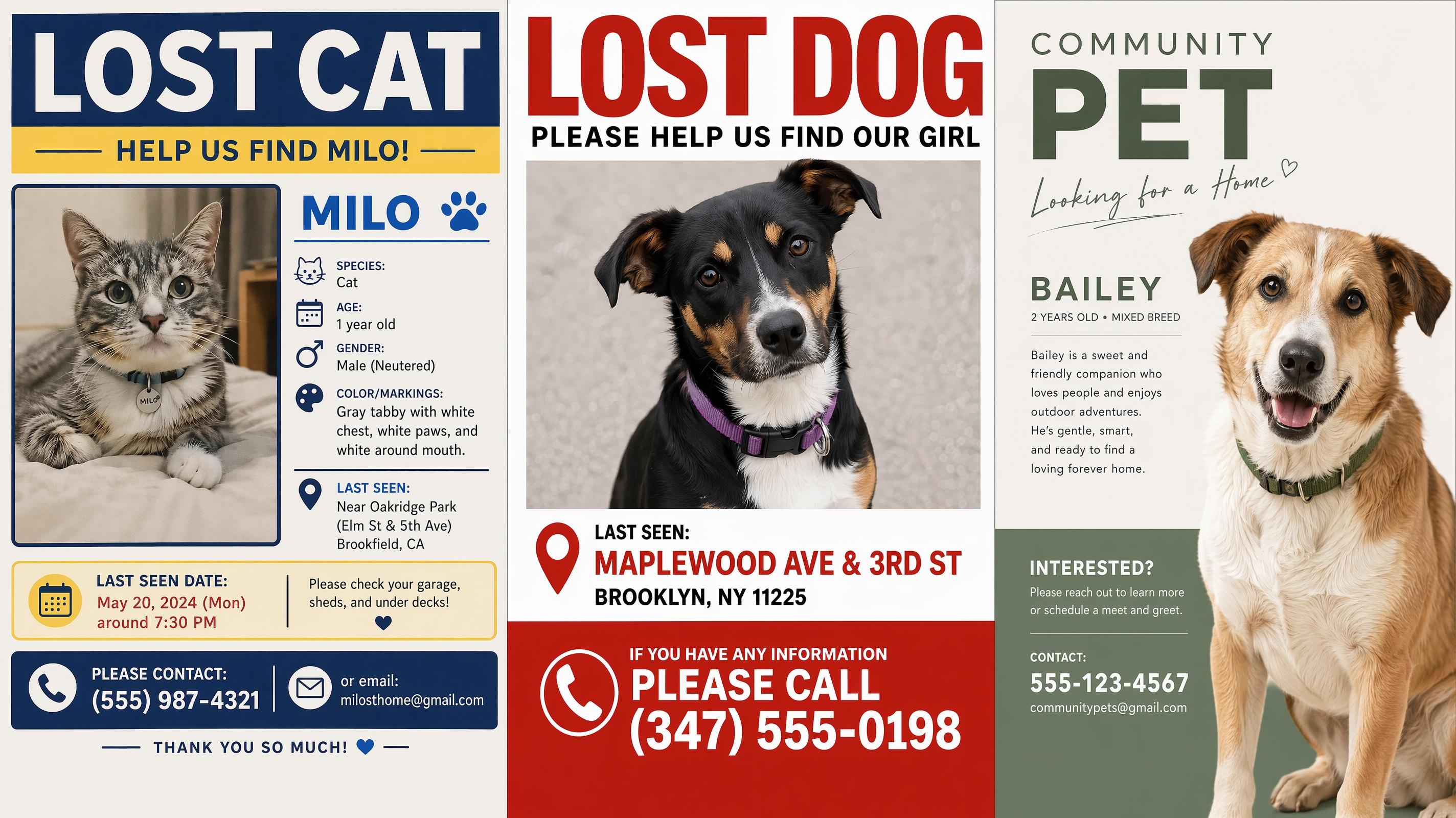
Missing Pet
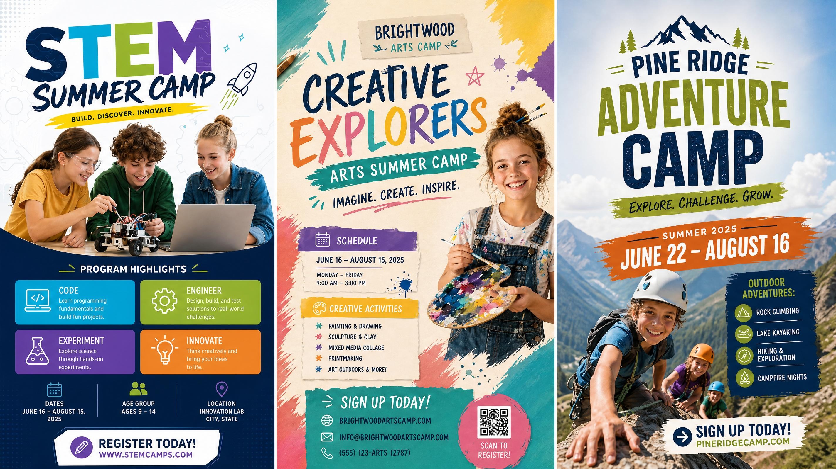
Summer Camp Poster
Frequently Asked Questions
What is a typography poster?
How do I make a typography poster with Designkit?
Start by entering the text you want to feature. Then add a style direction, such as minimal, bold, vintage, editorial, or experimental. The generator uses your text and style input to create poster layouts with font treatment, hierarchy, and composition that you can edit before export.
What file formats can I export the typography poster in?
Typography posters can be exported as PNG or JPG after generation. PNG works well for digital use and online sharing, while JPG is better suited for print. Before exporting, review the layout at full size and check that the margins and text are clear at the intended output dimensions.
Can I create a poster based on a specific font style?
Yes. You can describe the type style you want, such as serif, sans serif, condensed, handwritten, retro, or bold display lettering. The AI uses that direction to guide the type treatment and layout, then you can adjust the result in the workspace.
What kinds of text work best for a typography poster?
Short phrases, quotes, slogans, event titles, and single words tend to work well because they give the layout more room to breathe. Longer text can work too, but it usually needs clearer sections and more spacing to stay readable at poster scale.
Can I edit the text after the poster is generated?
Yes. You can revise the wording, adjust the layout direction, and refine the visual style after generation. This is useful when the message changes or when you want to test a stronger headline, shorter phrase, or cleaner text hierarchy.
Create a Typography Poster That Feels Finished
Your words are ready. Generate a type-led poster layout, edit until it looks right, and download a finished design.

What Designers Say About Typography Posters
See how creators use Designkit to turn text ideas into clearer typography poster designs.
The Quote Finally Looked Designed
I had the words ready, but my first layout looked like plain text on a page. Designkit gave the quote more structure, with stronger line breaks and better spacing, so it felt like a real typography poster instead of a quick note.
Font Tests Became Much Faster
I usually spend too much time trying different typefaces before the layout even works. Now I can describe the mood first and review several poster directions quickly, then choose the one with the best rhythm and refine it from there.
Worked Without a Design Background
I had never made a poster before, but the generated layout already had the information in the right order. I mostly adjusted the wording and the title size, and the final version looked like something I would have paid someone else to make.
Poster Sets Felt More Consistent
I needed several typography posters for one small campaign, but each message had a different length. Designkit kept the layouts varied while still making the set feel connected, which made the final group look much more intentional.
Client Revisions Were Easier to Handle
When the client asked for shorter wording, I did not have to rebuild the poster from scratch. I changed the text, generated a new version, and kept the same type-led mood, so the revision felt controlled instead of rushed.