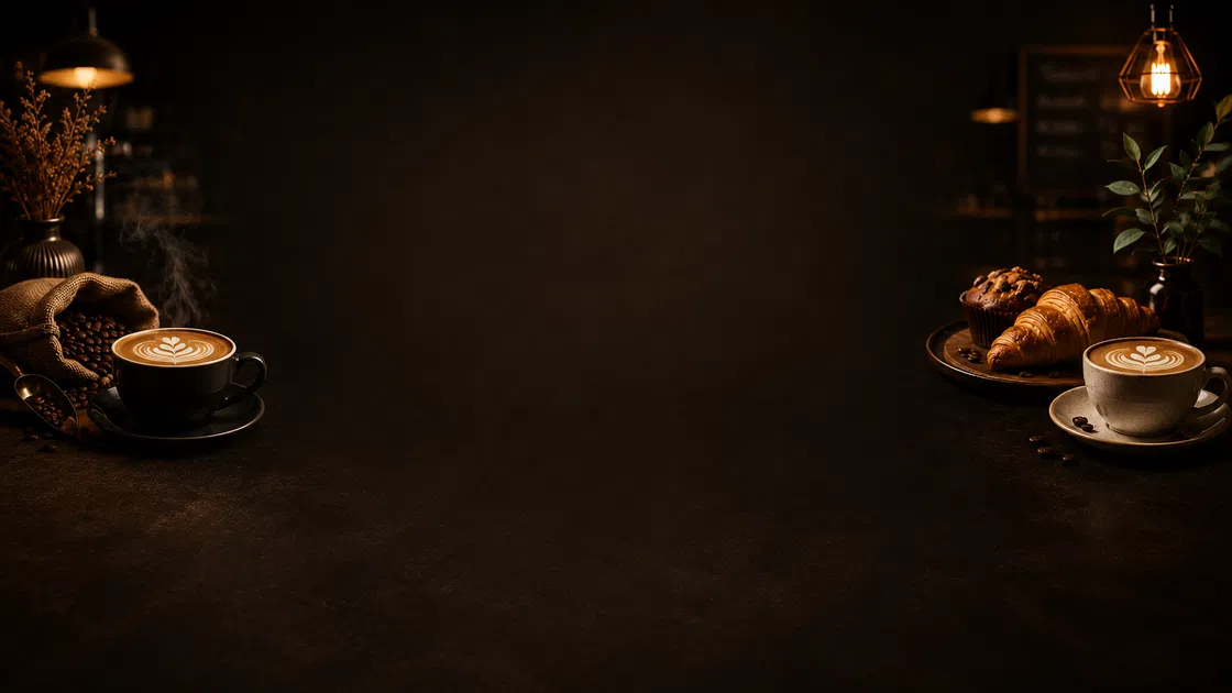
Create Coffee Shop Posters for Menus, Promos, and Events
Turn drink photos, menu details, or a simple prompt into polished coffee shop posters for product launches, daily offers, cafe events, and social posts.
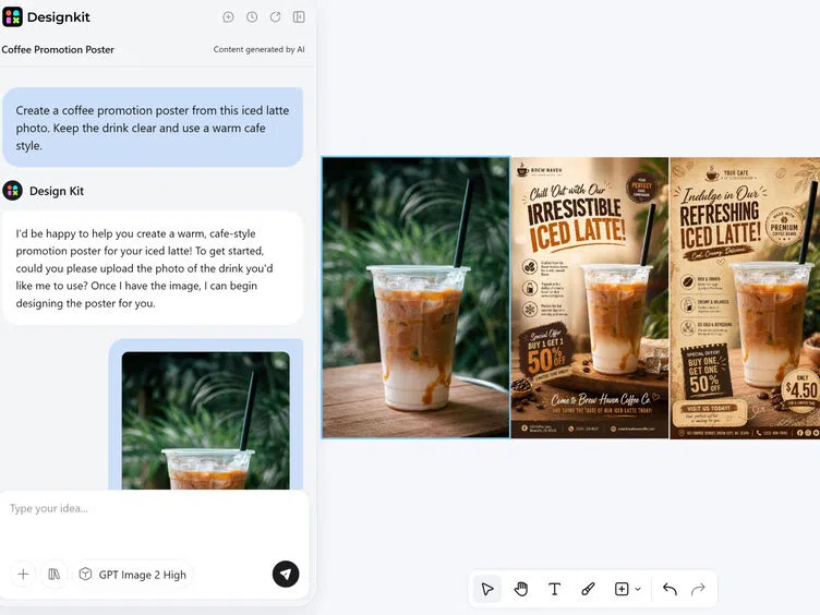
Generate Coffee Posters from Real Drink Photos


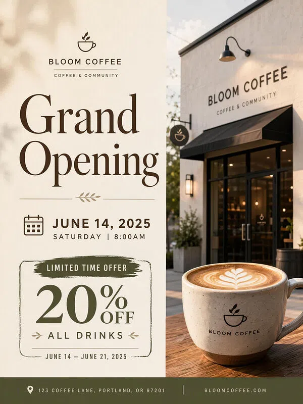
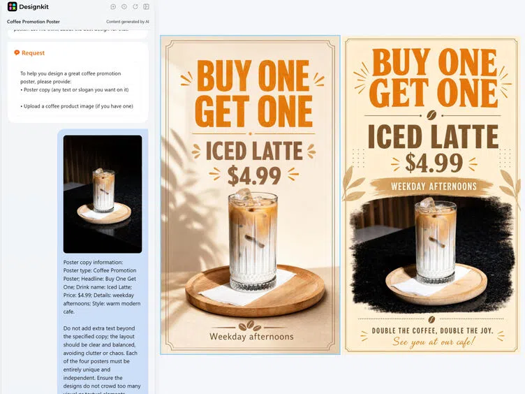
Turn a Cafe Poster Example into Your Own Campaign
Each example comes with a ready-made creative setup, giving you a quicker way to create a poster around your drinks, offers, or events.
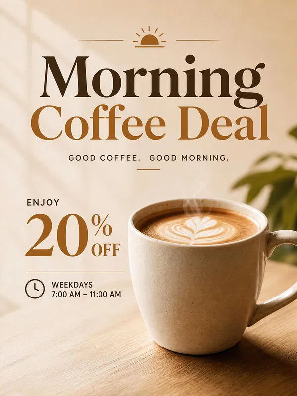
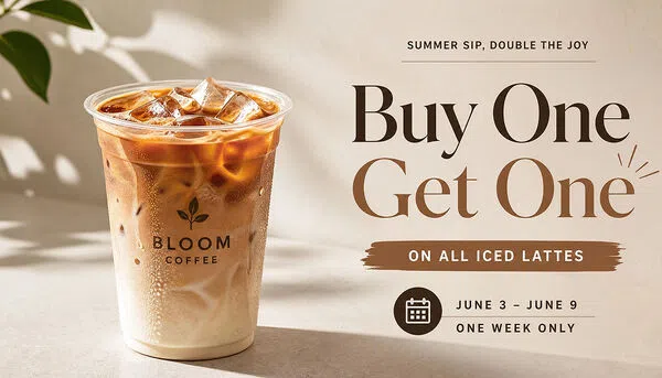
 Coffee Promotion Poster
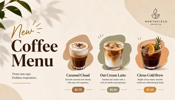
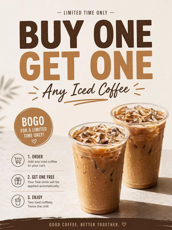
 New Menu Poster
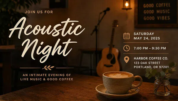
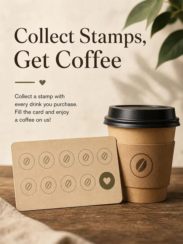
 Cafe Event Poster
How to Make a Coffee Shop Poster with AI
Add Photos or Describe the Idea
Start with a drink, pastry, logo, packaging, or cafe photo, or describe the poster entirely in text. Clear references help preserve product details and shape the setting, colors, and overall cafe mood.
Choose a Style and Add Poster Details
Add the headline, drink names, prices, dates, and offer details, then choose a style that fits the campaign. AI brings these choices together in a clear layout that keeps the main product and promotion easy to notice.
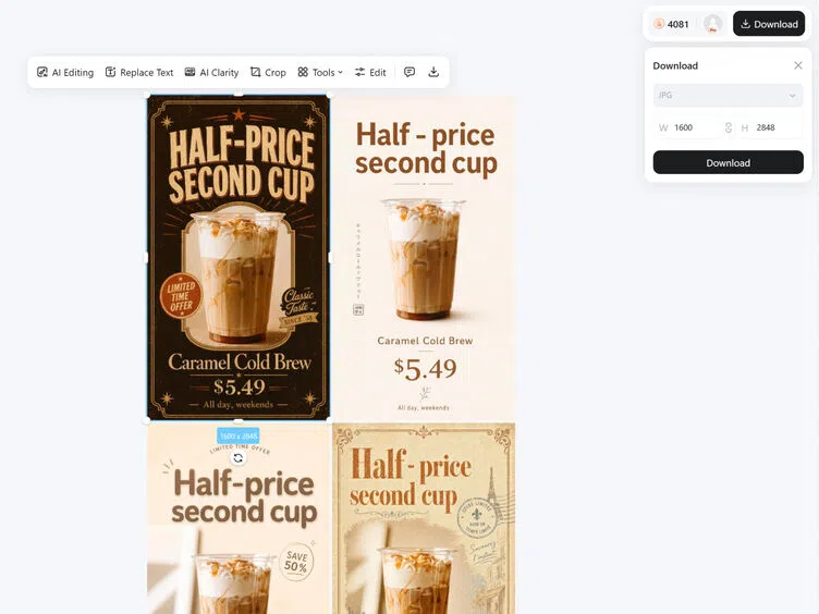
Generate, Adjust, and Export
Compare several versions, replace images, or refine the composition before exporting. Prepare square 1080 × 1080 posts, 1080 × 1350 Instagram graphics, 1080 × 1920 Stories, or A4 print posters in PNG or JPG format.
Shape Coffee Products, Offers, and Events into Posters
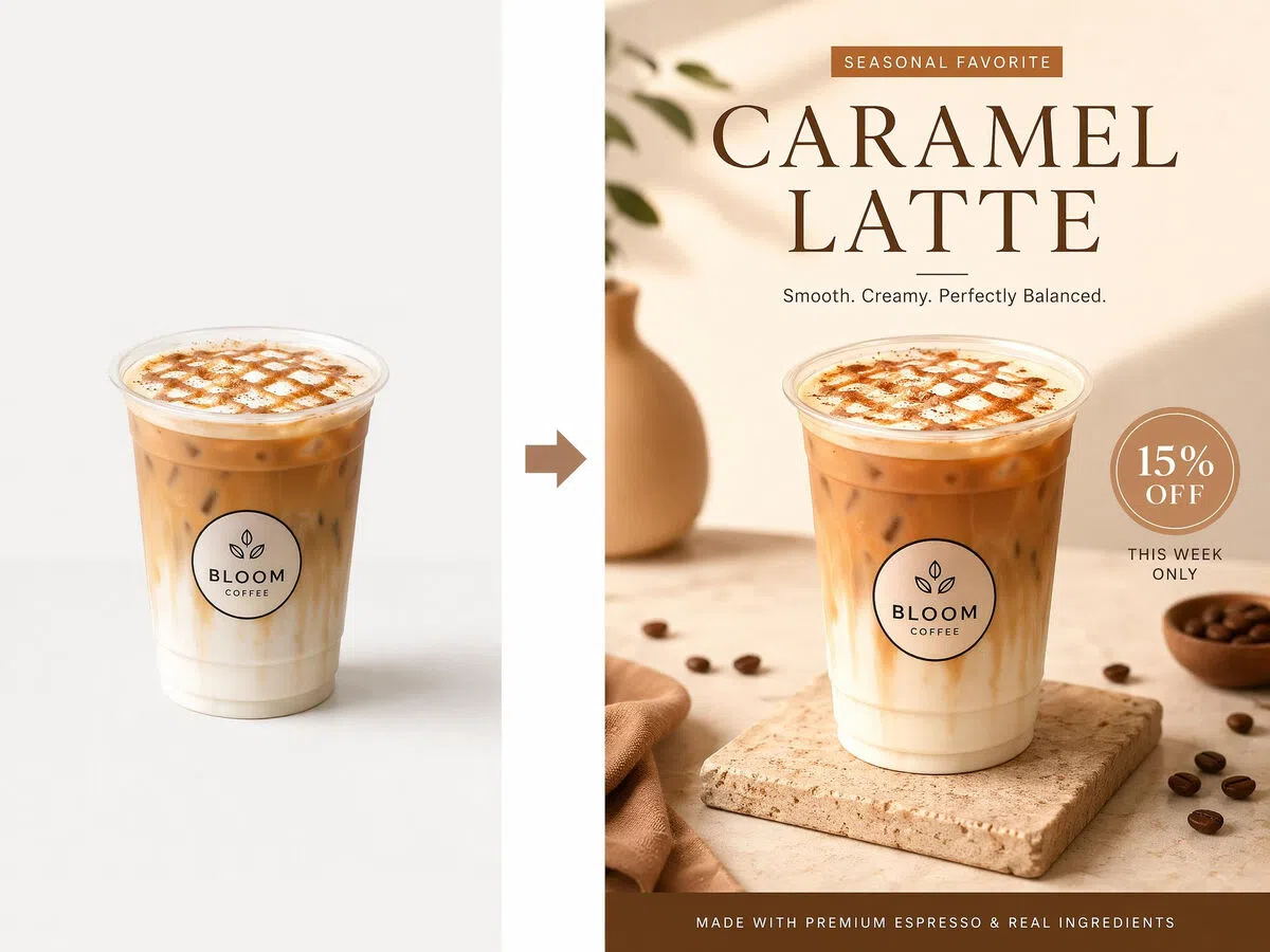
Keep Real Drinks Recognizable in New Poster Scenes
The cup shape, foam art, packaging, toppings, and other defining details can remain recognizable while the surrounding setting changes. Present the same product in a seasonal campaign, premium menu feature, or everyday cafe promotion without losing its identity.
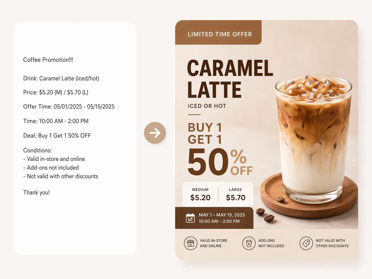
Make Prices and Offers Easy to Follow
Cafe posters quickly become crowded when product names, prices, flavor notes, dates, and offer conditions all compete for attention. A stronger hierarchy makes the featured drink or main promotion land first, while supporting details remain readable from a distance.
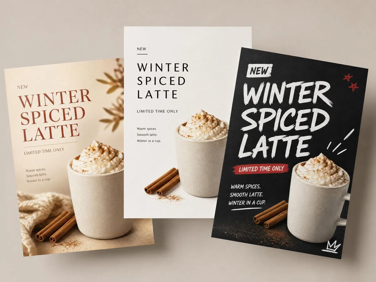
Compare Different Campaign Looks Before Publishing
One coffee launch can be presented as a warm seasonal design, a minimal menu feature, or a bold street-style advertisement. Generate several interpretations of the same brief and compare how each one changes the mood, product emphasis, and customer impression.
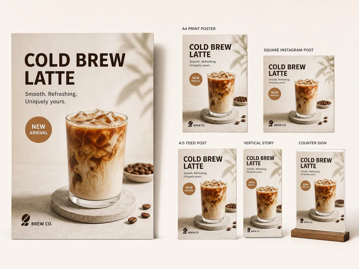
Apply One Campaign for Print and Social Media
A storefront poster, counter sign, Instagram feed post, and Story need more than simple cropping. Rebuild the composition for each placement while keeping the same drink, offer, typography style, and overall brand feel connected across the campaign.
Poster Types You Can Create with Designkit

Social Media Poster

Fashion Poster

Travel Poster

Food Poster

Birthday Poster

School Poster

Graduation Poster
Frequently Asked Questions
What is an AI coffee shop poster generator?
What can I upload to make a cafe poster?
You can upload a drink, pastry, menu item, logo, product package, or cafe interior. Clear reference photos are useful when the generated poster needs to retain the appearance of a real product or venue, but a text-only prompt can also be used.
Will the generated drink still resemble my real product?
A clear reference image helps preserve recognizable details such as the cup, foam art, toppings, label, and packaging. Results should still be reviewed before publishing when exact product appearance or ingredient representation matters.
Can I add prices, dates, addresses, and offer details?
Yes. Include the required product names, prices, dates, opening hours, addresses, or booking information in the prompt. The wording can be checked and adjusted in the workspace before the poster is exported.
Can I make posters for cafeterias as well as coffee shops?
Yes. The same process works for school cafeterias, workplace canteens, campus cafes, bakery counters, and other food-service spaces. The prompt can specify the audience, products, pricing, and placement so the poster fits that setting.
What poster sizes and formats can I prepare?
Common options include A4 print posters, square 1080 × 1080 social posts, 1080 × 1350 Instagram feed graphics, and 1080 × 1920 Stories. Finished designs can be prepared in PNG or JPG format according to the intended placement.
Can I change the poster after it is generated?
Yes. You can revise the wording, replace references, try another poster style, compare alternative versions, and adjust the composition before exporting the selected result.
Put Your Next Cafe Promotion on Display
Create your first poster free, refine the result in the workspace, and prepare it for print or social media with no design experience required.
What Coffee Lovers Say About Designkit
Trusted by cafe owners and marketing teams to showcase products, promote special offers, and highlight events across in-store displays and social media.
Our Seasonal Menu Finally Looked Connected
We had good photos of each drink, but every post felt like a separate campaign. Creating several posters from the same references gave the launch a more consistent look, while each product still had enough space to stand out.
Weekly Promotions No Longer Miss Their Window
Our offers change every few days, and design requests used to take longer than the promotion itself. We can now compare a few options, update the price and dates, and publish while the offer is still relevant.
The Event Poster Still Looked Like Our Venue
We used a real photo of the seating area for an evening music poster. The final design kept the lighting and recognizable details of the cafe, so customers could immediately connect the event with the place they already knew.
Customers Understand the Offer More Quickly
Our earlier posters included the right information, but the price and conditions were hard to find. The new version makes the drink and main offer obvious first, and we get fewer questions about what the promotion includes.
The Same Launch Works in More Places
We started with a window poster for a new espresso drink, then adapted the campaign for Instagram and table displays. Each format feels suited to its placement, but customers still recognize them as part of the same launch.